


I love all the wonderful inspiration being shared at the Global Design Project. From week to week, the challenges are producing some wonderful work from Design Team members and participants – and I love that I can share from the start of each week. This week’s color combination – Daffodil Delight, Basic Gray and Smoky Slate – offers SO MANY beautiful possibilities. Spring, baby, birthday, sympathy, thank you. Here’s the card I created with this gorgeous combination of colors:

And here’s the banner for the challenge that inspired my card:
 Tips, Tricks and Reminders
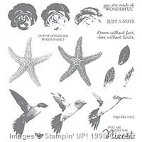
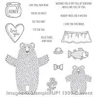
- Stamps. The sweet and simple images on my card were created by combining a sophisticated stamp set with a cutesy set. Do you know which ones I used? I’m not going to wait for you to guess – I’m just going to tell you. The sentiment is from Picture Perfect (a beautiful Two-Step and Three-Step Stampin’ set), and the flowers are from Bear Hugs (a sweet and silly set with adorable bears). As both images are photopolymer, I easily positioned the flowers perfectly on the sentiment similar to the way I stamped flowers on the Kinda Eclectic sentiment in this card.

Picture Perfect, Stampin’ Up!

Bear Hugs, Stampin’ Up!
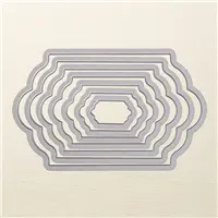
- Dies. With super-simple layering, the Lots of Labels Framelits add lovely elements to a clean and simple card. While there are some sentiments and images that are designed to coordinate with these framelits, almost anything can work well inside this fresh, fun frame. I didn’t center the sentiment and image in the frame so I could add some tiny banners beneath them.

Lots of Labels Framelits, Stampin’ Up!
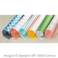
- Pretty Paper. I pulled two Designer Series Papers for this color combination – Schoolhouse Designer Series Paper has a really great Daffodil Delight page with Whisper White dots, and Have a Cuppa Designer Series Paper Stack has a great Whisper White page with Basic Gray dots. I split the background of this card by combining the two.


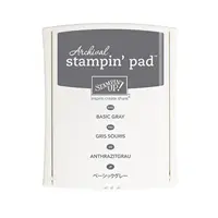
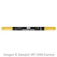
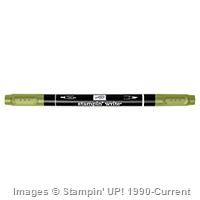
Stamp Sets: Picture Perfect, Bear Hugs Papers: Schoolhouse Designer Series Paper, Have a Cuppa Designer Series Paper, Smoky Slate, Basic Gray, Daffodil Delight, Whisper White Inks: Archival Basic Gray, Stampin’ Write Markers (Daffodil Delight, Pear Pizzazz) Accessories: Lots of Labels Framelits, Hexagon punch (for banner tips), Stampin’ Dimensionals

I hope you’ll pop over to the Global Design Project site to see the cards by the design team members and to play along with this week’s challenge.
Thanks for stopping by today!
Brian


Grey is one of those neutral colors that make light colors pop, however; I don’t think to use it more often. Generally, I choose black. Thanks Brian, for choosing Grey! Love this card.
Katrina – I often bounce back and forth between Basic Black and Basic Gray. This combination of colors was chosen for me in this challenge, and I love it. Thanks!
Love your card Brian! You have used the colours so well. Thanks for your continual inspiration.
Thank you, Kylie. The GDP is filled with such amazing challenges and inspiration. Always fun to see what people make.
Great card Brian! Love the colours and the trademark combinations of different stamps & DSPs.
Thanks, Nyree. These papers seem like they were meant for one another. 🙂
Brian, love this color combination, your layering of this panels is fabulous, I don’t grab gray card stock often at all but now, you just showed me that it can be paired beautifully with all of those soft colors for Spring.
Thank you for sharing.
Love these colors…..beautiful card!
Thanks, Linda. The colors define this card. <3
I KNEW those that little flower bouquet was from the bear hugs set! Very clever combination with this sentiment.
Thanks, Mary! Glad you picked out the flowers – you know your stuff! <3
Ok first off I have to thank you immensely with the color combination suggestions!!! I am one of those people who absolutely CANNOT put colors together beyond the basics (yellow with green, red with white…etc.). SERIOUSLY!!!!! But my question is this … you put the groups together but I don’t understand if you mean just any of that group together or the 3 in a row? Thank you for the help!
Thanks, Leslie. I’m so happy you like yesterday’s post. I know a lot of people have a hard time with colors, so I’m glad I can help. My thought is that you can pick three colors (one of each from the four categories): a pink, a purple, a yellow/green, a blue. I threw out a couple of suggestions based on that theory. Almost any combination will work, so have fun with it. 🙂
Brian- I just love this! You always know how to wow me! These two stamps are perfect together, but you already knew that? And that color combination is amazing! Love seeing all the amazing projects over at Global Design Project…you guys rock Thanks for making my Monday morning a little brighter
What a classy card! Clean and sleek. Love it!
Thank you, Karen. I’m so happy you like it!
Beautiful, Brian. The colors and design are perfect together.
Thanks, Debbie! I appreciate your kind words. <3
Hi Brian:
For some reason when I use yellow I always combine it with blue. I’m writing myself a note to use it with gray once in a while. With the note I put a little smiley face and the words “thank you Brian”! This card is just out of this world gorgeous. Thanks for sharing your amazing talents with us every day.
I don’t use yellow a lot, either, Grace. So happy with this color combo – glad it inspired me to make this card. 🙂
OH! So pretty, Brian. Your cards are always so crisp, clean and awesome that they always put a big smile on . Such an inspiration. Thank you.
Colors are wonderful, sentiment great and the way you set labels to side.
Elegant!
Thanks so much, Di! I really appreciate that.
Little flowers precious, also! Nice touch.
🙂 Thanks.
Great card as always Brian. I am going to crown you King (pun intended! LoL!) of DSP! You sure know how to use it well and bring out the best in it! 🙂
I love that! Thanks so much, Tracy! I love my DSP and am thrilled when they pair perfectly. 🙂
I hate to sound repetitive, you truly are the BEST with Designer Series Paper. Love how you combined these and the stamp sets to come up with this awesome card.
Thanks, Shawn! I love Designer Series Paper – it’s quite a compliment that you like what I make with it.
I love your mix of image and words – they fit together perfectly! Rocking this colour scheme too Brian!
Thanks, Paula. I appreciate it.
Hi Brian
I really like your card – It has a look of sophistication to it with just a little quirkiness by using the cute flower and sentiment.
I would like to CASE this card if I may.
Thank you so much, Christine! I’m glad you like it. 🙂 By all means, CASE away! Enjoy!
Pingback: Suite Sayings for GDP025 – STAMP WITH BRIAN
I love all the layers you have used in this card Brian! I never think to do that and I always wonder why not, when I see cards other people have done this way. It is a really lovely card!!
Wonderful card Brian … you are the king of layering! And those teeny long banners are perfect! xxx
so many delish layers! I would never of thought to use those bear hug flowers. they are the perfect little detail!
I love the color combo!