


I was so excited by this week’s Global Design Project color challenge (Daffodil Delight, Basic Gray and Smoky Slate) that I couldn’t just make ONE card for the challenge – I felt compelled to make TWO. I shared the first card on Monday – you can see that card here. Here’s my second card with this wonderful color combination:

And here’s the banner for the challenge that inspired my card:

Tips, Tricks and Reminders
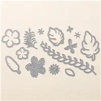
- Botanical Builder Framelits. The Botanical Blooms Photopolymer Bundle is the first of its kind (as far as I know). THREE items are combined in this 15% off bundle – a stamp set, coordinating Framelits and a pack of Designer Series Paper. Wowza! While all three offer their own personality to a card (and work perfectly together), each one can shine alone. I only used the Framelits/Thinlits on this card to create the sweet flower and ornate border along the bottom (this long piece is a Framelit on one side and Thinlit on the other). Love it!

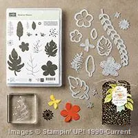
Botanical Blooms Bundle, Stampin’ Up!
- Simple Easter. I made this card as a challenge to myself. Not only was I inspired by this color combination, but I loved that I could make a sophisticated Easter card with this amazing sentiment from Suite Sayings and the beautiful Botanical Builder Framelits. Such a simple card, but I think it’s elegant and Easter-appropriate.
- Flatten it a Bit. When you crop out an image with Framelits, you’ll often see an indention left from the die you are cutting with. That’s OK if you are cropping out an image from scrap paper (because you are going to throw away the rest). If you are cropping out an image on a piece of cardstock you want to keep (like the vine above), you can run that piece of paper through the Big Shot a couple of times with clean plates or between copy paper to flatten the indentions a bit. You can still see them above the vine in my photo above, but they are not nearly as dramatic as they were when I first cropped them.
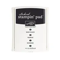
Stamp Sets: Suite Sayings Papers: Daffodil Delight, Basic Gray, Smoky Slate Inks: Archival Basic Gray Accessories: Botanical Builder Framelits, White Perfect Accents, Stampin’ Dimensionals


I hope you’ll pop over to the Global Design Project site to see the cards by the design team members and to play along with this week’s challenge.
Thanks for stopping by today!
Brian


Beautiful card Brian, I just ordered this amazing die set, it’s on back order so I truly hope they will hurry up and restock it and send it ASAP!!!
I love every single image on it, just look at what you made, so beautiful and that color combination looks great for Easter or Spring cards.
I too have troubles sometimes with marks left on my card stock after die cutting, thanks for the tip on how to minimize this marks, they are barely visible on your card.
Thank you for sharing.
Fingers crossed for you, Maria. It’s a great die to have – so many beautiful options. Can’t wait to see what you make with it. <3
Lovely card Brian. Thanks for the tip on flattening indentations – I did not know that.
Glad to share, Linda. 🙂 Let me know how it turns out.
You are really convincing me that a mix of traditional spring and neutral colors make for a really modern look! This is lovely.
Yay! These colors just work so well together. Glad you like them.
I love the vine border in this set of Framelits! Perfect on this card.
It’s really great – I’ve been hesitant to use it because I wanted it to be “the right” project. This one felt right. Thanks!
Beautiful card for Easter Brian. I love that border die. I too need to finish some cards for Easter. Easter is early this year and kind of caught me off guard. The contrast of Basic Gray with Smoky Slate is so soothing and gorgeous. Great job as always!
Thanks so much, Grace. Always love to hear your thoughts.
Smart looking card! Love the clean crispness. Thanks for the flattening tip too. Will be sure to try.
Yay! Let me know if it works for you.
My hats off to the designer of this framelits set. Totally, a wow!
Love the matching DSP in the bundle, however; now I see from your card, that solid Cardstock also pops. Thanks Brian!
I agree with you, Katrina. This is a great set. Glad you like this project, too.
Really beautiful card, Brian! I have to say I love this week’s color challenge as well.
Thanks, Susan! These colors are smashing.
Oh Brian you know what I’m going to say, I love love you card , FLOWERS ,
yes vary pretty !! ❤️
Tfs , oh and colors are wonderful too!
Hugs Frenchie!! ❤️
Thanks, Frenchie! I know how much you love flowers – glad you like it.
Another gorgeous creation from you Brian. It’s nice to see an Easter card that has neither an egg nor chick on it!
Thanks, Paula. Your Easter chick card on this week’s GDP, though – amazing.
Great card, great challenge, great stamp set and great framelits!!!
Thanks, Dawn. I’m guessing you think it’s great? 🙂
Beautiful and sophisticated card Brian. Loved how you combined all the elements together. Might have to Case this card for Easter if that’s okay. 🙂
Thanks so much for the kind comment, Juan! Please, CASE away! 🙂
Beautiful Brian … thanks for the tip to “flatten” out those pesky lines! 🙂 xx