Holiday Ribbon Share & a Blog Candy Giveaway
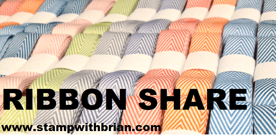
It’s November, and I’m happy to announce a stampwithbrian.com Holiday Ribbon Share! I’ve selected lots of sweet colors and beautiful ribbons so that you will be all stocked up for this Holidays. The ribbons in the share are listed later in this post (and aren’t necessarily represented by this delicious photograph): Here’s how a ribbon share works: You sign up for a spot in the ribbon share – participants will receive 2-1/2 yards of each…