


It’s Sunday! That means it’s time for another design challenge from The Paper Players. This week, LeAnne Pugliese gives us a wonderful sketch – you can do almost anything with this sketch. I chose to make a sweet valentine’s card: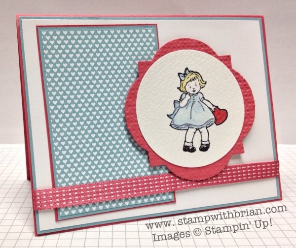
And here’s LeeAnne’s sketch:
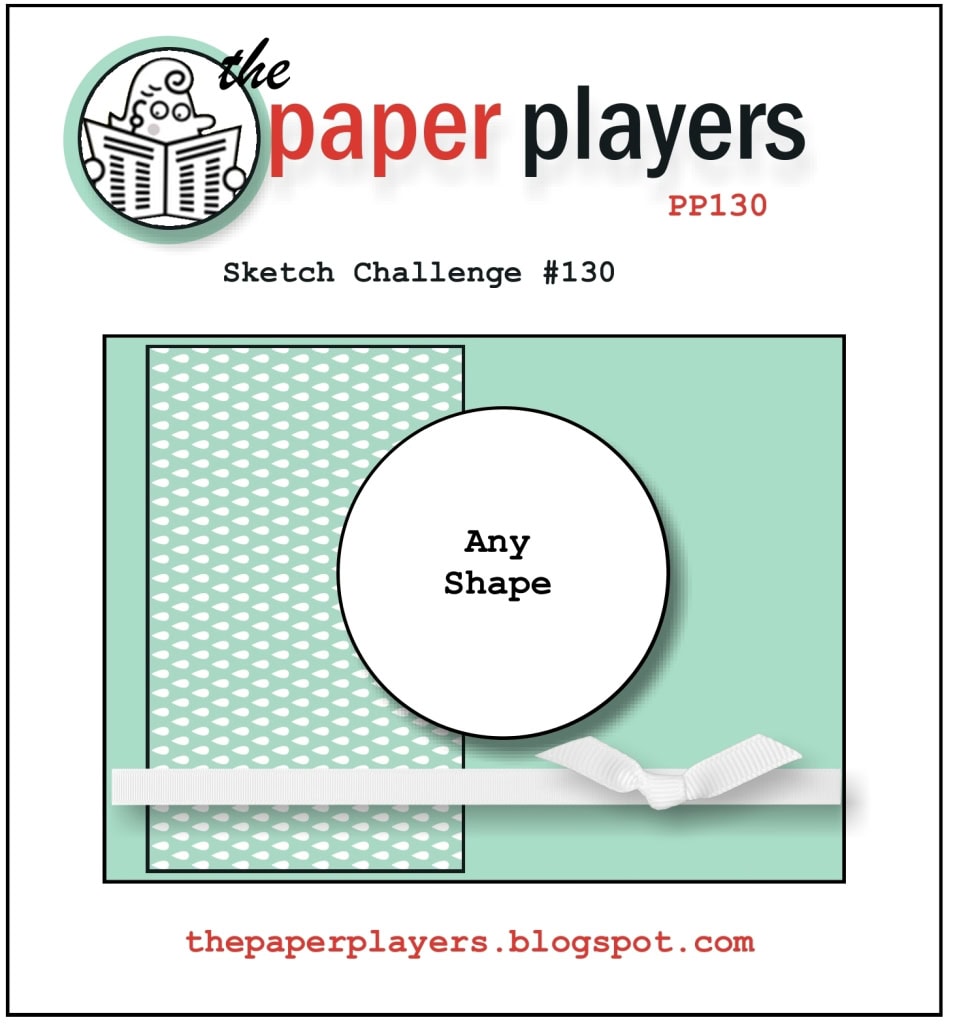 I’ve thought about this sketch challenge for a couple of weeks. It wasn’t until I posted my card to The Paper Players’ site that I realized how close my paper choice was to the one actually in the sketch. Ooops! I stand by my paper choice, though – it’s Baja Breeze, so that design belongs to me. 🙂
Tips, Tricks and Reminders:
- Colors. Once I decided to make a card with this image from Greeting Card Kids (I made that decision almost instantly after I saw the circle in the sketch), I knew I wanted to incorporate soft blue and soft pink. Of course, I immediately went to Baja Breeze – what other choice do I have? I played around with Pretty in Pink and Pink Pirouette but quite like how Primrose Petals pairs with Baja Breeze. I’ve always loved the tiny hearts pattern featured in the Patio Party Designer Series Paper, but I can’t remember ever using it. I was excited to feature it here.
- A sweet touch of texture. This card is clean and simple, but that doesn’t make it void of sweet and rich textures. Have you run your finger over that ribbon? It is silky smooth. I added a slightly rough texture by running the Window Frames shape through the Square Lattice Embossing Folder. Not too big, not too small.
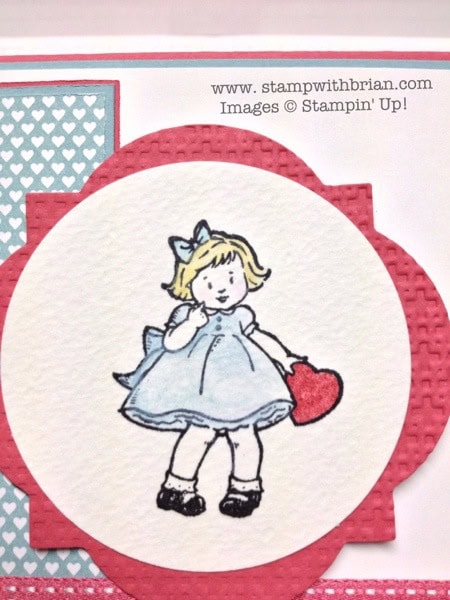
- Water coloring. The young girl is stamped with Jet Black StazOn on Water Color Paper. I then used my AquaPainter and Water Color Crayons to color her dress and hair and to give her skin a nice, soft hue. I blended multiple shades to give the young girl a softly watercolored dress.
Stamp set: Greeting Card Kids Inks: Jet Black StazOn Papers: Baja Breeze, Primrose Petals, Whisper White, Water Color Paper, Patio Party Designer Series Paper Accessories: 2-1/2″ Circle punch, Window Frames Framelits, Primrose Petals Stampin’ Write Marker, 3/8″ Stitched Satin Ribbon, Square Lattice Embossing Folder
Check out the other inspirations for this challenge at The Paper Players.
Thanks for stopping by my blog today!
Brian


Wow, you have out done your self with this one Brian. Gorgeous.
So happy to be the first to be able to say ….adorable!
Lovely! Love those little “campbell soup” looking kids!!!
This so sweet and so cute . love the colors…. and you used probably one of my favorite EF . But what is blowing me away here is the precision layering !!! How do you do that ? It`s not possible for a human person type to get such perfect layers? And don`t you love the silky feel of these In Color ribbons ? I also like that you chose the grown up pink…. This card gets an A for adorable !!
Hi Brian, very cute card. I love those ‘kids’ and don’t use them nearly enough. I may just have to dig them out today and create a card. Thanks for the inspiration!
I love your site and check it out every morning before going to work. Then when I need a break I think about your card and how I can use your inspiration to create something. Keep up the fabulous work and humor!!!
Excellent! Love the color combo and the added texture. Just right for my tastes!
Brian – did I read it correctly? Did you put the ribbon through an embossing folder?
Grace, I wrote about the smoothness of the ribbon and the roughness of the Window Frames shape (that shape was texturized with an EF) in the same breath of air. I could have paced that out a bit. 🙂 Sorry for any confusion.
Great Sketch LeeAnne! I’ve always enjoyed Greeting Card Kids, precious in this color pallet, love those tiny hearts you found from Patio Party! A precious Valentine <3
Well DUH – after the 5th reading I realized you were talking about the frame. Well am I blushing or what? So sorry. I’ll be quiet now. LOL
Ooh yes Brian I love it , nice colors , love that stamp set , I still don’t have it !!!
Sigh !!!
Thanks for sharing ,
Hugs Frenchie
Adorable, Brian! Your coloring is so soft and sweet!
Very sweet card, Brian and you used my favorite technique…..you water colored that cute little girl. Like Sonny, I’m also amazed at how perfectly you placed the layers of paper on this truly beautiful card.
Love the color combo Brian and the sweet soft watercoloring!
I want to pin this! How do I pin it? I just got on Pinterest and don’t know what I’m doing. VERY cute card!
Sandy, Thanks so much! You can click on the “Follow me on Pinterest” link at the bottom of my post. That will take you to my Pinterest page. You can repin my pin of this card. :). Glad you like it!
So sweet! Great textures! Love the Baja Breeze and Primrose Petals color combination!
I am “pinning” this precious card right now, Brian!
Oh my gosh … LOVE!
I just love watercoloring…when I first started stamping, every stamp set I bought had to be colored! Your sweet little valentine is as cute as can be….love the DP you used, too! BLUE is another favorite! Thanks for making my sketch look wonderful!
Adorable card, Brian! I love how your choices of soft textures and small prints really lets your sweet image pop! Great watercoloring, too! ((hugs))
I love this sweet image, Brian, and you colored it so well. The patterned paper is perfect with it.
Falling a bit behind again, but this time due to volunteering at a friend’s business – a good thing! I also fell in love with the tiny white hearts on the beautiful blue DSP…don’t have that one and had I noticed, it may have been worth having for that sheet alone! Great card…don’t have that set either but love your design….so sweet!
Perfect mix of patterns and textures! That little lady really pops against the small patterns. I *love* it…which is totally appropriate since it IS a Valentine’s Day card, right! 🙂
very cute.
Would you share sometime your approach to coloring the outline images.
Much as I try, I’m not getting the results that I want.
Many thanks,
Teresa
Teresa, I wanted to produce a quick water coloring video with this card but ran out of time. I will do one soon. Thanks!
Brian, this is a lovely valentine card. I am in love with that beautifully watercolored image.
Jaydee
Clean and fun! Your coloring is great! 🙂