


If nothing else, I’ve played around with a variety of styles this week. I’ve created cards from bright & cheery to dark & dirty. I created cards that are soft & ornate, so I figured I’d give bold & modern a try. My goal? To play around with Pleasant Poppies, creating a modern interpretation of the flowers. As I started shading the elements of the flowers, I realized this wasn’t an impossible task. I am so happy to share this card with you today – I couldn’t be happier with how it turned out: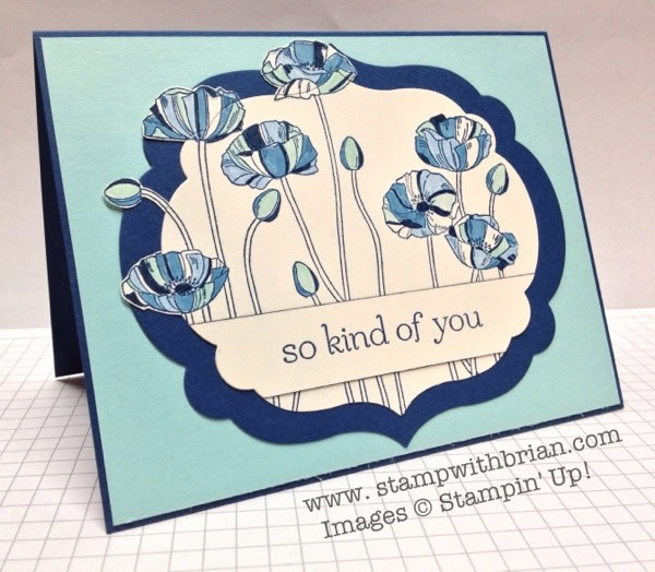
Tips, Tricks and Reminders:
- Go Monochromatic. I derive almost all my knowledge from Wikipedia (it’s such a reliable source of important information), so it’s only natural that I turned to Wikipedia for a sharp definition of the term “monochromatic.” Here’s what I found:
Monochromatic colors are all the colors (tints, tones, and shades) of a single hue. Monochromatic color schemes are derived from a single base hue, and extended using its shades, tones and tints (that is, a hue modified by the addition of black, gray (black + white) and white. As a result, the energy is more subtle and peaceful due to a lack of contrast of hue. Monochromatic color schemes may be considered boring unless there is diversity within the design.
That really makes so much sense. There’s a certain peacefulness in a monochromatic theme – now we understand why. This scheme, though, isn’t boring because the design of the images is so diverse. Thank you, Wikipedia!
Instead of watercoloring or adding depth to these poppies, I boldly colored-in sections of the flowers with Marina Mist, Midnight Muse and Pool Party. This added a modern flair to this beautiful image.
Let the layers overlap. Trapping all those poppies inside the framelit would be kinda’ boring (unless you have made a card like that – at which point I think it’s quite lovely). I quickly decided to let some of the flowers hang over the border. To add some uniqueness to the overlapping flowers, I decided to only let one side hang over. I colored the flowers and then cropped the images with the Labels Collection Framelits. If you look closely, you can see where I added the cropped pieces back to the flowers: 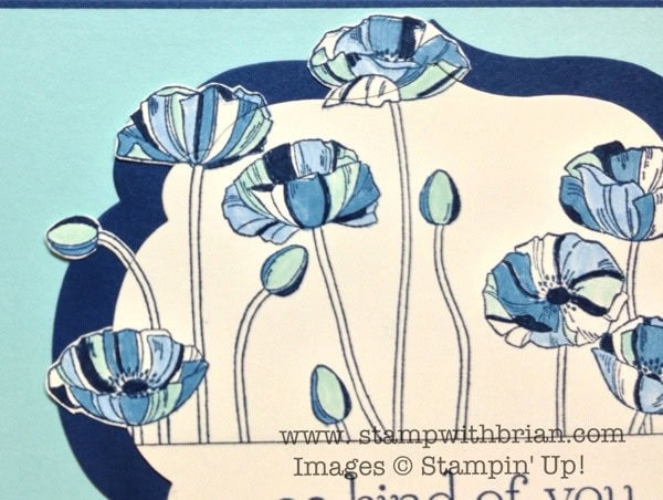
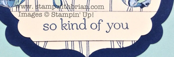
- Adding the sentiment. I like to find new and unique ways to add sentiments to a card. I knew I wanted to “cover up” the long, wiry stems of these poppies, so I cropped a 3/4″ strip of Very Vanilla, positioning it along the bottom of the Labels Collection framelits. I stamped this sentiment from Sweet Essentials. I needed something to differentiate the Very Vanilla strip from the background, and I didn’t want to add sponging to an (otherwise) crisp, modern card so I ran the brush tip of my Stampin’ Write Marker along the edge of the strip to give it a thin border. It almost adds a light shadow. How cool is that?
Stamp sets: Pleasant Poppies, Sweet Essentials Papers: Midnight Muse, Pool Party, Very Vanilla Inks: Midnight Muse, Midnight Muse Stampin’ Write Marker, Marina Mist Stampin’ Write Marker, Pool Party Stampin’ Write Marker Accessories: Labels Collection Framelits
I WANT YOU! Sale-a-Bration is coming to an end on March 22. If you aren’t currently working with a demonstrator, I would love for you to place an order with me here. BUT…not only can you earn great products for your purchases during Sale-a-Bration, but you can also join my team for an amazing, all-time low price. What do you get? For $99, you can select $156.50 of any catalog PLUS you get a bundle of business supplies for free PLUS free shipping. After you join, you get crazy discounts and perks galore. Please email me at [email protected] for more information. Won’t you join the fun?
Brian


Great job! I love the coloring.
Oh my gosh!! Your card couldn’t be more beautiful!!
Crisp, clean, modern and GORGEOUS!!!
Anne
Freakin’ Awesome! 🙂 Pinning!
Simply amazing, Brian. You should make a video tutorial showing us how in the world you did this card. I’m really trying to figure it out but I just can’t. Did you cut the framelit and then snipped the flowers and glued them again?? Well, whatever you did, it’s just beautiful!!
Maria, I stamped and colored the poppies. I cut them with the Framelits, allowing the Framelits to cut through some of the flowers. Then I snipped the parts of the flowers that got snipped and carefully glued them back down. Does that help?
WOW!!!!! that is amazing!! Yes, my dear, it helps a lot. I really was trying to figure out how you did this because I can see a very fine line where you say the Framelits cut the image but I never imagine you snipping this pretty flowers and glueing them back to the main image. You have some amazing paper snipping abilities, Brian. I must try this technique. C’mon, make a tutorial…..it will help even better. (I love your tutorials)
Love this! It is amazing the flowers just pop! I agree a video tutorial of this would be great.
Keep sharing your wonderful creations.
I think you must be an employee of stampin up in addition to a demo. (Grin) you certainly sell me on things I don’t already own. For example, noticed the other day I only own three or four of the background stamps so I just ordered a couple yesterday. I eyed the poppies….and passed. Course now I want it. Oh Brian, I hope your little in box is full of orders for this set and the markers! Happy weekend.
Brian, that is simply awesome! Love the monochromatic coloring and the way the poppies “hang over the border”. I’ve got to run to my stamping corner and make this card!
Brian ~ This is one of the best cards I’ve seen in a while. I absolutely love every detail you did ~ monochromatic colors, of the framelit image, everything! Thanks!
How cool is that? WAY COOL! Monochromatic considered boring? Not this baby! Speechless is what I was when I laid eyes on this beauty. You saved the best for last to close out the week. I like to disect your cards before reading tips, tricks and reminders to see if I can pick out everything you’ve done. I did really good except for running the marker around the sentiment. I did notice there was a shadow but didn’t realize how you did it. I put my vote in for a Brian video too!
Mission Acconmplished …”bold & modern” AND simply L-O-V-E-L-Y! Also in favor for a video of this one!
Wow, love what you did with the poppies! Letting them escape the shape is excellent!
lovely as a picture! And a picture is worth 1000 words. Don’t have time to type them all right now Brian, but you have mastered this one, it goes in your Hall of Fame. You need a Hall of Fame button so we can easily reference beauties like these!
This one might be my favorite! This is awesome.
Beth
I love everything about it! Getting out my markers!
I’m also voting for the video tutorial. This is the most original use of the poppies I have seen!
WOW! I love this stamp set but found it hard to work with as a new stamper. Minimizing the stems using the sentiment is such a good idea. Really, really love this card.
Fantabulous as always!!!!
Just look at you ! You are getting adventuresome … I like that you are getting into other card styles to keep things popping. And thank you for covering up those stems …they remind me of Jelly Fish or as I have said before Granddaddy Long Legs …!! I agree with the others that this would be a great instructional video …. You did get my attention with the flowers outside the frame and lining the sentiment with your marker … okay when`s the book coming out ??
Love, love, love this card. I do not own this stamp, but my wheels are churning with other stamps. The technique of adding back the cropped flowers is totally awesome. I’m off to fix coffee and get started on one of my ideas…I mean your idea! 🙂 Thanks for sharing this magnificent card!!
Since I started following your blog around a year ago I have seen you grow creatively. This card is spectacular. Thanks for sharing
I absolutely love this card. You nailed “modern” and “monochromatic” – simply amazing. But I’m with a few of your readers….a picture is worth a thousand words and a tutorial would be awesome! I don’t have any framelits yet so it’s hard to picture how you seamlessy pieced the snipped poppies and made that sentiment blend in so nicely. Pleeeeeeeeeeeease??
Holy cow, Brian!! This card is absolutely GORGEOUS!
Video, video… we want a video! 🙂
Hi Brian:
I was absolutely blown away by the way you put the sentiment on this card. Using the die to cut a partial die cut piece to fit into the whole die cut piece was so totally ingenious. The look is not only graceful but elegant as well. Gorgeous is the only word I can think of that is fitting.
Nothing more to add to the comments above, except my vote for a video also!!! Thanks, Brian and have a wonderful weekend – you truly deserve a rest after this one!!!
Gorgeous card!
I love this card, Brian! I’ve had this stamp set for a while but it’s been lonely in my stamp closet. Now I have a fantastic reason to use it! I love how the poppies hang over the sides of the frame. I can’t wait to recreate this myself. Thanks so much for the inspiration!
Well, Brian! You’ve done it again! I love the way you think “outside the framelits”, inspiring us to
do the same! Keep up the good work!
Beautiful card, also adding my vote for a video tutorial…
This is a gorgeous card. Who’d have thought you could lop off the heads of flowers and put them back together and have it be so beautiful.
Wow!! What a great effect Brian and the colours just pop out beautifully. I love seeing your blog updates pop up in my emails each day 🙂
Soooooo cooooool!
Now I know what to do with this gorgeous stamp!! Make a gorgeous card.Thanks Brian..
Wow brian! I’ve seen this card a day late but I’m not surprised at the amount of comments it has generated! It’s absolutely beautiful and one definitely to be CASEd. Thank you!
Fabulous card! –Terri O
Love it! The design, the stamp and most definately the monochromatic colour scheme. Total hit.
This is such a beautiful card! It is lovely and calming! Great job!
I gotta try this!!! Thanks Brian