I love a whimsical card, and I love a tailored, clean-and-simple card. When I can have both, I am one happy guy. The card I made for this week’s Global Design Project sketch accomplishes both. While it’s a tailored, clean card on the surface, the fun sentiment from Age Awareness wallops a punch of fun that I adore. Here’s my card:
And here’s the banner for the challenge that inspired my card: Tips, Tricks and Reminders
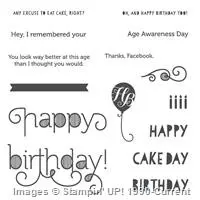
- Age Awareness. Age Awareness has few images to draw you in, so it’s easy to overlook the set. The set has been around since the 2014 Annual Catalog – if you don’t have it, now’s a great time to take another look. I really love the sentiment I used on this card – it turns a classy card into a card that’s perfect for fun-loving folk. There are quite a few great sentiments in the set – check them out:
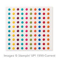
- No Doilies Today. While the sketch calls for a fun, scalloped element beneath the focal band, my decidedly-masculine card couldn’t host a doily. I thought I would leave the element off of the card (it’s allowed). When I really wanted a pop of Bermuda Bay in that area of the card, I thought Candy Dots would be a perfect solution. Bing! The dots are a perfect balance to the big Bermuda Bay Balloon.
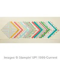
- Color Combination. Even I wasn’t expecting this color combination to work as well as it did. I started with the Bermuda Bay Balloon and another piece of the Cherry on Top Designer Series Paper Stack. That piece was too busy for my card, so I went with this awesome pinstripe of Whisper White and Tip Top Taupe. Turns out, the three worked really well together. Yay! If you like this color combination, too, feel free to save this:

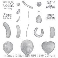
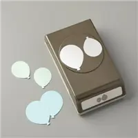
Stamp Sets: Balloon Builders, Age Awareness Papers: Cherry on Top Designer Series Paper, Bermuda Bay, Tip Top Taupe, Whisper White, Thick Whisper White Inks: Bermuda Bay, Tip Top Taupe Accessories: Balloon Bouquet punch, Brights Candy Dots (Bermuda Bay), Whisper White Baker’s Twine, Stampin’ Dimensionals
I hope you’ll pop over to the Global Design Project site to see the cards by the design team members and to play along with this week’s challenge.
Thanks for stopping by today!
Brian




Brian this card is so beautiful! I wish I can keep it simple like you!
Once again you point out a sentiment and use it in a way that is fabulous. Darling card!
Love the balloon! And your design makes it shine!
Well – let me see. I think this card has an elegant feel at first sight, then POW, ZIP the sentiment hits you and you crack up. So, I guess I would say this card is a surprise. I know a few people that would really appreciate it and I also know a few people who need to get a sense of humor that wouldn’t. Personally, I think it’s a beautiful, fun card that really fits the bill for us “older folk”. LOL
Great card ! Love that sentiment ! I also like the color combo . I have just grown to like Bermuda Bay more from this month`s Paper Pumpkin . It does look good with Tip Top Taupe ,doesn`t it ? Have to try it out today ! Thanx !
Sugar and spice!
You do tailored better than anyone I know Brian. By adding a sentiment such as that, it makes you do a double take!
Your card is perfect but the sentiment shows a humorous side. I really like it. I can’t do clean and perfect unless I copy yours…which I just might do! CASE-ing it it!
So simple and so beautiful! Top!
Perfect Brian! xx
Great Details Brian!