


I love to play along with the CASE the Designer Challenges for the Global Design Project – it gives me the opportunity to honor the other members of our talented team. Steffi Helmschrott is a super-talented member of our group who always amazes me with the softness of her cards and her amazing watercoloring. The card we are CASEing from Steffi is as soft, beautiful nature scene in all natural colors. Here’s my card:

Although the bold stripes and bordering papers might show up as black in this picture, I created an entirely neutral project with browns. What looks like black is actually Early Espresso. And here’s the banner for the challenge that inspired my card:
Tips, Tricks and Reminders
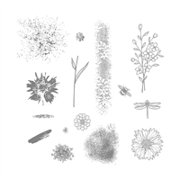
- Touches of Texture. I love the subtle background Steffi created in her butterfly card using images from the Butterfly Basics stamp set. There are many stamp sets that can be used to create similarly abstract textures – Gorgeous Grunge, Timeless Textures and Touches of Texture. I used the cleanest and least abstract of images from Touches of Texture to stamp this gorgeous flower. I stamped the images on Very Vanilla with Early Espresso and lightly pulled the ink into the leaves with a Blender Pen. After I stamped the same image on Whisper White and snipped out the little flowers, I glued them to the first image. The white flowers pop just a little bit against the Very Vanilla background.

Touches of Texture, Stampin’ Up!
- CASEing Steffi. It was Steffi’s neutral backdrop (mostly Crumb Cake, Whisper White and Gold) that attracted me most to her card. I always use so much color, so I’m wow’d by a project that uses very little (or that uses it so softly). While I kept my focal panel pretty clean (I was too frightened to add texture or background images to the flower). I know it could have added a nice touch (it’s what I like so much about Steffi’s card), but I couldn’t take the risk.
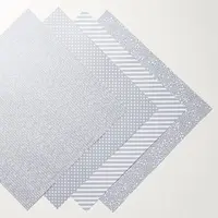
- Pairing Vanilla and White. It’s not often you’ll see my pair Whisper White and Very Vanilla. This neutral-themed card gave me the permission and the challenge I needed to make them work together. Once the flowers were highlighted with white, I knew my sentiment needed to be showcased on white and that I could use my Designer Series Paper Stack to highlight the images. So thankful I stayed neutral on this card.


Stamp Sets: Touches of Texture, Places You’ll Go Papers: Crumb Cake, Early Espresso, Whisper White, Very Vanilla, Neutrals Designer Series Paper Stack Inks: Early Espresso Accessories: Blender Pen, Stampin’ Dimensionals


I hope you’ll pop over to the Global Design Project site to see the cards by the design team members and to play along with this week’s challenge.
Thanks for stopping by today!
Brian

 BONUS DAYS in July. Stampin’ Up! is introducing a Bonus Days promotion in July – for every $50 you spend between July 7 and July 31, you’ll receive a $5 coupon to redeem in August. To read more about how you can earn these coupons, CLICK HERE.


This is a lovely card. The neutrals work – I noticed the whisper white and very vanilla combo right away.
Brian this card is just sensational.
Beautiful card, Brian. This is the nudge I needed to try a neutrals card. Like you, I like bright colors, but both yours and Steffi’s cards are stunning.
Thanks for letting us know about the early espresso! I too would never have paired white with very vanilla but it works here because of your “neutral” pallet! Another winner, Brian :0)
Have a nice week!
I also loved the very vanilla and whisper white combo….but the snipping. You have to be the snipping King. Beautiful card. Makes me take a second look at that stamp set.
Beautiful card with my fav set….I saw her card and thought I would do a butterfly but now I will pull out my Touches of Texture today and see what I can create for GDP. Thanks for inspiration!
This is a pretty card for a lot of uses . You can switch the sentiment and it is good to send . I like your color combo and glad you let us know the actual color of EE.
Great snipping skills !
I love how the stripes ground these gorgeous flowers, Brian. You showcase them well & I always love your CAS designs…my fave!
Ohhhh those snipped white flowers….beautifully done!
Beautiful blend of neutrals (especially the vanilla and white) and clean design.
Beautiful card! Who would have thought neutrals could be so elegant!
Perfect and beautiful!! I love every detail…
Brian I never would have paired whisper white and very vanilla, boy, have I’ve been missing out! Thanks
What a special Monday this is! Two amazingly beautiful cards to feed our eyes with. Thank you so much Brian for sharing not only your creation but Steffi’s as well. They are both just gorgeous!
Hi Brian, I LOVE, LOVE, LOVE the colors and the sharpness of this card. Definitely went in my CASE file.
🙂
Woah, that is a stunning card. Well done on the colors and layout and… well everything!
Love the neutrals, Brian, it makes this card very sophisticated. It looks lovely without the splatters but I would encouage you to experiment with using the, it’s very fun and really no wrong way to do it.
Awesome card as alway!
So glad you have been missing me, I assume the card was made for me! It sure looks like it was meant for me and I have been absent from making comments for awhile. Anyway, I love this card for the colors and the whole shear beauty of it and it’s design.
Early Espresso is one of my most favourite colours. No matter who you CASE, I can always spot a Brian card 🙂
Awesome ! I wouldn’t think of using Whisper White and Very Vanilla together…
Fab card! The designer series paper / bold stripes makes this really pop.
There is so much beauty in this card., the sentiment suit perfect with the design and the mood of this creation. You make it look simple! I love your work. TFS. X Bibi