


After Stampin’ Up!’s OnStage event, I came home with a new catalog and bits-and-pieces of products from the new catalog. What fun! I used a scrap of new Nature’s Poem Designer Series Paper (such a gorgeous stack of paper!) to make my card for this week’s CAS(E) This Sketch challenge. Here’s my card:
 And here’s the banner for this week’s challenge that inspired my card:

Tips, Tricks and Reminders
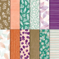
- Nature’s Poem. As the name suggests, the Nature’s Poem Designer Series Paper is inspired by nature. The paper is part of a suite of gorgeous products in Stampin’ Up!’s 2018 Annual Catalog – I can’t wait for you to get your hands on these products. While the colors, patterns and images have an Autumnal feel to them, they are perfect for any time of the year. I love this Tranquil Tide panel of paper – so soothing and sweet.

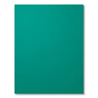
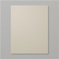
- Pops of White. My card features Tranquil Tide and Sahara Sand in bold panels of color. It’s the delicate pops of white, though, that really help these colors to shine. Some of the leaves in the paper are white, so I pulled inspiration from there. Not only did I frame each panel with a thin border of Whisper White, but I added three White Perfect Accents on the band the runs across the panel for an additional pop. The dots also add a little texture to the card, which I love. Tip for placing enamel shapes in threes: When adding a trio of enamel shapes, I always place the first and last shape before the middle shape. That makes it easier for me to make sure everything is balanced perfectly when I place the center one between the two that are already placed.
- Color Combination. These colors couldn’t be more tranquil, could they? I guess there’s a reason they call it Tranquil Tide! While the papers list Soft Suede as the brown in this pack of designs, these are so lightly colored that I paired them with Sahara Sand. Love it! If you love this combination of Tranquil Tide, Sahara Sand and Whisper White as much as I do, please save this:


Stamp Sets: Amazing Congratulations Papers: Nature’s Poem Designer Series Paper, Tranquil Tide, Sahara Sand, Thick Whisper White Inks: Archival Basic Black Accessories: White Perfect Accents,Stampin’ Dimensionals

I hope you’ll pop over to the CAS(E) This Sketch team page to see the cards by the design team members and to play along with this week’s challenge.
Thanks for stopping by today!
Brian

 Now that demonstrators have seen Stampin’ Up!’s 2018 Annual Catalog, the list of retiring items is available to everyone. These items will no longer be sold after this catalog period ends on May 31 OR while supplies last. Yikes! In addition, bundled pricing on all bundles (even those where the stamp set and coordinating punch/die) will retire on May 31. Click on the image above to review all of the retiring items in my online store.
For a list of all of the items retiring from Stampin’ Up!’s 2018 Occasions Catalog, CLICK HERE. For a list of all of the items retiring from Stampin’ Up!’s 2017 Annual Catalog, CLICK HERE.


I think your card is awesome and that DSP is beaufiful.
Thanks, Lucy! The papers are GORGEOUS. I love the color combination on this panel of the DSP. <3
Beautiful card Brian….I love everything about it!
Thanks so much, Kathy! I was happy with how the colors came together. <3
That is gorgeous DSP Brian, and I love how you added the white mattes.
Thanks, Dawn! The entire pack of these papers are gorgeous. Can’t wait to break into these papers. <3
The Tranquil Tide DSP is beautiful … the Sahara Sand matte is just right … continuing the tranquility of the DSP. Thanks, Brian!
Thanks so much, Suzie! I am beyond excited about the new Designer Series Papers and new colors. <3
This paper is beautiful…perfect placement here! Mine comes tomorrow! Thanks for the inspiration!
Thanks, Windy! This is the piece from the make-and-take that I just took. 🙂 I can’t wait to play with all the new goodies.
Love the beautiful DSP and the color combo you used today, Brian. Thanks for the great sneak peek. Keep them coming! Have a fun day!
🙂 So happy to share, HJ! <3
Love the color combination Brian!
Thanks, Mary! I love with the Designer Series Paper chooses the colors for me. 🙂
Such pretty paper and a lovely design. Sweet trio of white accents.
Thanks, Mary! I had fun with this little piece of Designer Series Paper. Gotta love that as a starting inspiration. <3
What a lovely and tranquil card (no pun intended). I’m loving this new DSP as well as your take on the card sketch. Love this card!
Thanks so much, Tonya! This is a gorgeous pack of papers – and this is only one of 12 designs. I predict I’ll be using these pages a lot! <3
Squeeeeel! I’m so glad to see this paper and card today. I love anything “nature” and it was difficult to see the beauty of this DSP when I looked at the online catalog. Wow! As always, you’ve done a great job showing us just how to make it stand out. Love the card you made; the colors are perfect together and the layout is superb. Thanks for sharing. Hugs!
Thanks for the sqeeeee, Bobbi! <3 So glad you like this paper - it's beautiful. I can't wait to get my hands on all the papers. Thanks for your sweet comments.
Gorgeous DSP Brian and the simplicity of the card is its beauty. Nothing to take away from the DSP only things to enhance it. Delightful!
Thanks so much, Grace! I really love the beauty of this paper, too, and didn’t feel that it needed much more to make it shine. Glad you like it! <3
Love the card! Can’t wait to get some of this DSP!
It’s gorgeous! This is the piece we had a OnStage for make-and-takes. 🙂 Thanks, Dianne!
I have a new appreciation for the Sahara Sand now. Love the DSP and the Sahara Sand looks great with it with the white. Brings new meaning to the word “tranquil” using Tranquil Tide and Sahara Sand! The card looks like you want to touch it to feel the texture with that print. A card that would be appropriate for all kinds of occasions. Can you tell I really like this?
Thanks so much, Chris! I’m so glad you like it. <3
Very pretty…it’s always better to see the paper “in real life” instead of a picture in the catalog! Beautiful color combo!
Thanks so much, LeAnne! It’s my favorite part of a new order – getting that new paper in my hands. 🙂
Gorgeous card, Brian! What a super way to use that lovely paper, Jo x
Thanks so much, Jo! I’m glad you like it. <3
You nailed this challenge and gave a sneak peek of a new product. Way to go Brian.
Thanks so much, Robbye! <3
Very nice card, absolutely love this color combo.
Thanks so much, Katrina! <3
So pretty ! I can`t wait for PRODUCT SHARES !!! You did a great job showing off this dsp !
How exciting! 🙂 It’s a pretty page from a gorgeous pack of papers. Thanks, Sonny!
Beautiful! Wonderful take on the sketch!
Thanks, Leigh!
I love this, Brian! What a terrific layout to put all the attention on a pretty piece of patterned paper.
Thanks so much, Sandy! That paper deserves to be front-and-center. Gorgeous! So happy to hear from you. <3
Beautiful DSP! Very classy card!
<3 Appreciate it, my friend.
Gorgeous paper–I thought you stamped it!–and a wonderful take on the sketch.
Thanks, Donna! This was a wonderful sketch – love all the projects by the design team.
Those papers are beautiful!! I like that it makes an easy card but has a lot of impact!! Great take on the sketch!
Thanks so much, Nora! I love when papers can stand on their own. This entire pack of papers is filled with gorgeous patterns and colors. Glad you like my card. <3
Hi Brian,
Can’t even express how PERFECT your card is. So clean and simple – the exact right mix to draw one’s eye around. This sentiment sums it up nicely!
Hi Barb! Thanks so much for your sweet comment! I am so glad you like the card – this paper demanded to be a star. <3
Catching up on the latest, have been away for so long (still away but have some me time this a.m.). Brian, I love how the DSP is showcased here. I have a problem cutting into my pretty papers, and this layout eases this pain a little. 😀
I’ve had that “can’t cut into it” problem in the past, but I’ve decided to just cut it up now – especially when I can buy more of that beautiful paper. 🙂 Glad you like it, Sheryl! <3