Since the black-and-white True Love Designer Series Paper first landed in my crafty little hands, I knew I’d be coloring it. Still, I’ve used it a couple of times already, showcasing it in its black-and-white beauty. Today, that all changes! I needed a handful of thank you cards, so I cut strips of the gorgeous paper and started coloring. Here’s the simple card I made for this week’s CAS(E) This Sketch challenge:
 And here’s the banner for the challenge that inspired my card:
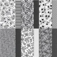
- True Love. Let’s start with the True Love Designer Series Paper – it’s truly a love-at-first-sight pack of papers. So gorgeous! Here’s a look at the colors and patterns in this incredible pack of papers:
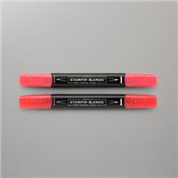
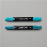
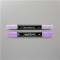
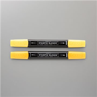
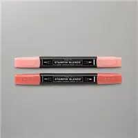
 See that floral pattern on the top, right corner of the picture above? I cut that into 1-1/2″ strips and colored the background space around the flowers. I used Poppy Parade, Pretty Peacock, Highland Heather, Mango Melody and Calypso Coral Stampin’ Blends to add gorgeous color to these pages:
  Each strip made 3 cards, so I had enough to quickly assemble the stack of thank you notes I needed to make. Here’s a look at the five finished cards:
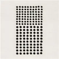
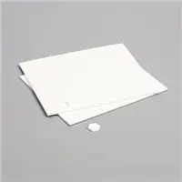
- Little Accents. To each card, I added three Matte Black Dots to create a random (but kinda planned) triangle around the sentiment oval. The trio of Matte Black Dots is different on each card. Here’s the card I featured at the start of this post:
 I don’t often use accents like this, but this card really called for them – and I LOVE these new dots. They add a beautiful, elegant element to each card, don’t you think? Here’s a look at these must-have embellishments:
- Color Combination. Let’s just say what’s on all of our minds right now – Pool Party is perfect with almost any color. That’s what you were thinking, right? Well, it’s true. I placed these Poppy Parade, Pretty Peacock, Highland Heather, Mango Melody and Calypso Coral strips against a Pool Party base – and I love them oh-so-much. If you like this mix of Pool Party, Poppy Parade and Basic Black, I hope you’ll save this for future reference:

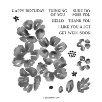
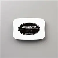
Stamp Sets: Blossoms in Bloom Papers: True Love Designer Series Paper, Basic Black, Pool Party, Thick Whisper White Inks: Memento Tuxedo Black, Stampin’ Blends (Poppy Parade, Pretty Peacock, Highland Heather, Mango Melody and Calypso Coral) Accessories: Stitched Shapes Dies (oval), Matte Black Dots, Stampin’ Dimensionals
I hope you’ll pop over to the CAS(E) This Sketch site to see the cards by the design team members and to play along with this week’s challenge.
Thanks for stopping by today!
Brian
Check out the New Catalogs!
Stampin’ Up!’s new catalogs are live now. If you haven’t already downloaded them, I hope you’ll take a look! CLICK HERE to read all about the new books and download one for yourself! ♥
 Placing an order today? Of course you are! If you are placing an order for $150 or more, I want you to enjoy all of the Host Rewards you have earned. If your order is less than $150, I’d love for you please add this Host Code – AQAK6EHK – when prompted. Thank you!





One of my favorite creative techniques you use is to color DSP in one way or another. Absolutely love these cards and your color choices! Thanks for the inspiration ~ ❤️
Thanks so much, Linda! There’s something really calming about just quietly coloring. I love this paper so much! ♥
The red and blue are stunning together!
Thanks, Mary! ♥
Your crafty little hands did some nice coloring. I, too, will be coloring this paper at some point. Great cards!
🙂 Thanks, Windy! You’re going to have great fun with this paper – so many fun ways to add color.
Great coloring, Brian. Each of the colors goes so well with Pool Party to make beautiful thank you cards. Enjoy your day!
Thanks, Hilda! I love Pool Party SO MUCH! I was planning to switch out the background pieces on the cards, but Pool Party gave me everything I needed for each one. Glad you like them!
WOW my friend. LOVE how you took 1-1/2″ strips and colored the background space around the flowers. Wish my hands weren’t so shaky, I would LOVE to do this. It’s a FABULOUS look. TFS!!!
Thanks, Kadie! I have to admit that I had to flip that paper around multiple times to get the right angle on each one. It was very calming.
Love those colored strips. I would never have thought to color the background instead of the flowers. Very creative.
Thanks so much, Donna! I didn’t think I could make the flowers more beautiful than they already are…so glad you like it! ♥
You showcased that bold and bright DSP perfectly! Pretty card!
Thanks, Linda! ♥
Arghhh… I always think of coloring the images, but never the background! What a great idea! Of course, you figured it out. Beautiful! XO
It’s less stressful than trying to make the flowers beautiful… 🙂 Thanks, my friend! ♥
Hi! It’s funny, when I saw that black and white paper, I somehow knew you’d be coloring it too! It’s beautiful. Your showcase card is beautifully striking, but my favorite is the Misty Moonlight! 🙂
Thanks, Debbie. OF COURSE I’m going to color the paper. 🙂 Always love to hear from you, my friend. ♥
Absolutely gorgeous! The focal card’s color combination is one of my favorites. So stunning!