


Card designing can be great fun – I always try to keep things simple and strive to find the perfect balance of elements on a card. That desire for perfection can be difficult sometimes. Here’s a common occurrence for me:
- I finish a card that I’m happy about – I’m immediately excited to share it and start thinking about what I want to say about it.
- I walk away for a bit – I don’t live in the Fungeon (though it sometimes feels like I do since I work and play down there these days).
- When I come back, I find things I should have done differently and feel the need to make adjustments. Sometimes I can adjust, and sometimes I can’t.
The projects I’m sharing today are the result of the situation I describe above. I finished the card and felt good about it. Upon returning, I immediately wished I had designed it in a different orientation. Here’s my card in both orientations:


Just curious – do you prefer one over the other? While the stripes are horizontal in both cards, the orientation of the card changes everything. To keep you guessing, I won’t tell you which one I made first and which one was the redo. Maybe I’ll disclose that at the end of this post…
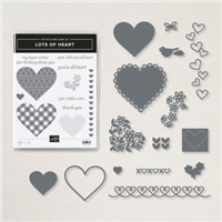
The hearts are cropped with Poppy Parade and Blushing Bride from the Many Hearts Dies, which are included in the Lots of Heart Bundle. I heat embossed the sentiment from the Lots of Heart stamp set on Basic Black cardstock and cropped it with the Stitched Rectangles Dies. Here’s a look at the Lots of Heart Bundle:
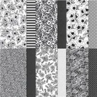
 By now, you are likely bored of hearing how much I love the True Love Designer Series Paper, but I won’t stop saying it. I love this paper! It’s beautiful in black-and-white or with a little color added. Here’s a look at the colors and patterns in the True Love Designer Series Paper:
 My original design for this card featured an additional, smaller Poppy Parade heart. I like things in threes, so three hearts felt right to me. The addition of the sentiment, though, removed the need for the third heart as the sentiment became the third element in this super-cool trio. On both cards, I lined up the black cardstock sentiment with a white stripe on the paper – almost a perfect fit. Here’s a closer look:
 This mix of pinks is great together – one is soft while the other is bold. With black, the Blushing Bride seems softer and Poppy Parade is even brighter. If you like this mix of Blushing Bride, Poppy Parade and Basic Black as much as I do, I hope you’ll save this for future reference:
 I’m so curious to know which orientation of this card you like the best (assuming you like either one…). I wanted to showcase these stripes as much as possible, so I originally designed the card in the portrait layout. I changed it to the landscape layout by snipping off the trio and adding them to a different card base. Now, I’m not sure which I like best.
Bundles: Lots of Heart Stamp Sets: Lots of Heart Papers: True Love Designer Series Paper, Basic Black, Poppy Parade, Blushing Bride Inks: Versamark Accessories: White Stampin’ Emboss Powder, Heat Tool, Stitched Rectangles Dies, Many Hearts Dies, Stampin’ Dimensionals


Thanks for stopping by today!
Brian

Check out the New Catalogs!
Stampin’ Up!’s new catalogs are live now. If you haven’t already downloaded them, I hope you’ll take a look! CLICK HERE to read all about the new books and download one for yourself! ♥
 Placing an order today? Of course you are! If you are placing an order for $150 or more, I want you to enjoy all of the Host Rewards you have earned. If your order is less than $150, I’d love for you please add this Host Code – AQAK6EHK – when prompted. Thank you!


I like the landscape! But both are beautiful. The colors are great together. Thanks for showcasing so many ways to use this DSP!
Hi Brian, I prefer the landscape one since it balances he background CS better but whoever gets either card will be happy to be thought of.
I prefer the landscape. It breaks up the background paper better – even though the paper is lovely, the stripes make my eyes go funny!
I vote Landscape, too. I never look at your cards and think “I really like this, but if it were me, I’d …yada yada yada”. Your ability (and willingness) to do just that is one of the things that sets you apart from other designers. Bravo for the cards and the thought process share. ❤
Ditto what Linda said. I like the landscape version and love that you share your thought process with us. Anyone would be pleased to receive either of these cards. Enjoy your day!
I prefer the landscape card. I think the portrait version seems a little unbalanced with all of the open area at the top. Thanks for sharing your thought process with us. I just love a black and white card with a pop of color!
SERIOUSLY Brian……Both are PERFECT in my book.
Both. Seriously lovely x2!
Both are awesome. So simple and fast to make too! Thank u ou for sharing
Yup, I love them both. The portrait one is anchored by the hearts and the landscape one has a good symmetry. But I’m a sucker for stripes no matter what!
Landscape seems more balanced ! Enjoyed your description of the creating process . In other words DITTO all the above comments !!
Smile !
I’m going against the flow and say I prefer the portrait card! I think your first instinct was the best. I don’t mind the “blank” space at the top and I like the way the hearts fit the space at the bottom. But like everyone else said, I think they are both great. You are a master at CAS designs!
Vertical 😁
#TeamLandscape! I am a huge fan of stripes and now after seeing this I must order the heart dies!
I prefer the landscape orientation. The hearts are more of a front and center focal point. Actually looking at the portrait one, the b/w stripes made me a little dizzy because that is where my eye was drawn.
Fun cards…the stripes seem to like the landscape! I have the same process sometimes! Usually when designing cards for my card classes!
Oh Brian – must you make us choose? sigh, sigh, sigh. O.K. I refuse to choose, I love them both!
I prefer the landscape— but like the boldness of both. Maybe I will case for my husband. 😉
Love both cards but maybe the portrait version because it’s less predictable. Sometimes it’s fun to go outside the lines of uniformity and play .
I’m in the minority, too. I like both of them but prefer the space on the vertical layout. The landscape/horizontal layout almost seems too centered and predictable. It’s nice but the vertical layout — the hearts are more “all heart” to go with the sentiment. 🙂
I like them both but the Portrait wins out. I like the extra space at the top to highlight the stripes!
I love the landscape card, but I love all your cards. I always save your samples of color combinations, they are very helpful for me when choosing multiple colors.
Really like both cards and your choice of dsp. I am leaning towards the landscape version — it makes me feel better!
Both are great Brian. Love the red matte.
Well, it’s a matter of preference only, because both cards are masterful! My preference is Portrait…I always love when you compose off center! A skill I’m trying to develop!
I prefer the vertical card. Do not misunderstand, they are both lovely, I just like the vertical one better than the horizontal one.
Beautiful cards! I prefer the landscape version, although I seem to always be partial to landscape. Thanks for sharing both of them.
They are both great but I’m leaning towards the landscape orientation for sure!
Love both cards, but my favorite is the portrait/vertical card!
Both cards are great, but, I prefer the portrait card. I kept looking back and forth. Sometimes first instincts win out. Love the simplicity of your designs!