


I often hear from other card makers that they struggle with finding color combinations for their projects. While I love to play with color and love trial new combinations, I often times reach for Designer Series Paper as a guide for the colors I use in my projects. I reached for the sweet pages of the Petal Garden Designer Series Paper Stack to layer circles for this week’s Freshly Made Sketches challenge. Here’s my card:

And here’s the banner for Cecil Ribon’s challenge that inspired my card:
 Tips, Tricks and Reminders
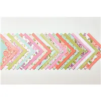
- Petal Garden Designer Series Paper Stack. Don’t look at it all at once! This is a gorgeous stack of floral 6″ x 6″ designs – they are all so soft and delicate – but it may be difficult to take them all in at once. As a collection, the floral patterns clash with one another. Individually, they are amazing! I chose three of the pages from this stack and mixed them between floral and monochromatic to create the trio of circles on my card. Here’s a peek at the papers – again, please hold your hands over the pages so you can take them in one-by-one. 🙂

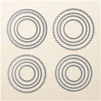
- Layering Fun. Not only do these circles stack wonderfully on top of each other (thanks to this super-fun sketch), but I added extra dimension to the two top circles and popped them up from the circle beneath. In order to add support to the thin Designer Series Paper (it would definitely bend when mailed if left alone), I cropped an additional circle in Thick Whisper White with the same dies and glued to the Designer Series Paper on top of the Whisper White circles. The added dimension gives these circles a fun pop. Here’s a side-view of these layers:

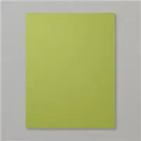
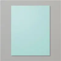
- Sweet, Retro Colors. I adore Cecil’s sketch – the stacking of the circles has such a retro vibe to it, so I wanted to create my project with equally retro colors. Glad this paper stack offered me these colors. Pool Party, Calypso Coral and Old Olive seem like colors you’d find in a 1960’s kitchen – or in a super-cool, modern kitchen that has a nod to the ’60’s. If you like these colors as much as I do, please save this:


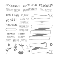
Stamp Sets: Banners for You Papers: Petal Garden Designer Series Paper Stack, Pool Party, Thick Whisper White, Old Olive Inks: Archival Basic Black Accessories: Layering Circles Framelits Dies, Stampin’ Dimensionals


I hope you’ll pop over to the Freshly Made Sketches site to see the cards by the design team members and to play along with this week’s challenge.
Thanks for stopping by today!
Brian

Order Big & Earn an ADDITIONAL Rewards. All orders over $150 earn Stampin’ Rewards – what a great opportunity to earn free products (your choice) when you treat yourself to a fun shopping spree! During June, Stampin’ Up! is giving us one more incentive to place a big order. 🙂 Not only can you earn the standard Stampin’ Rewards for purchases from the new catalog, but you’ll earn an additional $35 in Stampin’ Rewards (to spend however you want) for orders greater than $350. That’s HUGE!


Brian, I love today’s card. Great take on the sketch and lovely DSP used. Good tip on how to choose a color palette. Have a great day!
I love your version of the sketch! A beautiful color combination.
Well this layout is a keeper !! How many possible options for card designs !!
I was not really sure about this collection BUT you know how we DSP LOVERS are ….hold it in your hands and it is a HOARD HONEY !! Another thing I discovered the other day is the Memory Keeping cards on page 192 MATCH this paper ! LOVE IT !!
I really like your card !
Ohhhh…I love this! Ehat a awe layout! And that color combination is sooooo pretty?
Love this card Brian. Nice simple layout with a huge impact. Thanks so much for the hint about putting card stock under the DSP when using dimensionals. Don’t know why I never thought of that.
Darling layout. I love the mix of bold circles and pretty patterns.
Brian, you are a master at making us look at things differently. I have not been too impressed with these papers, but now I know it’s because I was looking at them all at once. You’re right; they do clash. But you’ve given me a whole new way of seeing them and now they are on my “buy me” list. Great card today! Thanks for inspiring me.
I love the simplicity of this card. Everything about it is eye-catching; the fresh retro colors, easy layout, and the way you mixed the different paper patterns while getting them to work so nicely together. I will definitely be buying this paper pack and using your combination to design my own card. Thank you!
This card is lovely! I love the layout and the color combos you suggested. Beautiful!
What a gorgeous mix of color and pattern. Your card is that wonderful hybrid of CAS and superb layers. I’m so glad you shared this with us at Freshly Made Sketches!
This is really lovely Brian! So clean and with a great use of those colours. Thanks for joining us at FMS this week