


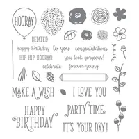
Yesterday I shared a sweet card I made with the Happy Birthday Gorgeous stamp set (you can read my entire post here). The card features a variety of soft, sweet colors with the Happy Birthday Gorgeous stamp set. What fun! Today I’m going to share a couple of tips for building an arrangement of flowers on a card and some tips for color coordination.
I’m going on the assumption that you read yesterday’s post – especially since I gave you the option to read it above. Still, here’s the card I shared yesterday:
 Tips, Tricks and Reminders
I shared all the products I used on this card yesterday (your remember because you’ve already seen that post). Today I want to share a couple more things (all about the colors) about this sweet, simple card:
- Black is not Basic. While I created a soft Peekaboo Peach base and cheery Daffodil Delight borders for this card, it’s the Basic Black border that really frames the focal point of this card. The thin, black border mimics the outlines of the flowers and leaves in the arrangement. The amount of black in this card helps to “ground” the soft, sweet colors.
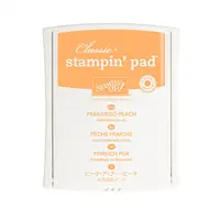
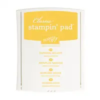
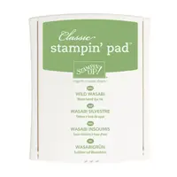
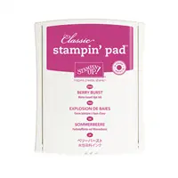
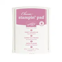
- Building a Collection of Colors. When pulling together a collection of colors, pull shades from all color families (as appropriate). While Peekaboo Peach (a soft, subtle color) and Daffodil Delight (a bold, bright color) are the most prominent colors, Wild Wasabi (subtle), Berry Burst (between regal and bright) and Sweet Sugarplum (subtle) also play a part. This includes shades of orange, yellow, green, red and purple. You can’t go wrong with a variety of colors in a variety of shades.
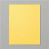
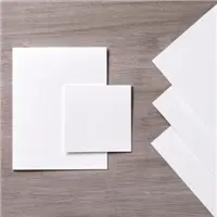
- Selecting the Center. My original version of this card (before I glued everything down) included a Peekaboo Peach center. Before finalizing the card, I tried it with Daffodil Delight and Thick Whisper White to see which I liked most. Quite a difference between them all, so I thought I would show you all three.

 What do you think? Which do you like most? The bouquet looks gorgeous behind each of these, but which one do you think pulls in the colors of the card best?


Stamp Sets: Happy Birthday Gorgeous Papers: Peekaboo Peach, Daffodil Delight, Basic Black, Whisper White, Thick Whisper White Inks: Peekaboo Peach, Daffodil Delight, Wild Wasabi, Berry Burst, Sweet Sugarplum, Basic Black Accessories: Pretty Label punch, Stampin’ Dimensionals


Thanks for stopping by today!
Brian


I think the yellow works best, the peach and white seem to dominate more than the yellow. In isolation though, they are all lovely.
Hi Brian,
I would have to say the yellow is best for color but I kind of like the white also. Have a great day.
I wonder if you would have switched up the color of label to match the 5 and 1/4 by 4 if that would have made it stand out as stunning as the first example. You would have to switch up all the card bases etc. Just what went flying through my mind.
Well, first of all I am really liking the DD and PP used together as mats .
I think DD. is the one that most would use ,but putting the PP. in the spotlight is leaning more toward “THE ART OF COLOR “. I like both ,but then there is that WW. looking all classic and predictable . I would love to get any of these in my mailbox !!!
This was fun !!
I would have just needed to flip a coin between the daffodil and peach. Both are beautiful! I love this layout.
I think the Peekaboo Peach really makes your colors pop
Fabulous tips, BK. I agree that the black layer is so defining. Loved seeing the different possible colors for the sentiment.
I think the yellow works really well. I agree with Sonny. Any of the three cards would make someone’s day.
Beautiful cards, Brian. My favorite is the yellow. Adding the black layer is the perfect addition to bring out whisper white with the pretty flowers. Enjoy your day!
I actually like the label in Peek a Boo Peach. It brings all the flowers together. It brightens up the card. It adds a little pizzazz.
The white label seems too stark. While the yellow one is too soft or subtle.
There’s just one word for this card, Happy. It’s bright and would definitely light up the recipient’s day. Love it!
Well, only because you asked, Brian. I like the white one the best. Seems brighter. I do love the bouquet!
🙂
The daffodil delight center is best imo.
I like the Peekaboo Peach center the best, although all 3 are so lovely! Fun to see the differences side by side. ?
Hands-down the yellow center ?
You are a master of color and space…you chose the perfect focal point…IF I used the white, I think I would Ink the border stamp (included in stamp set) with Peekaboo Peach (sans scrolling).
I liked the Peekaboo Peach best. The white center gave the card too much white.
Lovely cards and way to step out of your comfort zone and inspire us again! I love seeing the different options. I can’t tell you how many times I’ve gone back and forth over picking one. I like the Peach the best. Thanks for sharing!