


This week’s Global Design Project color challenge will definitely take you far from Halloween and Christmas – Peekaboo Peach, Tangerine Tango and Lemon Lime Twist are a fresh, flirty combination. I adore the combination of these orange colors and bright green. My card is equally as fresh and bright as these colors. Here’s my card:
 And here’s the banner for the challenge that inspired my card:
 Tips, Tricks and Reminders
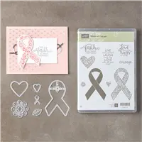
- Ribbon of Courage Bundle. The Ribbon of Courage bundle is such a great set for any show of support and encouragement. The set was designed by Patty Bennett (in coordination with Stampin’ Up! designers) to celebrate Patty’s $1 million in sales and honors Patty’s mother’s battle with cancer. The set is not limited to health issues, though. This sweet flower and coordinating leaves work beautifully with this sentiment to offer any level of encouragement.
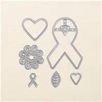
 I love how the flower and coordinating leaves layer. Here’s a look at this bundle:
Ribbon of Courage Bundle, Stampin’ Up!
- Peekaboo! Peekaboo Peach and Tangerine Tango – how in the world am I going to find a paper that incorporates both of them. Aaaah! The gorgeous Painted Autumn Designer Series has a gorgeous page of watercolored paper that pulls from both of these oranges. Yay! I built the rest of my card around this panel of paper. Love when that happens! Here’s a look at the other colors and patterns in Painted Autumn Designer Series Paper:

- A Different Size. You might not be able to tell from the picture above (or from holding the card in your hand, for that matter) that this isn’t the standard 4-1/4″ x 5-1/2″ card base. To mix things up a bit, I shaved 1/4″ of the side and top of this card. It still fits in a standard envelope, so all’s good, right? It’s a small change, but it makes a difference. <3

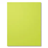
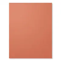
Stamp Sets: Ribbon of Courage Papers: Painted Autumn Designer Series Paper, Lemon Lime Twist, Tangerine Tango, Peekaboo Peach, Very Vanilla Inks: Archival Basic Black Accessories: Support Ribbon Framelits Dies, Bone Folder, Stampin’ Dimensionals


I hope you’ll pop over to the Global Design Project site to see the cards by the design team members and to play along with this week’s challenge.
Thanks for stopping by today!
Brian

When you place an order for $300 or more in September or October, you will earn an amazing, limited-time stamp set – Merry Patterns. The set is added to qualifying orders. If you’d like to gather orders from friends, please reach out to me. I’d love to help you earn this set! 🙂


Fresh and bright is indeed what I thought about this card just now Brian, I will add BEAUTIFUL, CHEERFUL, SWEET.
Love the colors too, this is a card that will totally bring a smile to anyone who receives it.
Thank you for sharing.
XO
Maria.
Thanks so much, Maria! I’m so glad you like it – these colors were really fun to play with. <3
Good morning Brian,
Very pretty card. Love the color choices. So vibrant. Have a great day.
Thanks so much, Lesa! I loved working with these vibrant colors. So glad you like it.
Super card! And I would never have put those colors together, but I love them!! Anyone would love this card.
Thanks so much, Jackie! I actually picked the colors for the challenge and then wondered why I picked them when I sat down to make my card and then loved them when I started playing with them. 🙂
I love the color combo and the sentiment that you chose! What a sweet, encouraging card!
Thanks so much for your kind comment, Carrie! I appreciate it.
So pretty and the colors are perfect . I just love the Painted Autumn DSP ! You picked one of my favorite designs in the mix .
Great card !
Thanks so much, Sonny! I was so happy to have that pattern available in the paper. It gave me just what I wanted. <3
Love this card, Brian, with the bright colors and very sweet sentiment. Enjoy your day!
Thanks so much, HJ! I really appreciate it. Hope your day was wonderful, too!
Often we associate are cards with the seasons, with a card like this you would enjoy receiving anytime of the year. Why, because the colors are so “cheerful” it’s brings a breath of joy and fun.
Thanks so much, Katrina! It’s a refreshing break from all the green and red, right? I enjoyed working with these colors. I appreciate your kind feedback.
fresh & sweet. i love the background paper (which I used today as well). love & hugs, m
I noticed that! 🙂 Thanks so much, Mary!
This layout is so you, Brian! All of the lovely layers, and above all, highlighting something I never noticed in a set. Today it’s the pretty flower in the Support Ribbon framelits. I must admit that sometimes I buy the set, or bundle if it’s offered, for one element! What a sweet card!
This flower is really sweet, Sheryl. I’m so glad you like my card – I really love layering and sometimes can’t help myself. 🙂
These colors are fresh and fabulous…….like you!
That’s a little over-the-top, don’t you think, Linda? 🙂 Thanks! I think you are pretty fresh and fabulous, too!
So perfect for this challenge
Thanks, Robbye! This is a wonderful color combination. <3
I just made a card that used almost this exact color scheme (with the addition of Crumb Cake) and I was just telling my sister that I really liked the color scheme and wanted to use it again soon… and then 5 minutes later, I opened up your blog to see that GDP chose those exact colors for this week. It looks like I got my wish to use them again!
What fun! It’s a great combination – can’t wait to see what else you make with it. 🙂 At least it’s still top-of-mind for you. 🙂