


Gray, white and silver – today’s card is a sophisticated and solemn wedding card that features several great, new products from Stampin’ Up!’s 2017 Annual Catalog, 2018 Occasions Catalog and 2018 Sale-a-Bration Brochure. These items came together beautifully for this card for this week’s Global Design Project sketch challenge:
 Here’s the banner for the sketch challenge that inspired my card:
 Tips, Tricks and Reminders
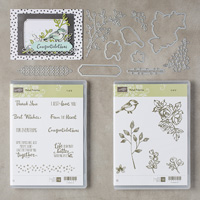
- Stampin’ Up! Goodies. The construction of the card is quite simple, so I want to give you a quick rundown of each of the elements on the card and where you can find them (since they are peppered over multiple catalogs/brochures:
- 2018 Sale-a-Bration Brochure – Feb 16 release. The texture on the oval is created with the Basket Weave Dynamic Textured Impressions Embossing Folder from the 2018 Sale-a-Bration Brochure – Feb 16 release. The folder is part of the Blossoming Basket Bundle, available with a $100 purchase.
- 2018 Occasions Catalog. The “congratulations” sentiment is stamped and cropped with the Petal Palette Bundle. The silver foil flowers on vellum are found in the versatile Sweet Soirée Embellishment Kit.
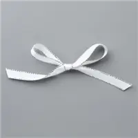
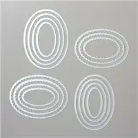
- 2017 Annual Catalog. The Layering Ovals Framelits Dies and Silver 3/8″ Metallic-Edge Ribbon are both found in the 2017 Annual Catalog. I stamped faint watermarks of splatter texture above and below the oval with the Swirly Bird stamp set.
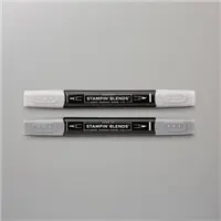
- Metallic-Edge Ribbon. Did you know you can’t “paint” your ribbons with Stampin’ Blends? The white ribbon looked a little bright on my card base, so I took a cue from my friend, Patty Bennett, who has been coloring lots of her ribbons with the Blends. My Smoky Slate Stampin’ Blend allowed the ribbon to just blend right in with the rest of the card – be careful to stay on the silky ribbon (and not run over the metallic part of the ribbon) if you want to preserve the tips of your pens. Don’t ask me how I know.

- Formal Colors. How gorgeous is this color scheme that includes Silver, Smoky Slate and Basic Gray, along with a touch of Whisper White and a touch of Basic Black? I’m in love with these tones and think it makes for a very formal color combination. If you are as inspired by the mix of Silver Foil, Smoky Slate and Basic Gray as much as I am, please save this:


Bundles: Petal Palette, Blossoming Basket Bundle (Sale-a-Bration) Stamp Sets: Petal Palette, Swirly Bird Papers: Basic Gray, Smoky Slate, Thick Whisper White Inks: Archival Basic Gray, Archival Basic Black, Smoky Slate Stampin’ Blends Accessories: Sweet Soirée Embellishment Kit, Layering Ovals Framelits Dies, Stampin’ Dimensionals
I hope you like today’s project, and I hope you’ll pop over to the Global Design Project site to see the cards by the design team members and to play along with this week’s challenge.
Thanks for stopping by today!
Brian

![]() BECOME A ROYAL
BECOME A ROYAL
Have you ever thought about being a demonstrator? Now is a GREAT time to become a Royal. Here’s what you can get with your Starter Kit when you join during Sale-a-Bration:
- With your $99 Starter Kit, you get $125 of product (your choice) with FREE SHIPPING.
- During Sale-a-Bration, you earn 2 free stamp sets (your choice) at any price. That’s a HUGE bonus!
- You will save 20% on everything you buy straight out of the gate (with an opportunity to save more).
- You have access to sneak peeks and early product releases.
- You get to be a part of our incredible online community. <3
I love our group and would love to introduce you to them. This is such a great opportunity for you to join or re-join. If you have questions, please email me. I’m happy to set up a call to chat with you about this amazing opportunity. You can JOIN NOW or EMAIL ME.


Very pretty…. wonderful color choices and stamps as well!
Thank you so much, Bette! I had a lot of fun with these colors. I’m so glad you like the card. ❤️
How chic with the mix of grays and a pop of silver!
Thank you, Mary! I was really happy with how all of the grays turned out. ❤️
Bravo Brian, this card is stunning! Your color choices are so unique and unexpected. They work so beautifully together. Outstanding job!
I am so used to colors that the grays were a challenge. I love how they turned out, though. Thanks for your comments, Robbye! ❤️
This is such a beautiful sophisticated card! I love the tip to color ribbon. I haven tried the markers yet but hoping to very soon now. Happy Monday!
Thanks, Christina! The ribbon was very easy to color – the markers are truly wonderful. Have fun!
Beautiful wedding card, Brian. Love the pretty flowers on vellum and the colored ribbon to match. So pretty. Have a great day!
Thank you, HJ! The flowers in the embellishment kit are really wonderful – The vellum pieces are gorgeous. I had fun with them.
Lovely card, Brian. May CASE for a 50th anniversary card I need. Thanks for the ribbon coloring tip. Will try that soon.
It would be beautiful for an anniversary card, Dianne! Love it! Thanks for your comments! <3
LOVE LOVE LOVE the idea of the ribbon coloring. I am this ribbon is now on my ordering list. Can’t even have too much ribbon!
Haha! Thanks for your comment, Maleta! You will have so much fun coloring your ribbons. It makes quite a difference!
Oooh I love it that Valem, makes it look so elegant ♥️
Tfs my friend
Hugs Frenchie ♥️
Have a great day
The vellum pieces are gorgeous. Thanks, Frenchie! ❤️
Absolutely fabulous! If I were the recipient I’d frame this one and put it on the mantel.
? Thank you, Grace! I’m so glad you like it!
I won’t lie…I sat for a moment with my mouth open on this one. Beautiful and perfect balance of the grays!
Awww…Thank you so much, Windy! It’s not my normal color scheme, but I had a lot of fun with that. I’m glad you like it.
Great tip for the ribbon, but sorry about your marker Brian! The basketweave oval is fantastic…there is no end to your cleverness.
Thanks so much, Dawn! I appreciate your comments and condolences of the marker. Lucky I had a back up. ❤️
Très élègant! Love the colored ribbon too!
Thanks, Linda! It started out a little outside of my comfort zone, but I’m happy with how it turned out – even though I don’t understand those foreign words you typed.
Love these elements. Thanks for the ribbon tip!
Glad you like it, Rachael! So many ribbons, so little time to color all of them. ?
Such a classy card!
Thank you, Jennifer! I’m glad you like it. ❤️
What a monochromatic masterpiece! I’m guilty of neglecting to use my embossing folders, but I love using an embossed piece as a focal point like this. Gorgeous!
Thanks so much, Nina! I always love the look of an embossed page but rarely reach for my embossing folders. That has to change. <3
Just beautiful Brian. A simple and elegant design with clean lines. Just my favorite kind of card!
Thanks, Jan! I’m so happy you like it! I normally use more color, but I’m happy with all the grays here. <3
Very elegant, Brian. I love Smokey Slate and the continuation of that color in the ribbon is perfect. Good choice of textures as well.
Thanks so much, Suzie! I’m so happy you like it and always love your comments. <3
Just wonderful – classic, elegant and timeless.
Thanks so much, my friend! <3