


Yesterday I shared a card with layers of green and vellum that came together for me pretty quickly. There’s one thing I didn’t tell you about in my post yesterday…the card came together quickly until I got to the color of the circle around the sentiment – I started with Basic White, changed it to Soft Succulent and then settled on Evening Evergreen.
Rather than just leave it at that, I thought I would share the other options with you. Did I make the right decision? Did I settle on the right circle? Here’s a look at the card with all three of the options (along with my thoughts about what did and didn’t work for each):
 I stamped the sentiment with Evening Evergreen on Thick Basic White cardstock and cropped it with a Stylish Shapes circle die. The white circle really draws your eye to the sentiment, but I didn’t have white anywhere else on the card, so I felt it was too bright and too disconnected from the rest of the card. I tried switching the vellum layer between the base and the other layer with white cardstock, but that didn’t work for me, either, as it took away from the warmth of that panel.
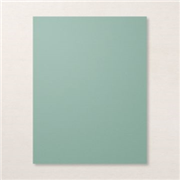
 I stamped the sentiment with Evening Evergreen on Soft Succulent cardstock and cropped it with a Stylish Shapes circle die. The soft green pulls from the Designer Series Paper layer near the base of my card and helps to highlight the Soft Succulent panel that’s behind the Lovely Layers Vellum piece. On this card, though, the Soft Succulent circle seemed to blend too much with the panel below it. This sentiment didn’t stand out enough for me.
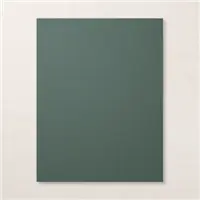
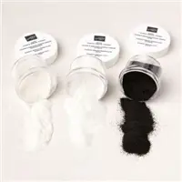
 When I heat-embossed the sentiment with White Stampin’ Emboss Powder on Evening Evergreen, the sentiment really popped for me. I didn’t initially envision the dark circle at the center of my card, but it seemed to be the option I liked the most.
Here are links to the products I used in the third card above:
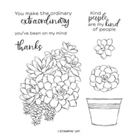
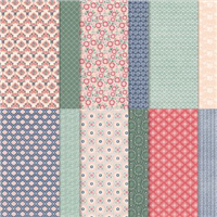
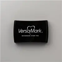
Stamp Sets: Simply Succulents Papers: Lovely in Linen Designer Series Paper, Lovely Layers 3-3/4″ x 5″ Vellum, Evening Evergreen, Soft Succulent, Vellum Cardstock Inks: Versamark Accessories: Fabulous Frames Dies, Stylish Shapes Dies, White Stampin’ Emboss Powder, Heat Tool, Stampin’ Dimensionals


Which of these cards to you like the most? My feelings won’t be hurt – unless you tell me there was NO WAY to save the card. ♥ Do my explanations for how I landed at the Evening Evergreen circle make sense? Would you have continued playing until you found the circle you wanted, or would have have stopped when it was done?
Thanks for stopping by today!
Brian

Last Chance Sale – Happening Now
Stampin’ Up!’s Last Chance Sale is going on right now! Products from the January – June 2022 Mini Catalog are being sold (while supplies last) and some are deeply discounted. To check out all of the items in this sale, click on the image below:

Kit Collection BOGO 1/2 Off Sale Starts Today
Stampin’ Up! is offering a month-long promotion on the products in the Kits Collection – Buy One, Get One 50% Off. Yippee!
 To read more, CLICK HERE. To see all of the kits currently in the Kits Collection, CLICK HERE.
 Placing an order today? Of course you are! If you are placing an order for $150 or more, I want you to enjoy all of the Host Rewards you have earned. If your order is less than $150, I’d love for you please add this Host Code – 3T3DBHUP – when prompted. Thank you!


Good morning, Brian,
I was typing a much more detailed reply to your question regarding the sentiment and 🤦🏼♀️somehow it disappeared … operator error, obviously. Anyway, I would choose number three if I based it on just the way you presented them. I might try to put the next size up circle (without stitching) in Early Evergreen behind the BW one. I would disqualify #2. That, of course, leaves the Evening Evergreen with the BW embossed sentiment. I might also try a slightly larger plain vellum circle behind it to soften it a wee bit/mimic the vellum layer you already have. Thank you! I am eager to read other people’s thoughts, too. Have a great weekend!
I love to see the progression in your creative process. I agree that the white as sentiment background is stark and jarring. While I think Suzanne’s idea of a backing Evergreen circle might help, I can’t get behind the starkness of that Basic White. But Suzanne, I DEFINITELY can imagine a second vellum layer, behind the Evergreen circle! Great thought~Layers, Baby!
Brian, thanks for posting the design steps: Inspirational to those of us who remake the same card a dozen times because we aren’t sure about the 1st pass(es).
If even the King does it…👍!
Brian,
Your decision to use the Evening Evergreen was absolutely spot on and the use of the white embossing powder was genius!
I am always impressed with your cards and projects and I don’t honestly think you’ve ever been wrong with your colour selections. I’ve not liked all the cards you’ve made, mainly because they’ve not been my style of stamps but your colours, design and cutting accuracy is SIMPLY THE BEST!!
I love going thru your decision making. All were great versions!
Mmm! Certainly a dilemma. Evening Evergreen is the best color but I think the problem is the circle is too large. I would have kept working on it, but I might have stepped away from it for a while and then come back to the project with “fresh” eyes.
I love white embossing! I think all are great because my eye goes to the vellum more than the sentiment at first look. Thanks for sharing!
Loved seeing your other versions for the sentiment and your explanation was spot on. Absolutely I like the Evening Evergreen the best. If I’d started with the white circle in the middle I would have continued trying different colors too. Just like Goldilocks, I think the last one is just right!
They are all lovely cards, but the Evening Evergreen with the white embossing gives the the card deminsion and is striking.
Yes! The Evening Evergreen is perfect! It makes my eyes the happiest when looking at it. lol
LOL, so glad to know you cut out multiple parts, too, until the perfect combo is reached.
I really liked your first card Until I saw the last. The evening evergreen does look best but I probably would have just been content with the first one if I had made it. I guess I just don’t take enough time to make sure it is always the best. Thanks for sharing and challenging me to do better.
#3 Evening Evergreen, although rather than centering the circle, I might have moved it down and to the right, just a smidge, and added 3 of something – the little gold butterflies or dimensional dots, just to add some texture to the circle. (more is better, might be my motto…)
I think you made a great choice in going with the white embossed lettering. Your eye goes right to the message but the pieces still blend together beautifully. Well done Brian!
First, let me say that you NEVER make a bad decision. Everything you make is just as great as before. But, I agree with you. I like your choice the best. 🙂
Without reading about your trials of getting this card perfect, I would have chosen the beautiful #3 just by seeing the three together. Actually, there is nothing wrong with the first two cards if we saw each one separately. I do enjoy reading about your process to get it as perfect as possible. Enjoy your weekend.
Yes, they were all lovely options. I think I do prefer your final choice though. Beautiful card as usual. xo
I like all three! I think if it were a birthday card the white would work being more bright. The Evening Evergreen would be good for a sympathy card. More subdued. Those were my first thoughts when I saw all three. I love all three of them