


I often receive requests for the measurements of my cards. The truth is, though, I don’t always have those dimensions when I start to build a card (I often cut away at layers until I get the size that looks right to me) AND the dimensions I use on one card won’t always translate to another. The proportions of layers and elements on a card are EVERYTHING when it comes to making a beautiful card.
Today I’m going to take another look at the card I shared on Thursday with a comparison to the card’s transformation from version 1 to version 2. As you might have guessed, I updated the proportions of the elements behind the mittens to make the card I ultimately shared. Here’s a look at these two cards (version 1 is on the left and the final version is on the right):
 You might disagree with my decision to change the first card (you are entitled to your opinions), but I felt the proportions were off on my first round of the card. I wanted the mittens to be the focal point, but they seemed to drown in the large panels of Designer Series Paper. I decided to reduce the Pool Party panel and give it a little frame. If the focal element were larger (like a big Christmas tree), Version One might have given me the dimensions I needed to showcase the image – the mittens were just too small.
If you quickly glance at the card on the left, your eyes might bounce around the card before settling on the mittens and sentiment. If you quickly glance at the card on the right, I’m guessing your eyes go right to the mittens and sentiment. The smaller, tighter elements behind the mittens force the eye right where you want it. Am I right? Do you see that?!
Here’s a look at the two cards (side-by-side) with the the noted differences between them:
 Here are the measurements for the two versions of this card:
VERSION ONE
- Real Red – 4-1/4″ x 11″ (scored at 5-1/2″)
- Stampin’ Dimensionals
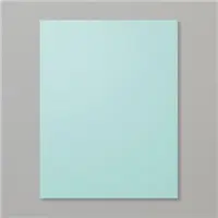
- Pool Party – 4″ x 5-1/4″
- Sweetest Christmas Designer Series Paper (2 panels) – 2-1/2″ x 4-1/2″
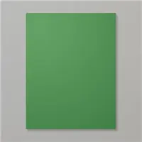
- Garden Green 3-1/2″ x 3/4″
- Stampin’ Dimensionals
- Thick Basic White – cropped with Celebrations Tags Dies
- Mini Stampin’ Dimensionals
- Thick Basic White – 1-3/4″ x 3/8″
VERSION TWO
- Real Red – 4-1/4″ x 11″ (scored at 5-1/2″)
- Real Red – 4″ x 5-1/4″
- Stampin’ Dimensionals
- Thick Basic White – 3-3/8″ x 4-5/8″
- Pool Party – 3-1/4″ x4-1/2″
- Sweetest Christmas Designer Series Paper (2 panels) -2″ x 3-3/4″
- Garden Green (3″ x 3/4″)
- Stampin’ Dimensionals
- Thick Basic White – cropped with Celebrations Tags Dies
- Mini Stampin’ Dimensionals
- Thick Basic White – 1-3/4″ x 3/8″
The size of the elements behind an image or sentiment on a card can play a supporting role or serve to distract. Do you play with the dimensions of your card bases/card layers?
If you’d like to read more about the card I shared earlier this week (Version Two), CLICK HERE.
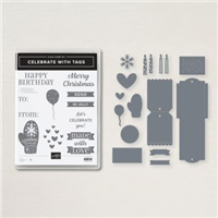
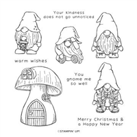
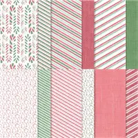
Bundles: Celebrate with Tags Bundle Stamp Sets: Celebrate with Tags, Kindest Gnomes Papers: Sweetest Christmas Designer Series Paper, Real Red, Pool Party, Garden Green, Thick Basic White Inks: Real Red, Garden Green Accessories: Celebrations Tag Dies, Red Rhinestone Basic Jewels, Mini Stampin’ Dimensionals, Stampin’ Dimensionals


Thanks for stopping by today!
Brian

New Weekly Deals
Stampin’ Up! is offering a selection of products at a great discount – and a new collection of products will be offered each week this month.
New products were added to this lineup today. Be sure to check out the sale items – click on the image below for more:

Six New Bundles
 Stampin’ Up! has designed amazing dies for six stamp sets in the 2022 Annual Catalog and July-December 2022 Mini Catalog. To read more about them, CLICK HERE. To check them out in my online store, CLICK HERE.
 Placing an order today? Of course you are! If you are placing an order for $150 or more, I want you to enjoy all of the Host Rewards you have earned. If your order is less than $150, I’d love for you please add this Host Code – P4HRWFZR – when prompted. Thank you!


I love the way your eye sees… love the card #2 and the way the white frames your DSP and images
Brilliant. Not just the design evolution, but the explanation. Thanks for helping us “see” more clearly. Impressive as ever. ❤️
Love your tips and BOTH of these cards. The extra red “frame” on the second is very cool.
Brian,
This is a great blogpost! I definitely prefer the second card with more of the card base showing as well as the white layer underneath the Pool Party layer. It really makes the focal images “pop”. Revisiting this card design with your analysis is a good teaching tool for me.
Thank you so much and have a lovely weekend!
Thank you for an excellent lesson on dimension. Honestly thought, at first glance, that the mittens were larger.
The difference is amazing !
Yep! Card #2 is the winner for all the reasons you gave. Thanks so much for the explanation (and dimensions) for your cards- very informative!
Yes ! I agree with your decision about the second card . I might even go for a white card base to get those adorable red mittens even more attention . This was fun !
I feel like I have been to a CARD COMPOSITION CLASS !
Definitely getting this Bundle !
I like the second card the best. Everything seems more in proportion with each other. Love your work.
I’m with you Brian…proportion is everything and the second card is much more pleasing to the eye.
Yup, I’m nodding my head and agreeing with what everyone above has written. Loved this post and I do play around with proportions on my cards. But not always with such clarity of thought. 😉
Ditto kiddo, great insight on your process with all the tips and tricks. Love the warm fuzzy vibe I get from the second version. Great job of explaining the process for us. Sometimes I just give in instead of working until it looks perfect in my eyes. It is all in the creative process. Thanks Brian!
Excellent comparison, 2nd card all the way! Thank you so much Brian for detailing the differences. At first glance you don’t see them.
Perfectly explained and wholeheartedly agree!
You were absolutely right! I never would have thought of it, but the second card has MUCH better proportions. Thanks for sharing how you think!
Brian, it truly does make a difference and you are so right about showcasing the design elements. What a good lesson. Thank you.