



Dear Stampin’ Up!:
Hi there. I have not yet told you this, but I love you. I am thrilled that I get to spend time with you almost every day. AND, when I am not able to make something fun with your spectacular products, I am thinking the products I have and what I can make when I return to them. In that regard, you are with me all the time. I love you, I honestly love you (that should be a song!).
There was a point to that first paragraph of my open letter. Did you catch it? No, it’s not that I love you (which I do, I honestly do). The point of the first paragraph is that I think about you all the time. Non-stop. In a borderline unhealthy way. It sometimes interrupts my sleep or a conversation I’m having with a friend – my mind starts racing, and I’m unable to think of anything else but Stampin’ Up! colors, clever card layouts and beautiful stamped images. Lately I’ve been dreaming up strategies for your next business moves – particularly as it relates to the color families in June. You didn’t really ask, but that won’t stop me from sharing my thoughts.
We all know that the 2011-2013 In Colors retire when the new catalog comes out in June. This makes me sad. Very sad. I was overcome with emotion as I started contemplating life without these very good friends, so I started scheming ways to help keep them around. For every new color that gets added to the permanent color families, though, someone else has got to go. The circle of life is never ending (that should be a song!) It’s tough, but I hope we can all agree that my opinions are pretty awesome and that my sugestions are the best. I hope this helps while you are making your decisions, Stampin’ Up!:

Old Olive and Lucky Limeade
Let’s be honest. If they aren’t positioned side by side, you are hard pressed to differentiate between Old Olive or Lucky Limeade. They are very similar – yet so very different at the same time. Old Olive is our old friend from high school. We’ve known him for years, and he’s always pulled through for us, putting a very mature spin on things. But Lucky Limeade… there’s just something about his youth and vitality that draws us to him. He seems to brighten our spirits just by walking in the room. While I hate to say goodbye to the old, mature friend, it seems like a nice gesture to give the new guy an opportunity to shine. **Please don’t retire Always Artichoke to bring in Lucky, though – Ann love Artichoke too much.

Rose Red and Calypso Coral
We have a lot of pinks right now – Pink Pirouette, Pretty in Pink, Rose Red, Raspberry Ripple and Primrose Petals. I don’t think I’ll be OK without Calypso Coral, though. While it borders on an orange, I’d be OK to let go of Rose Red to introduce Calypso Coral as a permanent color. What’dya say, Stampin’ Up? I’ve was resistent to embrace Calypso Coral at first, but I’ve really grown accustomed to having my versatile Calypso Coral at my fingertips. Please. Don’t. Retire. It.

Bashful Blue, Pool Party and Baja Breeze
I was not coo-coo over Pool Party – until recently. If you had asked me in November (and, again, I realize you didn’t ask me today), I would have been OK to let her go, but after the Spring Catalog awakened a Pool Party passion in me, I couldn’t bare the thought of living without her. It’s true love. But what would I be willing to give up to keep her around? How about Bashful Blue? I can’t imagine why we need both, and my vote is securely with Pool Party. I added Baja Breeze to the photo above as way to ask that you please keep Baja Breeze around forever. Please. I don’t know what I would do if I couldn’t reach for my old standby, my calm friend during a crisis, my haven in the storm. I love Pool Party – but not enough to let go of Baja Breeze.

Night of Navy and Island Indigo
Much like Old Olive, it will be difficult to ever say goodbye to Night of Navy. He’s been such an amazing friend over the years. He’s been a perfect companion through sympathy, birthday and holiday cards alike. With Midnight Muse on his heals, though, it might be time for Night of Navy to hang up his hat and rest a bit. And – perhaps this is my most passionate plea of the whole bunch – we MUST find a home for Island Indigo. What a versatile and beautiful shade! Please find a loving home for Island Indigo in your permanent color families, Stampin’ Up! I need this. Did I tell you I love you?
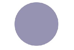
Wysteria Wonder
I won’t fight you on this one. If you need to let her go, that’s fine by me. It was fun while it lasted, but this is a battle I just won’t fight.
Thank you for being so understanding, Stampin’ Up! I look forward to hearing back from you.
With love,
Brian
Before I send this along to Stampin’ Up!, let me know what colors you can’t live without. But remember – this isn’t a petition – it’s a love letter.
Sent with Love. Stampin’ Up! has introduced a new travel-themed bundle called Sent with Love. Available now through April 30, this adorable set is a must-have. See the flyer below and go to www.stampwithbrian.stampinup.net to order. I’ll be making single swatch books for $3.95 with this DSP if you’d like to update your collection. Please email me at [email protected] if you are interested.




I like all the in colors and there isn’t a light purple that is nice, sorry Perfect Plum, so I’d like to keep Wysteria Wonder too. The only one I will cry buckets over losing, if it comes to that, is Pool Party. I feel about Pool Party like you feel about Baja Breeze
Remember the Carol Burnett bit (you may be too young)…. as Scarlet when Harvey Korman says, “i wish i was in the land of cotton, old times there are not forgotten….” and Carol says (with a curtain rod running through her dress, “That’s real catchy…. you oughta put it to music’. Ahhh good times. Love your post 🙂
Tanja, I know it well. I find myself always quoting song lyrics and then pretending I could make them into a song – and then poor Bandit has to listen to me sing them all day.
Brian, I have an idea…you should do a video with snippets of songs to sing us! Love it!! ;D By the way, I don’t want to lose Baja Breeze, Island Indigo, or Lucky Limeade, either!
Very nice comparison! I will be sad to see any of these colors go. Have you noticed how close/interchangeable calypso coral is to tangerine tango? It works!
I truly don’t understand why SU retires some colors that are very popular. I think they should ask ALL of us customers and, of course our demonstrators, to vote for the colors we want to stay and which new colors we want to be added to the up coming list. The same with stamp sets, it’s sad to see some really beautiful images gone for good. I have been lucky enough to purchase a few of this stamps before they are gone, among them, “Blooming Beautiful”, “Just Buzzing By”, “Pun Fun”, “Spring Song”, “Peace Within” and a bunch of others.
Maybe SU should send an email to us, through our demonstrators, with the colors and maybe even stamp sets, and ask us to vote for our favorites, specially paper and ink, so we can still purchase this items. From the colors I see here on your blog today Brian, I will hate to see Wysteria Wonder go, as well as Island Indigo and Night of Navy, this are amazing colors for masculine cards, Old Olive is just so rich and yummy, maybe it’s because I adore Olive Oil, (not Popeye’s girlfriend) and Calipso Coral is just a fun color for summer.
Sorry for this long comment, I just wanted to say what came to my mind about today’s post.
I agree with you, Maria, about voting…THAT’S what they should do instead of not letting us have any say in it! ;D
Maria – I do actually remember last year getting a survey from SU that asked what colors we used most often and least often and which colors we couldn’t live without and which retired colors we would like to see some back. Fortunately with MDS they will last forever!
Well, I have to agree with you on most of this, but don’t be messing with a man’s Night of Navy. Teal comes and goes; Navy is forever! They even named a branch of the armed Forces after it!
Well played, my friend. Well played.
Amen to that, Richard!!
OMG! You have said what I have been saying for such a looong time! OK, so here’s my input:
Out with Old Olive, nice color, but I’m tired of it. I absolutely LOVE Lucky Limeade…you’re right, it makes me happyy. Out with Bashful Blue; must keep Pool Party and Baja Breeze. Oh, and Marina Mist? eh. whatever. I would keep NIght of Navy because it is a good masculine color, but Midnight Muse and Island Indigo are my FAVS! They can get rid of Tempting Teal; it just seems too WOW for me. I can never find much to go with it other than some DSP. (that’s probably me and my inability to make a decision on paper). I would give up Perfect Plum to keep Wysteria Wonder too.
Oh yes, and we must keep Calyspo Coral and Tangerine Tango. I would give up Rose Red to keep those two. I think I will send a letter too. If we all did this, maybe we would be lucky and they wouldn’t retire all these colors this year…. it’s worth a shot.
Brian, thanks for your take on this. I also think that SU should ask demos what they think about paper and card stock once in awhile too. We’ve had surveys on catalogs, so why not card stock?
By the way, as always, your letter made me laugh. Your blog rocks!.
I will go sit in a corner and cry if SU decides to retire Old Olive or Bashful Blue, my two favorites of all the colors. I mean I went into horrible withdrawal when they took away Creamy Caramel and don’t know how much more this old heart can take! And then, what are we supposed to do, throw out the old ink pads because we can’t get paper to match? Sob, sob! See I’ve started mourning already!
I know what you mean, Gracy! I hate to buy a new stamp pad, then to have no paper to match….arghh!
I cried buckets when SU ended Creamy Caramel. It was like loosing a gentle, reliable friend. I wish they would bring her back.
Now you have really gotten my attention….love the colors …all of them and I have to have them …It is my other passion besides dsp . And I begin to get panicky when they begin to get old and I`m afraid they may be returning to the Land Of Rainbows because SU thinks It`s time to let them go … I still have 4 pads of Close To Cocoa ink …because SU let it go …Only Orange ..what a pretty true orange …yes, I still have that one too …Sigh ! Yes, I remember the Carol Burnett skit …love it and Maria..so glad you clarified that it wasn`t Popeye`s Olive Oyl instead of Olive Oil…that you love…(she`s too skinny anyway) Loved this Brian…and hands off my Rose Red …I love her !!!!
Holy junk! I had to check my catalog to see that Perfect Plum was still a color! It’s there in my ink carousel. Wow! My number one, all-time favorite color, you ask? Ever heard of Mellow Moss? *tear running down my cheek*
Some of your trades I agree with but not with night of navy and bashful blue. Sometimes you need a cool blue and if you take away those there aren’t anymore cool ones. I really would like to keep island indigo though.
What a thought-provoking post! I could let Calypso Coral go as long as I have Tangerine Tango. I use Bashful Blue a lot – think baby boy cards, baby showers and more. I’ve often wondered about stats on the most and least purchased SU card stocks. It would be cool to see them. In my experience it seems some very popular colors get retired.
Mellow Moss looked awesome with Vintage Violet, one of my favorite sympathy card color combos. And throw away ink pads? NEVER! What if they “come back” (think Tangerine Tango)?
And I love Elegant Eggplant the best. Currently.
Your next color challenge (to yourself) is Perfect Plum, Brian. LOL and have fun with that.
Hey, Carol I saw someone do Stippled Flowers in Midnight Muse and Bashful Blue the other day…Stunning…I love Bashful Blue also….btw Brian I still have some Mellow Moss…. he`s very old but I refuse to throw colors away !!! This is a good lesson on why you buy reinkers of colors you really love …who knows???
Oooh, thanks Sonny! I haven’t tried that, but I will now. Love Midnight Muse. Loved Mellow Moss too, but my supply ran out.
Love your comparisions but I have to agree with the others that Navy has to stay. I love Wisteria Wonder…nice soft purple…but then purple is my favorite color.
You are too funny! Always enjoy your posts and your creations.
I agree with you and Bobbi Miller. BUT you are WRONG (so SELDOM happens) about Night of Navy!!!! 🙂 We need the darker colors for contrast. I almost cried when they got rid of Hunter Green, but I found a cardstock company that carried a similar color. I am sure SU has made up their minds already, but a vote from their WONDERFUL demonstrators (and customers if they are really smart…at least they ASKED) is just good business. Brian, you are the best. If you lived in the Southern MD/DC area, I so would be sitting in your classes! I like Wisteria Wonder too because I love purple, but I can let it go…Have other choices…Love YA!!!!
Please don’t get me wrong. I love Night of Navy. I do. But it is a GIVEN that Midnight Muse will be around for another year. That’s why I am willing to “cut my losses” with Night of Navy. I agree that variety is King (see what I did there?), but that’s also why I am willing to let go of NoN – won’t get rid of MM just yet. Oh, this is all so very stressful!
Clever on the King, Brian. i would have caught it…LOL! I do love Midnight Muse and will just stock up on NoN when they retire it. I LOVE, LOVE Cherry Cobbler at Christmas…so rich. Oh well. WISH I could retire some of my extra fat.
Business decisions HAVE to be made… Still love ya! 😉
Just got my big new order after being away from Stampin’ Up for over 11 years. Bowled over by the new colors; the only color I’m really sad to see retired is Mellow Moss. Out of the new colors, I can already tell that Baja Breeze is definitely a keeper! I have my eye on Cajun Craze too, and Cherry Cobbler. Can’t wait to use all my new stuff!
No touchy Night of Navy or Old Olive….now Bashful Blue I have not touched in years! I do get a little edgy when the in colors retire but then find I like several of the new ones. WE will survive!
As a customer only, I cannot stress the importance of re-inkers. I then juice up my pad with my favorite retired colors and brayer over white or another color. I have even done that to the back of DSP (the old ones were often 1 sided) to create 2 sided paper for projets. Thanks for making us think an giving us a heads up on the re-inkers we may soon need.
In 16 years with Stampin’ Up! I have seen wonderful colors come and go. Hated losing Mellow Moss and Old Amethyst – a favorite combo for a long time. Have also seen styles of ink pads come and go. LOVED the flip tops – they worked better for small hands than our current design. But you know what? Stampin’ Up! always comes out with newer and better, so I’ll just hang out and wait for next year!
Just had my kitchen repainted and was trying to decide between Old Olive and Lucky Limeade. Limeade won as it was more yellow and I needed that to go with the purple of the other walls. Interesting topic for discussion and I am always sad when things that I Iove go away. But usually there is something new to take it’s place and after all, this is our business. If nothing changed, what would we have to sell?
We all love colors differently, and at different times we have our favorites. I have to say that I will miss any and all of the In Colors, and don’t want them to leave. There are any number of old colors that I have never purchased paper or ink to use, and they can just go. But, having worked a number of years in womens apparel, I know that sometimes things have to change, and there will never be a change that makes everybody happy. Don’t know how many years we said “give us some gray”, and now I won’t even wear it. I think of it as exciting and kind of fun to await the new colors, like anticipating the birth of a new baby, and not knowing the sex. But, we also know that eventually somebody has to die, like dust to dust, baby. We shall see…………….and I love your musings.
I think that Bashful Blue could go for Pool Party. I have actually created cards meaning to use BB only to find that I used PP instead. They are so close in hue that it is hard to tell the difference even side by side. I do also love Calypso Coral one of my very favorites and would easily let Rose Red go for that one. I think there are too many pinks and not enough oranges anyway. I do however love Old Olive and Night of Navy but also would like to see Lucky Limeade stay. I can’t say that I have used Island Indigo or Wisteria Wonder at all so I definitely won’t miss them although I would like to give Indigo a try.
Thanks for the suggestions and I hope that they work. I love reading your posts every day, I really look forward to them and hope to participate in one of your card exchanges someday soon.
Blessings,
Melissa
I don’t really see the point of retiring anything anyway, except that warehouse space would be a major issue, because now that there is MDS, nothing really retires. I just keep my “real” sets and colors and use them because they would be “current” if I did it in MDS. I just think that whole idea is ridiculous. Retired if tangible, but not if printed. Yeah, I’m old, but I bought the sets because I liked them and so I’ll use them with real ink and color them anyway I like. So there! Yeah, I have MDS, too, but I much prefer stamping in “real time”…when I actually have “real time” !!!
Love your thoughts here, Brian! I wouldn’t mind losing Perfect Plum…..can’t even remember when I used it—ink or paper! I NEED Pool Party and Baja Breeze AND Marina Mist…love my blues, but I am with you on Bashful Blue….it could go bye-byes. Unfortunately, I am sure that SU has already made up their minds about whats staying and what’s going a LONG time before this! Maybe they could hire you on as a consultant for next year!
No, no. Leave my Bashful Blue and Night of Navy alone!!! We NEED pure blues. Enough of the adding a little green to the blues.
While this is always a hard transition for all of us, I applaud your letter – did you send it to SU!? I cannot agree with all of your choices to keep, especially Wisteria Wonder…I sooo miss all of the purples that are now gone…girly girl, yes, I admit it totally and unabashedly! I want to have the dark blue and the deep pink….and the dark greens….okay, okay, we obviously can’t have everything we want…old or current and who knows what is ahead of us??!!! However, for me, it is kind of a mute point as I am a hobby demo….NOT tossing it in anyone’s face, just saying that I don’t have to loose anything, that is until I do swaps…and then I have to fall with the rest of you as to what we can and cannot use….and how happy we may or may not be! Thank you Brian…always love what you do and say….and thank you for your letter on our behalf! GO NINERS!!!!!!!!!!!!!!!!!!!!!!!!!!!!!!!!!!!!!!!!!
I will fight you to the death for Night of Navy! How could you even say such a thing?! I thought we might be good friends, but now I see your true colors. (Get it? True colors? Ha, ha. I’m almost as clever as Brian!)
I can work with the rest of it. Especially Pool Party over Bashful Blue. But Night of Navy must stay.
Why must great colors retire???? I vote to extend the retirement time, or let them be semi retired. After all, that’s what America’s work foce is doing. LOL. I absolutely loved the post. I had not given retiring colors any thought lately, but I sure took another look after reading this post. Very thought provoking. Thanks so much Brian.
The Pantone colors are just out for Spring: http://www.pantone.com/downloads/support/FCR/PANTONE_FCR_Spring_2013.pdf
Emerald is THE color of the year! It’s a little washed out for me, but I can live with it.
A lot of the Pantone colors seem to match ones that SU have already – but a few need to be filled in; I’m sure that their lead time is in years, not months (the catalog is probably being printed, now), but we can hope!
I for one hate to see classic colors go – Old Olive, and my fave – Cherry Cobbler – so perfect for Christmas cards (and Valentines).
Agreed that we need a dark blue, but also a light blue for sky and water backgrounds;
I fell in love with Pool Party the minute I saw it – long may it wave – but nothing takes the place of Bashful blue backgrounds (embossing is made for that color). unless maybe Tiffany Turquoise!
Oh my, the thought of pool party retiring with all the cool pool party items in the spring catalog!!! I just received a pkg of card stock a few hrs ago and am planning on using half a pkg of it by tomorrow….time to order more, just in case SU doesn’t agree with your choices, I think I might hoard a few packs….. I think it is time for some of the colors to retire and I will be sad, but know they will have some really nice ones to replace them with too.
I am still struggling with the loss of Brilliant Blue!
LOL I googled “so sad that stampin’ up is getting rid of pool party” and found this. made me feel less crazy:). So pleeeeeeeease keep Pool Party! Get rid of white if you have to, I don’t care, Just keep my Pool Party.
Old Olive is a purer green than Limeade. I love Limeade, but not enough to sacrifice Olive.
I could not stop laughing when I read this whole thread. Better late than never!!! I am suffering tremendous withdrawal over losing Baja breeze. This reason I discovered this old thread is that I am currently searching “blackmarket” Baja breeze items. LOL!!!!! Glad they kept the colors they did keep, but I will never get over losing my Baja breeze. :(((((