


It’s Thursday, and that means one thing – it’s time for a Pals Paper Arts Challenge. Woo hoo! For this week’s color challenge, the team selected Early Espresso, Crisp Cantaloupe and Summer Starfruit. While this combination was truly a challenge for me (I worked tirelessly to make these colors work together), I am so happy with result. Without this challenge, I would have never made this card. Here’s my card:
And here’s the challenge banner: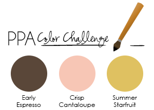
- Color Combination. Each of these colors is very beautiful (you really can’t go wrong with any of Stampin’ Up!’s colors), but together, these three colors have groovy attitude. The combination of these three colors reeks of the 1970’s, doesn’t it? I think of avocado countertops and yellow Tupperware containers. The ovals and chevrons and flower all play into the flower child theme.
- Repeating Shapes. Did you notice how perfectly lined up the patterns are in the chevron paper? Here’s what I did: I cut two rectangle pieces from the Summer Starfruit and Early Espresso DSP paper stacks (same size, same corner of the paper). I then cropped an oval from the center of the Early Espresso piece. I added Multipurpose Liquid Glue to the back of the cropped piece and then glued it down. The liquid glue doesn’t dry immediately, so I was able to slide it a little to make sure it was perfectly lined up. Yipee!
- A Little Overlap. When I stamped the center oval, I knew I wanted my flower to slightly overlap the oval a bit. It cuts into the oval-oval-oval-oval combination of shapes and adds character to the center image. I simply stamped the flower on Crisp Cantaloupe card stock and on Summer Starfruit card stock. I snipped them and added them to the finished card.

Stamp sets: Oh, Hello! Papers: Early Espresso, Crisp Cantaloupe, Summer Starfruit, Whisper White, Designer Series Paper Stacks (Early Espresso and Summer Starfruit) Inks: Early Espresso Accessories: Ovals Collection Framelits, Stampin’ Dimensionals
Thank you for stopping by my blog today!
Brian
CLICK HERE to order Stampin’ Up! products 24/7.


lovely! Would certainly not have thought of combining those colours together. Crisp Cantaloupe is not one of my favourites I must admit….. I won’t say what a couple of us call it in my Craft Group… 🙂
WOW! I Love the colors! You are, so good, at matching the lines up!
Very impressive! 😉
HELLO to YOU!!!! Great use of the colors! This was a tough color combo and you did it proud!
Wow! The precision on this card is quite impressive! Love it! 🙂
Looking at this card, I would never know you struggled a bit with this challenge Brian!!! Your 5 ovals look seamless and the flower stamped in Early Expresso on Crisp Cantaloupe with Summer Starfuit looks fantastic!! 🙂
Well, you keep amazing us with your paper snipping abilities, aren’t you?? WOW, this card is really awesome, the lines on the DSP line up perfectly, how clever the way you did this. I love Crisp Cantaloupe, I think it’s a very beautiful shade of pink and pastel orange. I never would’ve pair it with Summer Star Fruit though but you did a fabulous job combining this two very different colors.
Great card, Brian! You would never know you struggled with this mix of colors!
Oh hello back at ya! Again you manage to tame wild patterns with a calming center! Love it!
From my point of vision the Crisp Cantaloupe oval looks like an opening …that`s amazing ! This card proves that you have patience and determination . Color combo is so new and fresh … I like it ! A real Thursday Thriller !! And that mono liquid is a great glue but, I get it everywhere … I keep trying because it`s such a good product . Guess you would call that “User Error ” or “Unqualified Glue User”
I always love it when UGU’s make UE’s. 🙂
Oh my! What a color challenge this would have been for me! Summer Starfruit and I are only passing acquaintances. And I am just getting to know the newest InColors as I am a bit behind. Bravely tackled challenge, Brian! And expertly executed!
Suzie, The challenge is open until Tuesday, so maybe this COULD BE the color challenge for you! 🙂
Great card Brian, the precision and attention to detail is amazing
Lots of WOW factor! The layers are lined up so well,it looks like a printed window sheet with an early espresso oval underneath. I look forward to your blog every morning!!! Thanks for the inspiration!
I absolutely love the color combo and the design! CAS at its best!
Valerie
Holy Makeral Batman! If I didn’t see this card I wouldn’t have believed it possible. The way you lined everything up perfectly just blew me away. What a fantastic card Brian!
I was immediately drawn to the chevrons and how well they line up! I love your use of these colors and think you did an awesome job with them. Thanks for joining DT 1 this week, Brian!
Confession time here: I blog stalk you everyday for the amazing inspiration you provide. I’m still playing with the Andy Warhol/penguin look you inspired me to try a few days ago and now THIS!!!! OMG!!! I kept looking and looking at the summer starfruit/early espresso chevrons and wondering how the heck you did that before I even read your post (I really like to challenge my stampability knowledge before finding out the secrets you share). I was thinking “Hmmm…did he use the chevrons from the grunge collection with versamark and an oval template to color them in? No, that doesn’t look right. OK, did he use dsp and color part of it with a template over it to look achieve the oval in the center? No, that doesn’t look right either. Hmmm….what the heck did he do?” Then I gave up trying to figure it out and when I read what you did I gobsmacked my forehead and said “SILLY ME! I complicate everything!!” It’s a stunner and totally drew me in. In fact, I was so captivated, curious and eager to find out how you made it that when I read about the two tone flower I thought to myself “What flower is he talking about?” I had to go back and look again and yep, there is a two tone flower there too! I love your artistic style. Thank you for the daily inspirations. 🙂
love it, even though i would’ve been put off by having to work with this color combo. did you try it with a summer starfruit rose? great job!
This is very pretty!
What an amazing job of lining up the patterns! Very pretty card, Brian. Thanks for sharing with us at Pals Paper Arts this week!