


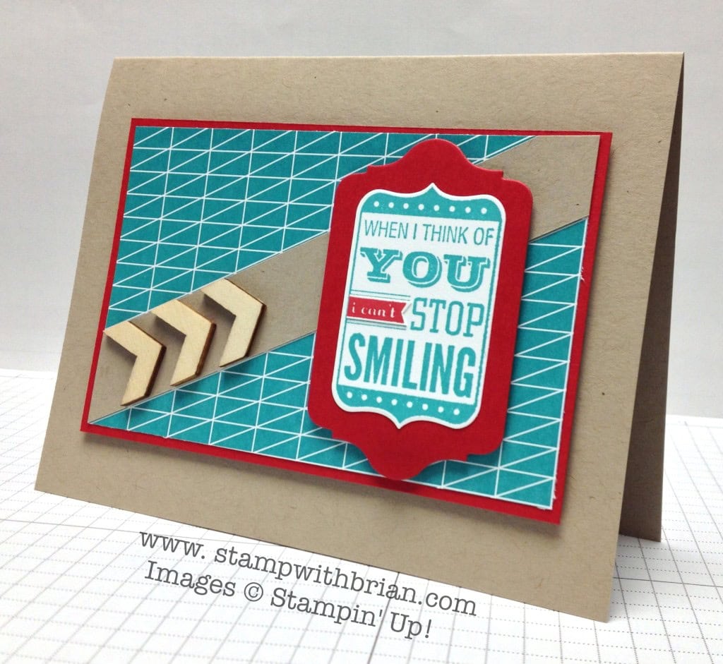
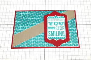
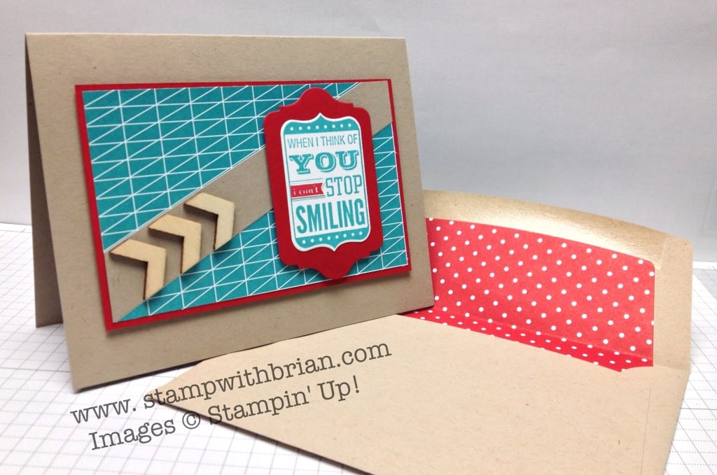
Crumb Cake. Bermuda Bay. Real Red. These are the colors for this week’s Pals Paper Arts Color Challenge. I enjoyed playing around with these colors to make a fun card for you today. Here’s my project:
 And here’s the challenge banner for this week’s challenge:
 Tips, Tricks and Reminders
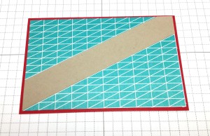
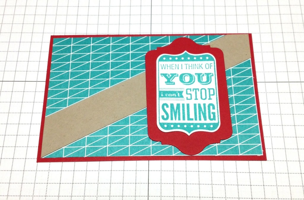
- Balancing an Off-center Band. After I trimmed this center piece of Bermuda Bay paper from the edge of a piece of Kaleidoscope Designer Series Paper (the paper includes other colors that aren’t part of this challenge), I trimmed a corner-to-corner band of Crumb Cake to ground the sentiment on the card. The diagonals in the paper don’t exactly go corner-to-corner, so I would be left with an unbalanced band. I balanced the rest of the card by placing the bright sentiment far over on the band and the wooden elements along the lower right side of the band. Here’s how the balance of the card changed as I stacked the items:
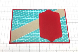
- Pop-it with Framelits. If you haven’t used Framelits, then you are missing out on a whole bunch of joy. They were awesome two years ago but even awesomer (that’s a word, right?) since the introduction of the Magnetic Platform. With a quick placement and pass through the Big Shot, I am able to crop my stamped images and crop their frames – AND with the blink of an eye (OK, maybe it’s really two blinks), I can change out the frame color to see which I like best. Framelits are incredible. End of discussion.
- My Theory on Arrows. Arrows and chevrons are really big right now (and have been for a while). Maybe this might be the overly-analytical accountant coming out in me (he pops into my card making world every once in a while), as I try to create aesthetically pleasing projects, I always make sure the arrows point up or to the right. An arrow seems to have action to me, and I always want it moving up or forward. On my card from Tuesday, the chevrons in my Pool Party panel of DSP are pointing to the right.
If they point in a different direction, I want to make sure they are pointing at something (like the focal point of a card).


Stamp Sets: Love You to the Moon Papers: Crumb Cake, Real Red, Whisper White, Kaleidoscope Designer Series Paper Inks: Bermuda Bay, Real Red Accessories: Essentials Wooden Elements, Chalk Talk Framelit Dies, Stampin’ Dimensionals
 If you would like to check out the Pals Paper Arts Design Team projects or participate in this week’s challenge, please click here.
Thanks for stopping by today!
Brian


love this sentiment ! And I love my Framelits ! Maybe it`s just the way I look at things ,but arrows that go left on cards just don`t seem “Right” to me …. The colors in this card just make me happy ! It is a perfect card for just about anyone ! It`s fun!
Happy Friday !
Love it…have a great trip and TGIF.
Brian, I just love your thought process that goes into each one of your cards. I am very grateful that you explain why you do things, it enables me to learn and grow as a paper crafter. Hope I didn’t sound too gushy.
Your card is fantastic today. I love the arrows and definitely agree with your directional rule.
Thanks for sharing all that you do, it’s appreciated greatly 🙂 Take care!
These really are happy colors! And you really do educate your readers, Brian … we do appreciate it a lot. Thank you!
I agree with Suzie and Jill. I appreciate the education behind your card making process. Thank you Brian. I love your layout. Great card.
Love this color combo!
Wait…you’re an accountant? You have broken the stereo type! I would never guess accountant and I mean that with love. Great card as usual. Love the arrows.
I too enjoy your explanation on how you arrived at your card design, it’s really very helpful for someone like me who is kind of challenged in this department. Love the “why” and the ”How” of your cards Brian, if I didn’t know any better I would also think you are first a designer and then an accountant, this is also said with lots of love. This is a really pretty combination of colors and you did a beautiful job with them as always.
On another note…..I wish you the best time on this trip and cruise, take lots of pictures, we all want to see you having fun in the sun.
Great card and great explanation – it’s good to see another “center-brained” person – I am a business analyst by training but a crafter and cardmaker by choice. 🙂
Love this!
Great card!! I love how the arrows make the card come alive! Your card reminds me of one of those signs with the moving lights that bring your attention to the main insignia of a sign. Love it!! 🙂
Brian, will you please take a day or two off, so I can get caught up with all your cards! You do such a great job, and I love getting all the great ideas that you post! I am just so far behind. Thank you so much!
I was just kidding! Love your cards!
Joy, Ha! Ha! I’m headed out of town for a much-needed vacation on Sunday. I’ve got a week of posts all lined up for you. I get a break, but you have to keep working. 🙂 🙂 🙂
So amazing how you always get everything to come together. I have yet to use my wooden elements. I don’t know why. Thanks for the inspiration.
Wow! What a fabulous card, Brian! Love the design and the colors! Wonderful touch with those wooden elements…well done!
Congratulations on your well deserved vacation. You are a true champion. Love this card. You are my design hero. I love how your mind works. I hope you have a wonderful time on your vacation. I look forward to seeing pictures of just how much fun you have!! I can’t wait to see the posts you have lined up for us in your absence. I know they will be filled with fun and terrific ideas. They ALWAYS are.
I’ve just started following your blog. I appreciate the tips and ideas on how you bring your cards together. I appreciate too that you have gone the extra mile to have your blog arriving while you are on your cruise. Thanks so much!
Have fun!
This card is awesome indeed! Love love love your use of those wooden chevrons and that perfectly sized pop of red. And I, too, like reading your thought processes. Keep up the details for those of us who are design challenged!
And happy vacation!
Picky,picky. But that is what makes (or breaks)a design. Thanks.
You can make anything look gorgeous. This is one color combo I would never use, yet you make it rock. Love those wooden chevrons
As a fellow accountant I too like to have my arrows pointing up or to the right to move forward. I thought it represented our positive spirit! Another fantastic card Brian. I hope your trip is Fabulous.
Definitely a fun card, Brian! Really loving the diagonal piece with the chevron cuts!