


I have seen the 2014-2016 In Colors, and they are FANTASTIC!
When I first saw these colors, my immediate reaction was, “they are close to other colors we have.” The more I have processed them, though, the more I realize they each have a personality of their own. If I were to describe them to you, I might say, “It’s close to [this color]” or “It’s somewhere between [this color] and [that color].” Rather than TELL you, I’d love to SHOW YOU.
Below are some note cards I made with each of the five 2014-2016 In Colors. I used the new colors as the base for each card and indicated that color in the panels with a white flower. I’ve compared each color with other colors in the current Stampin’ Up! family of colors.
Without any further ado, I’d like to introduce you to your new favorite colors:
MOSSY MEADOW
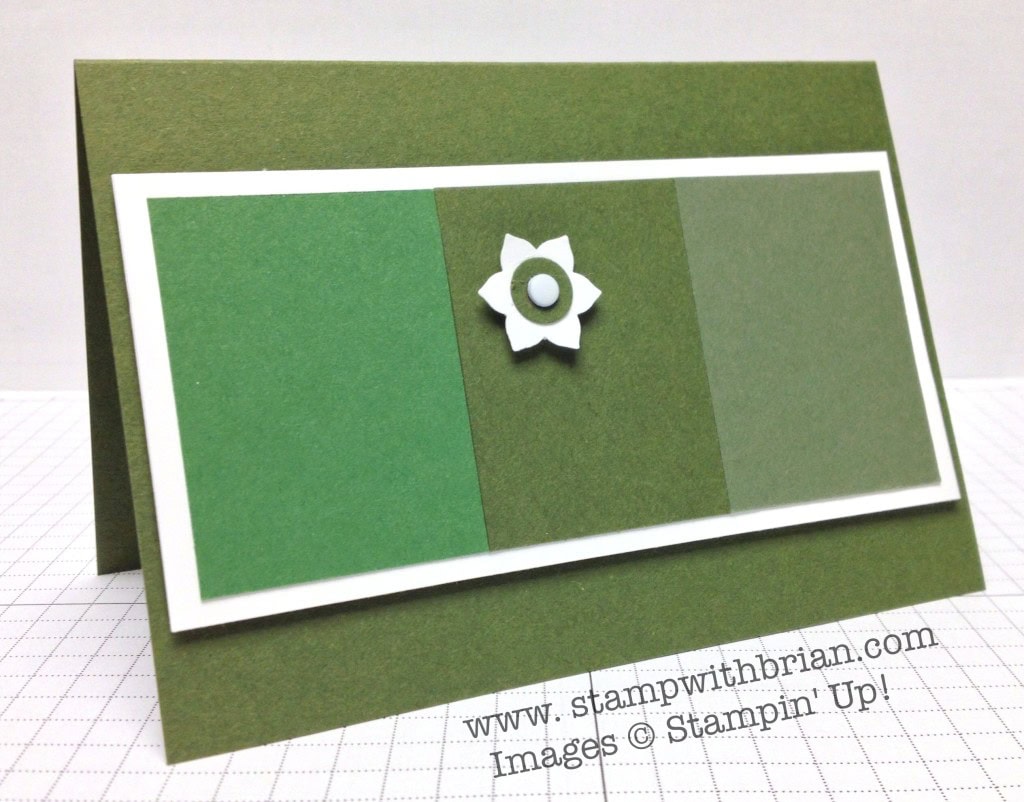 Garden Green, Mossy Meadow, Always Artichoke
HELLO HONEY
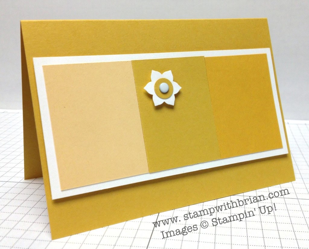 So Saffron, Hello Honey, Crushed Curry
BLACKBERRY BLISS
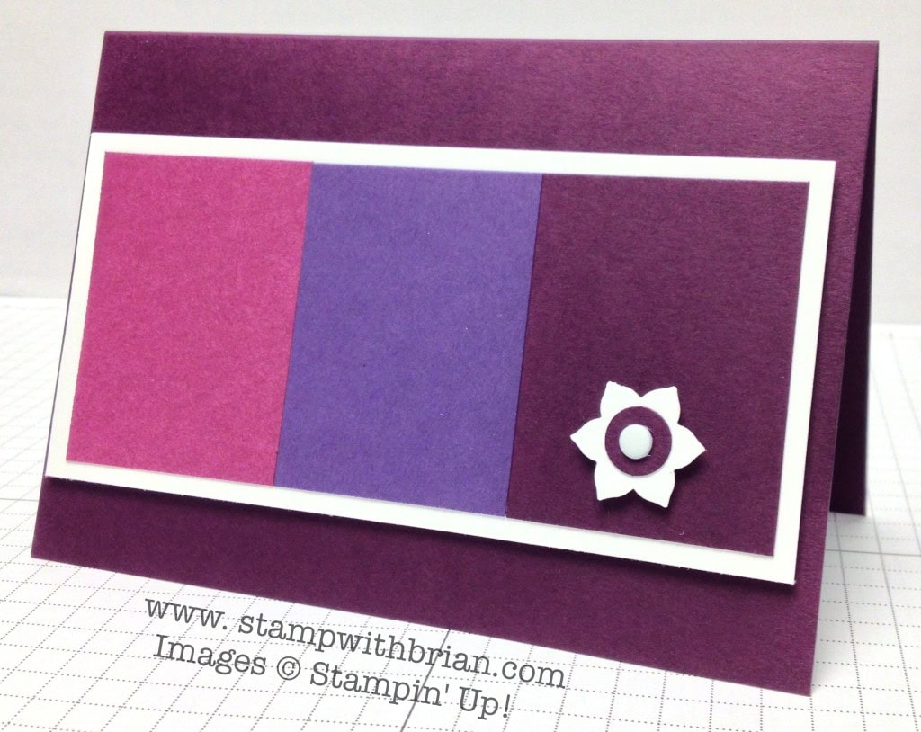 Rich Razzleberry, Elegant Eggplant, Blackberry Bliss
TANGELO TWIST
 Pumpkin Pie, Tangerine Tango, Tangelo Twist
LOST LAGOON
 Lost Lagoon, Coastal Cabana, Pool Party
So, what do you think? I know a lot of people were hoping for an emerald green of a bright orchid. I, too, was surprised that these weren’t included in the mix, but I have to say I’m very happy with this selection of colors and can already think of a thousand projects I’d like to make.
Thanks for stopping by today!
Brian


Thank you for the comparative color blocks! I saw the new In-Colors on another blog yesterday, in a Stampin’ Up video, and I, too thought they looked like some other color. I am happy to have a warmer purple! Stamped off once may produce that orchid that we have been missing since 2010. I thought/think that Lost Lagoon looks a lot like Baja Breeze.
Have a fantastic trip! Bon voyage!
I am happy! Real colours this time! (Sorry pastel-lovers!). Can’t wait to see them in the flesh and get mixing them with some old favourites.
I like how you used the new color as your card base . That will be how I use them at first because they are so dark . I think you really don`t get the colors until you work with them . Hello Honey is nice and the Blackberry is going to be the rising star along with that Lost Lagoon . And yes it does remind me of BB (your lost love color) in a deeper tone . Last ,but not least …. Have a wonderful time on the cruise ….Rand R just what you need ! Bon Voyage !!!!
I think my favorite new color is the Blackberry Bliss, it looks like a richer, truer shade of purple. The Lost Lagoon comes in a close second favorite, it does look somewhat like Baja Breeze but a shy darker. The Tangelo Twist looks yummy, I think it would be awesome for Halloween.
Have a great trip Brian, rest and have fun, you deserve it, my dear.
Great way to introduce the colors! I can’t help but think you should be in the advertising business, instead of accounting:-)
I am in love with the blackberry bliss! I really appreciate you making 5 cards to compare simular colors. They really are unique.
Brilliant post Brian!! Great to see our new favorite colors juxtaposed with the others we know and love!!! 🙂
Did you overnight your pre-order like your super-snazzy Demo friend Justin, or did you win the New In-Color packet of card stock at the Premiere last Monday? Either way, a fabulous post to display the new colors!! My initial instinct, without having any of them in my hot little hands yet, has me leaning toward Blackberry Bliss, with Lost Lagoon as a close 2nd, and Tangelo Twist right there in 3rd.
Have an AMAZINGLY AWESOME time on your tropical getaway!!! Safe travels to you all!!! 🙂
Can’t wait to get them in my hands! I think blackberry bliss and mossy meadow will make beautiful Christmas cards! Have fun cruising!
I am loving the new colors and adore how you made these cards so quickly. I absolutely adore the contrast. A great, great reference for the future. I wasn’t around during the Baja Breeze and love the Lost Lagoon my favorite. Hello Honey, Blackberry Bliss, Mossy Meadow and Tangelo Twist would the the remaining order. So have a great trip and take lots of pictures. 🙂
Well I am from Tennessee and Tangelo Twist looks like UT orange to me. Gonna be a favorite of mine.
I am already in love with Blackberry Bliss and Lost Lagoon. Oh, and Hello Honey …oh, I guess I love rhem all! Thanks for the comparison/ analysis. Very helpful.
Thank you for making displaying these new colors in this way. It truly helps distinguish the newbies from the others in the palette. Beautifully done ( but of course)! Sail on safely.
only you would find such a creative way to highlight the new colors – awesome!
I am surprised how different Rich Razzleberry and Blackberry Bliss are! They looked close in the catty. Great cards! Thanks for the comparisons. Happy sailing!
Love how you showed us all the colors!!
Great job showing the new colors!! I love them all!
Thanks for the comparison, Brian. It was very helpful. Can wait to see them in person! Have a great weekend!
You did an amazing job show casing these colors…thanks so much!
Great way to show case the new colors. Thanks.
Brian – only you would think to show these colors in a comparison that makes up a card! Fantastic job and I do love them all. I think my favorite of the new colors is the Tangelo Twist. It’s really hard to find a nice orange and/or a yellow for that matter. I was hoping SU would come up with a new yellow but maybe next year. Thanks for being a genius!
Well DUH! I said yellow, I meant pink!
Oooooh, I think they are all such warm, rich colors. Love them all. Thanks for the comparatives, Brian. Brilliant as usual!
What a creative way to introduce the new in-colors. I think SU should hire you. Huh! Have a wonderful time on your cruise.
What a great way to show case the new colors! Love all the comparisons on the lovely cards, Brian! And, I’m lovin’ those new colors, too!
Thanks for the comparisons Brian!
I love to see them!
Looking forward to playing with them myself irl!
Thank you for your great examples….
Wow, thanks for the color comparison Brian! It’s the best way to get a feel for the new colors, seeing them right next to their color mates.
Wishing you an incredible cruise. Bon voyage!
Very informative. Thanks for giving us a very clear idea and a great way to compare.
Scrumptious colors!!
Great colors, I already picked my favorites, thank you for showing them to us
In this fashion. Have a great trip Brian!
I almost feel out of my chair when I saw these colors….Love the depth and richness
Great way to showcase the differences! Thanks for doing this.
Unfortunately, I’m once again disappointed with what I consider “muddy” colours (too much gray in them). Keep hoping they’ll come out with a beautiful pastel palette.
I’m head over heels for two of the new In Colors. I can’t wait to get all of them in my hot little hands because I already have plans for them.
Thank you so much. You did a great job of showing the new in-colors. They have great potential this year.
Mossy Meadow will be first on my list! I was so sad when Mellow Moss was retired!
Nice comparison of colors…green is always a favorite!
Excellent way to showcase the new colours. I’m in love with them!!!!
Fantastic showcase of our new colors, great to see a comparison. It will take some getting used to for me, but then I see the new DSP and get all kinds of ideas. Can’t wait for my catalog & order, yay!
Have a wonderful time, you worked hard and deserve to relax!
Linda Dudon shared your color comparison. I am a fellow demo. Yours is the best I have seen.
I am going to predict right now that Lost Lagoon will be the #1 favorite. I also like Mossy Meadow. Gonna need a catalog, man.
I still miss More Mustard. Thanks for the comparisons.
Brian – you’re a master at tech. thanks for the helpful comparisons.
Thank you for showing us the “New” color comparisons. Love it!
I love them! I just became a SU Demonstrator last night and I can’t wait to get these new colors and start playing…I mean, working. 😉
I just saw that you signed up (I was away on the incentive cruise). Congratulations, and welcome to the group! You’ll love it.
Thanks, Brian! I have so much to learn!