


This week’s Global Design Project theme is LOVE. Know what I love? I love playing with Designer Series Paper, making sentiments work the way I want them to and sharing cards with you. Oh, I also love colors. And quick-and-easy cards. I am also pretty fond of love, so today’s post is kind of a celebration of love, right? Here’s my card for this week’s Global Design Project challenge:
 And here’s the banner for the challenge that inspired my card:
 If you haven’t already guessed, the inside of the card says, “You.” It would be kind of silly if it said, “I love playing with Designer Series Paper, making sentiments work the way I want them to and sharing cards with you. Oh, I also love colors.”
Tips, Tricks and Reminders
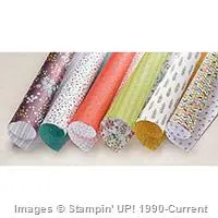
- Manipulating the Paper. This card features two beautiful pieces of Wildflower Fields Designer Series Paper, a versatile pack of papers that you can earn during Sale-a-Bration (through March 31) for a $50 purchase. If you like these pages, you’ll love the others. Check them out here:
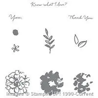
 Incidentally, this sentiment is also part of a stamp set exclusive to Sale-a-Bration – What I Love.
  As I mentioned, the design of this card is really pretty simple – I am excited to share with you the ways I’ve manipulated this paper to create the exact image I was looking for. All three manipulations involve Pear Pizzazz, a color that isn’t even included in this gorgeous pack of papers.
- Stampin’ Write Marker. The largest layer of Wildflower Designer Series Paper features Lost Lagoon, Whisper White and Basic Black. I used a Pear Pizzazz Stampin’ Write Marker to color in a few of the raindrops.
- Blender Pen and Classic Stampin’ Pad. The smaller panel of Wildflower Designer Series Paper is Basic Black and Whisper White when it comes out of the pack. I wanted to soften some of the dandelions, so I lightly colored them with a Blender Pen and Pear Pizzazz Classic Stampin’ Pad. A Stampin’ Write Marker would have given me a full concentration of ink, but the Blender Pen allowed me to lighten the coverage.
- Extended Tag. This gorgeous sentiment from What I Love would not fit inside a normal punch of the Washi Label punch, so I cropped a 1/2″ strip of Pear Pizzazz cardstock, stamped the sentiment and then cropped the edges by sliding the piece of cardstock into the punch. I shared this trick some time back – you can read more about how that works here.
- Simple Layout. When I first designed this card and laid out all the panels on my craft table, the plan was to center these panels and offset the sentiment (like it’s shown on the final card). I liked it but feared it was too boring. Once I had the adhesive on the back of the front panel, I quickly decided to glue the panel in the lower, left corner of the card. So happy with that decision. It made all the difference in my final project.
- Color Combination. I get it – this color combination isn’t quite the set of colors you’d expect from a card that represents “love.” Still, I adore the combination of the dusty Lost Lagoon and the dusty Pear Pizzazz. Combine them with Basic Black and Whisper White, and I think you’ve got a color set that anyone is sure to love.


Stamp Sets: What I Love Papers: Pear Pizzazz, Basic Black, Wildflower Fields Designer Series Paper Inks: Pear Pizzazz, Archival Basic Black, Stampin’ Write Marker (Pear Pizzazz) Accessories: Washi Label punch, Blender Pen, Stampin’ Dimensionals
Built for Free Using: My Stampin Blog
I hope you’ll pop over to the Global Design Project site to see the cards by the design team members and to play along with this week’s challenge.
Thanks for stopping by today!
Brian

 What is Sale-a-Bration? Do you want to learn more about the huge benefits of Stampin’ Up!’s Annual Sales Event? I’ve created a blog page to explain it all – click here to learn more.
 Weekly Deals. Stampin’ Up! releases new Weekly Deals every Tuesday – some of your favorite products at a discount for one week only (or while supplies last). To check out this week’s deals, click here.


I love this card, Brian! It has such a clean, modern feel to it. Great job!
Wonderful! Love how you have used the Wildflower Fields paper – it looks so different to when you look at the pack as an entirety. One of your gorgeous clean, layered cards Brian. Tops.
Brian, as usual, a fabulous color combination. That’s a keeper, Thanks! Have a great day.
Love this!
Fab card, Brian! Love the colours, too! And those papers…yummy!
Great job, Brian. TFS 🙂
Love the card. I think I like your second choice for the inside: DSP, colors, etc., any of us could totally relate if we received a card with that sentiment!
I would have never come up with these two pattern papers, it truly works, great job.
Hi Brian:
Using the black as backing for the panels makes this card a WOW card. I think without the black backing the beauty of the DSP’s would have been lost. You did a fantastic job with this one (as usual). Have a wonderful day my friend.
Love, love, love this card!
Great, Brian! Those DSP’s together are great. For sure a WOW!
I really love how you combined the small scale and simplicity of these two patterns.
Wonderfully simple and gorgeous Brian! I love that you colored some of the raindrops and flowers.
Loving the color choice today Brian!
The offset layer is striking Brian. Love the little subtle pops of colour. Pear Pizzazz and Lost Lagoon go so well together! Thank you. xx
You do have a way with color and Designer Series Paper. This card proves it. I love the combination and the simple layout displays the papers beautifully.
I love how you use DSP Brian! You always make it work so well together! 🙂
The colours are so lovely together and it’s great to see the gorgeous dsp used in your card x
I just love your use of DSP every week Brian. I am one of those silly people that just can’t work out how to use it! Another King masterpiece xox
You just always seem to make me smile! I love this card so :>
Such a great card, Brian! I also like quick and easy cards. And I like your combi of colors and DSP!
Many greetings from Austria!
Claudia
Great use of non traditional colours of “love”.