I hopped right to Easter for this week’s Pals Paper Arts color challenge. Lynn Hoyt is this week’s Featured Designer at PPA, and she chose Pear Pizzazz, Blushing Bride and Night of Navy for this week’s challenge. Love it! I drew inspiration from Lynn and Stampin’ Up!’s Annual Catalog to finish my Springy card. Here’s my card:
And here’s the banner for the challenge that inspired my card:
Tips, Tricks and Reminders
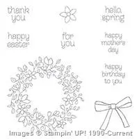
- From a Wreath to a Beautiful Arrangement. The sweet spray of flowers behind the focal sentiment is actually a wreath from Circle of Spring, a stamp set that was introduced in the 2016 Annual Catalog. The wreath, bow and flower all coordinate with the Wondrous Wreath Framelits. Yay! This set may have been overlooked because we were just past Spring when the set arrived – if you don’t have it, this is the best time to add it to your collection. Great sentiments, too!
- Additional Green Space. As I was sitting down to assemble all the components of my card, I had everything matted, framed and centered on my card front. With all the pink and blue, though, I needed some more green. Argh. What to do, what to do?! I decided to add a little panel of Pear Pizzazz cardstock (3″ x 4″) beneath the main layer to create two little tabs on either side of the middle square. Not only does this add color, but the panel helps to ground the center square. It’s a two-fer. Yay!
- Borders Abound. The Night of Navy borders around the square elements of this card were defined by the border around the circle in the middle. While I typically go for thin, tiny frames, but the 1/4″ difference between the two circles creates a thicker border that I repeated on the other two Night of Navy elements. The consistent framing creates a repetition that’s (in my opinion) pleasing to the eye. Here’s a recap of all the measurements of this card:

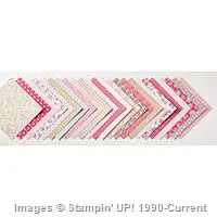
Stamp Sets: Circle of Spring Papers: Love Blossoms Designer Series Paper Stack, Night of Navy, Pear Pizzazz, Whisper White Inks: Archival Basic Black, Night of Navy, Stampin’ Write Markers (Pear Pizzazz, Blushing Bride) Accessories: 1-1/2″ Circle punch, 1-3/4″ Circle punch, Stampin’ Dimensionals
I hope you’ll pop over to the Pals Paper Arts site to see the cards by the design team members and to play along with this week’s challenge.
Thanks for stopping by today!
Brian







Oh Brian, what a lovely, fresh and sweet Easter card!! Love all the layers and the soft colors, the square shape really frames this beautiful Spring wreath beautifully.
Thank you for sharing.
Thanks, Maria! I had a lot of fun with these soft, Springy colors. Glad you like the card.
Thanks Brian, found a card to CASE for my Easter/spring card class! Love the little touch of Pear Pizzazz!
Yay! Happy to make things easier for you, my friend.
Sweet details, perfect balance and simple and pretty coloring!
Thanks, Mary. You are the best!
Brian, I agree with everything Maria Said. It is such a sweet, pretty card. Love the spring wreath that could be colored differently to go with other seasons as well…IMO. Have a great day.
Thanks, HJ. Glad you like it!
Love the spring wreath peeking around the sentiment, Brian… well done!
Thanks, Katy! These flowers and leaves are quite beautiful – it was really no work on my part. 🙂
Good Morning Brian:
I have been patiently waiting to see some Easter cards that didn’t have bunnies in them and here you go fulfilling my wishes! LOL I shouldn’t be surprised as you always seem to make the most beautiful and appropriate cards. Now, I’m not saying bunnies at Easter are inappropriate I’m just saying that occasionally they are overdone. Love this card Brian. Wishing you a Terrific Thursday.
There are SO MANY options for Easter that don’t include chicks and bunnies. I have a couple more ideas up my sleeve and will be sharing them soon. Thanks, Grace.
Love how you used the wreath behind the sentiment! Pretty card!
Thanks, Linda! I always love your feedback.
I’m in love all over again!! Every day every card!!!!!! This is Beautiful? Such a creative way to use the wreath!!! Love that you added the green panel just showing on two sides. What a great last minute addition!!!!
Thanks, Jennifer. That panel makes quite a difference in the overall appeal of the card – glad you like it.
Brian-I enjoy seeing the beautiful cards you make. I especially love your “new” page. I can click on the email and it instantly changes to your page.
And thank you for showing us the names of colors you used and the sizes of paper used to make the cards. So helpful to those of us that like to make cards but are mathematically challenged.
Thanks, Kathy! I won’t always include the graphic with the sizes or products, but I’ll add it frequently. Glad you like it! 🙂
Brian, you have such a great style all your own. I love this card, love the layering and especially love the circles with sentiment! Gives the wreath a whole different look.
Thanks, Lynn! I love your color combination – great inspiration!
Love this color combination, love square cards and love this design…you are the king of layering Brian!
Great card today, Brian. Very nice interpretation. Thanks for the tip on framing and the little side panel technique.
Glad to share, Sharon. Glad you like it!
I love Navy and Pink, the green really is the ticket for balance! Wow
Thanks – I agree that blue and pink are always lovely together. The green helps keep it grounded.
Georgeous Brian! Hats off to you and your precise coloring.
Guess I was thinking of Gorgeous George when I wrote that. LOL!
Tee hee. Thanks, Rae!
Thank you for sharing the measurements on your sweet card.
I’m happy to share – especially when they are precise and easy to measure.
I love how you put a circle in the middle of the wreath. It totally changes the look. The wreath is pretty, but your new look is amazing!
Thanks, Barb. I love the “explosion of flowers” that seems to come from behind the sentiment. Just a different way to look at the wreath. :0 Glad you like it.
I like your card ! Pretty and delicate . I have to go now because I have to rip the bunnies off my just made Easter cards !!
Love the card! I also love the recap of the card with measurements, DSP names, colors, etc. Now to go get the set out and make this card. Thanks for sharing!
Thanks, Denise! I love that I can offer those additional graphics – glad you like them.
Hi Brian,
Could you tell us about thick whisper white vs. regular whisper white? Is one smoother? What do you like to use? Is one better for stamping? Thanks, Mary
Thanks for your question, Mary. The Thick Whisper White is 100# paper, colored cardstock is 80# and Whisper White is much lighter than that. In essence, the Thick Whisper White can be used for a solid base on a card and for popping up and layer with Stampin’ Dimensionals if you don’t want to layer it with cardstock (to pop up a sentiment in a circle, for example). It’s thick enough to not get destroyed in the mail if popped up. The finish on the Thick Whisper White is the same as Whisper White, so you get the same results from stamping (although it can withstand a bit more with light watercoloring). If you haven’t tried Thick Whisper White, you should definitely give it a try. I love it. I hope that helps.
Fabulous card, Brian! I love that you made such a sweet Easter card! I had forgotten that this stamp set has a ‘happy easter’ sentiment. I love the added green panel, and it really does ground the square. Simply sweet with a lot of pop!
Thanks, Jackie! The colors led me to this. 🙂
Beautiful card, Brian! I still have not inked up this set. Thank you for the inspiration!
Simply beautiful Brian, awesome job. I love how you used these colors.
Stunning Brian. The layers and the star of the show, your beautiful wreath. I truly don’t know how you do it all. Amazing!
Such a nice card Brian! Love the panel of Pear Pizzaz panel peeking out. You are a master of layers 🙂