


In last week’s Brian’s Bulletin, my twice-a-month newsletter, I shared a simple chart with suggested border and frame sizes that can easily turn a simple card into a “wow” card. I’m using similar sizes to frame the simple image on today’s card. Here’s my card:

Tips, Tricks and Reminders
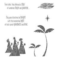
- Wise Men from Afar bring Good Tidings. I grew up with two brothers – the three Kings were always a simple choice for the annual nativity at church. I guess it’s natural, then, for me to be drawn to a stamp set that showcases the three kings. I adore the styling of this new Wise Men from Afar stamp set – I love the design of the three kings and the fonts used for the sentiments. Such a great set! Here’s a look at Wise Men from Afar:

Wise Men from Afar, Stampin’ Up!
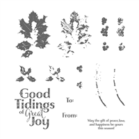
While I really like those sentiments, I really want ed to include this gorgeous “Good Tidings of Great Joy” sentiment from Good Tidings. I thought the solid letters with open dots inside would look great with the solid images of the three wise men and the designs on their robes. Together, they are a perfect pair. Here’s a look at Good Tidings:

Good Tidings, Stampin’ Up!
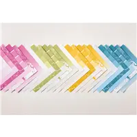
- Color Theory Designer Series Paper Stack. From the moment I first saw the Color Theory Designer Series Paper Stack, I was in love. My eyes popped out of my skull, and my tongue rolled out of my mouth like a huge fruit roll-up. Aaaa-oooga! I love the four colors featured in this gorgeous paper, and I love the various shades of each. While you COULD create your own shaded background for your own card, but you don’t have to do all that work when you have this stack of paper. Here’s a look at Color Theory:

- Simple Layers. I am happy with how this card turned out. I think it’s the simple layout that makes it so striking. Isn’t that odd? Here are the measurements for the layers on my card (from the card front base and working my way up):
- Dapper Denim – 4-1/4″ x 5-1/2″
- Whisper White – 4″ x 5-1/4″
- Basic Black – 3-3/8″ x 4-5/8″
- Color Theory Designer Series Paper – 3-1/4″ x 4-1/2″
Stamp Sets: Wise Men from Afar, Good Tidings Papers: Color Theory Designer Series Paper Stack, Dapper Denim, Whisper White Inks: Archival Basic Black Accessories: Stampin’ Dimensionals


Brian

Last Day to Sign Up! I posted my shares and swatch books from Stampin’ Up!’s 2017 Holiday Catalog last week! What a great way to get a little bit of a lot of things in this amazing catalog! Today is the last day to sign up so that I can include you in the first order on Friday. Sign up now to make sure you are a part of the shares! To read more about my shares, please click here.


Good morning Brian,
Great card. I just joined your news letter. Will I be able to have access to your previous newsletters? I am interested in the frame sizes.
Thank you and have a great day.
Thanks, Lesa! I’m pretty sure you can see past issues of the newsletter when the next newsletter arrives. If not, please let me know. Thanks so much!
On the whisper white layer you listed 5 1/5″, was that a typo? If not, how did you get the 1/5? Love the card. TFS
Hi Dianne, Yes! Thanks for pointing it out. The white layers is 4″ x 5-1/4″.
Another typo, the black can’t be 3-1/8″ if the Color Theory DSP is 3-1/4″. Is the black 3-3/8″?
Gah! This is why I don’t like to give measurements – I’m not very good at it. I mostly just cut into the paper until it looks good. Thanks, Nancy!
An absolutely brilliant combination of the wise men and classy holiday sentiment!
Thanks, Mary! I was in love with both and thrilled that they worked so well together. <3
Another super card! I love the faded look paper and the images are wonderful.
Thanks, Jackie! I can’t get enough of this paper – love it! I appreciate your comments.
I really like your use of the blue with this scene . I have not used my Color Theory selections of dsp yet . I have been inspired to pull it out !
That is another good reason to do the Paper Shares ….I HAVE SOME OF THAT BLUE ! PRETTY CARD !
Thanks, Sonny! Go ahead and pull out the paper from the shares. You’ll definitely want to buy more of this paper. The blues are my favorite in the collection. <3
What a wonderful use of that Color Theory DSP! A perfect card all the way around – I love it!! (ps – Fruit Roll-Up’s will never be the same for me?)
Thanks so much, Elisha! You may be the first person to read through that part of my post – at your definitely the first to comment on it. 🙂 I appreciate your comments.
OH my gosh!! This card is simply GORGEOUS!!! The lovely blue gradation of this paper is just the perfect background for this elegant and beautiful image of the Three Kings.
Another stunner Holiday card Brian, thank you for the inspiration.
XO
Maria.
Thanks so much, Maria! The paper and stamps did all the work on this card. 🙂 I appreciate your comments.
Three Kings, I get it. Card is stunning, I love the way you used the DSP. Always something to learn here.
Thank you so much, Dianne! I had big ideas for this card, but I decided it didn’t need much more. I appreciate your kind words.
Three Kings and Mother Mary – How perfect can a family get!!! So from the start the King family boys were comedians – you guys should have gone on the road with that and made your Mom rich! LOL Anywhooooo – getting back to your card – it is knock down gorgeous and I cannot imagine a more beautiful or appropriate Christmas card. The color combination is outstanding and definitely puts the emphasis on the three Kings. I love, love, love it Brian. Thank you so much for sharing your genius with us every day! It is appreciated more then you will ever know.
Mom definitely had her hands full (and, on some levels, still does). Thanks so much for your sweet feedback, Grace! Always nice to hear from you. <3
Stunning! Love the silhouettes on that paper.
Thanks, Candy! Such a simple way to achieve a beautiful result. <3
Wow! Such absolutely wonderful card stating the reason for the season. Thank you. I hope you don’t mind if I CAS.
Germaine – I would LOVE for you to CASE it. Thanks so much for your kind comments. I appreciate them.
Beautiful Christmas card with a great message. TFS
Thank you so much for your comment, Barbara. I’m so glad you like this card.
This is such a awesome card!!! I love the combination of the wise men and that large sentiment. The styles are perfect together, but then you already know that ? totally georgious ❤?
Thanks so much, Jennifer! I really appreciate it. I’m so glad you like this card and the combo of sentiment and image. <3
Great card…just gorgeous. Love the memory of The Three Kings…
Thank you so much, Sandra! This paper is certainly a favorite of mine – and these images are gorgeous. Thanks for your comments.
Wow, this Color Theory paper is an excellent background for large sentiments. Talking about making it pop! I better get busy.
Thanks Brian
I totally agree, Katrina! You could spend a lot of time shading a piece of paper with ink, or just get this paper. 🙂 Have fun!
Brian, this is just a super cool card! I just bought both of these sets and I too, am in love with the 3 Kings, as well as the Good Tidings. What a perfect match, to use them together. I have to CASE you…you’re SUCH a great leader! Hugs my friend
Thanks so much, Bobbi! I’m so glad you like this pairing. Feel free to CASE away! <3
Perfect mix of these two sets and paper! Love the card!
Thanks so much, Windy! It’s always nice when that happens. <3
This card is stunning!
Thanks so much, Carrie! I appreciate your kind comment.
The Color Theoryakes the perfect background and I love the sentiment. I think I watched too many Disney movies because the stamp set reminds me of Aladdin. However I think your card is stunning.
Thanks, Robbye! I love the styling of this set – very bold. I don’t see the connection to Aladdin, but I’ve only seen it once. I’m glad you still like the card. 🙂
Such a pretty card….I love both of these sets…..why don’t I have them?
Thanks, Linda! I can’t tell you why you don’t have the sets, but I can give you some reasons to get them (if you want). 🙂