


Yesterday’s project for this week’s Global Design Project Sketch Challenge features one of my favorite patterns from Pick a Pattern Designer Series Paper. If you missed it, you can see it here. Today’s sweet and simple project features another favorite from this pack of papers. Here’s my card:

Tips, Tricks and Reminders
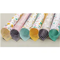
- I Love Pick a Pattern. When I think of love, I think of Crushed Curry. No. Not really – but look how wonderful it looks with Flirty Flamingo. While this page of paper only showcases Crushed Curry, Whisper White and Basic Black, I saw how well Flirty Flamingo coordinated, so I colored some of the circles with a Stampin’ Write Marker. Such fun! It really gives this paper a different look. I showcased this card during my World Card Making Day event to showcase how easy it is to transform Designer Series Paper patterns. Here’s a look at the patterns and colors in this pack of papers:
 Pick a Pattern Designer Series Paper is one of the papers that’s on sale in October (buy 3, get 1 free) – you don’t want to miss this deal! What fun! Click this banner to see all the papers that are a part of this special:
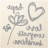
- Sunshine Wishes Thinlits. This is the second time in the past two weeks that I’ve shared a project with the Sunshine Wishes Thinlits (you can see the last project here). They might feel a little “old-hat” by now (they’ve been around for more than a year now), but these dies are as fresh and fun as they were when we first saw them. I’ve asked Stampin’ Up! to offer every word in the dictionary with this font, but I’m not sure my wishes are being recognized. Here’s a look at this wonderful set of dies:

Sunshine Wishes Thinlits, Stampin’ Up!
- Unique Color Combination. If it weren’t for this pack of paper, I don’t know that I ever would have paired Flirty Flamingo with Crushed Curry. The two are almost so diametrically opposed that they look wonderful together. This combination was a risk that paid off. If you like this combination, please save this:
 Want to see more great color suggestions to use with this paper? Click here.


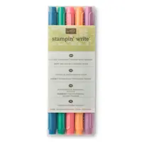
Papers: Pick a Pattern Designer Series Paper, Flirty Flamingo, Basic Black Inks: Stampin’ Write Marker (Flirty Flamingo) Accessories: Sunshine Wishes Thinlits Dies, Precision Base Plate, Stampin’ Dimensionals

How sweet is this card?! It’s so simple, but I love the combination of colors so very much.
Thanks for stopping by today!
Brian

One-for-One Card Swap. The cards are pouring in for my 2017 Holiday One-for-One Swap. I love opening up the mailbox each day to see what you’ve created – but the deadline is soon approaching, so please get your card in the mail to me soon. For information about the swap and how you can participate, please click here or on the picture below:

Designer Series Paper Sale. Who doesn’t love a Buy 3, Get 1 free promotion? You don’t want to miss Stampin’ Up!’s sale – going on until the end of October! What fun! Click this banner to see all the papers that are a part of this special:


Ohh!! what a happy, cheerful card, made my heart happy as soon as I saw it.
I would never put those colors together but they look wonderful.
Thank you for sharing that color combination chart, they help a lot.
XO
Maria.
Thank you so much, Maria! I pulled these colors from the other pages of this paper – I can’t really take credit. I love them together, too. It feels so right and yet so wrong. 🙂
This card is so cute! You’re right about pairing those colors- not a likely combination, but once again- it works !!!
Thanks so much, Rene! This color combination is a big shocker – I would have NEVER put them together without that little push from Stampin’ Up!. Glad you like it.
This is super cute! I have to remember to color the DSP.
I have to steer clear of it so as to not overdo it. 🙂 Thanks, Jackie!
I love the simplicity of this card. Coloring the DSP adds another element of ‘zing’ to your wonderful card.
Thank you so much, Lisa! I appreciate your comments! <3
I love how you made the DSP your own by adding the pink, genious! The Flirty Flamingo looks great with the Crushed Curry. Great card!
Thanks so much, Traci! It’s a super-fun color combo, huh? Who’da thunk it? Glad you like it!
I LOVE how cohesive it looks with the touch of pink on the DSP!
Thanks, Mary! You are catching up on episodes of Project Runway, aren’t you? 🙂
I seem to always focus on the color combinations and this one is a hit. I’m with you on the thinlits too! Bring them on!
Yay! I’m going to continue to push for a dictionary of these dies. 🙂 Thanks for your comments, Dianne!
Brian – you are a dog gone genius! You pulled it all together with a marker. Need I say more? Love it!
Tee hee! Your comments always make me smile. Thanks, Grace! <3
Brian I agree, I would not have thought to put these colors together, however; Black (the beautiful neutral that it is) makes colors connect!
AND, adding in spots of color on the DSP… Perfect!
Thanks so much, Katrina! You always know just what to say. I appreciate your comments!
Great color palette, love how you used Sushine Wishes thinlits. All in all awesome card. Great job Brian.
🙂 Thanks so much, Robbye! I always love to hear from you.
Ooooooh yes that’s a lovely, love card my friend ♥️
Hugs Frenchie ♥️
Thanks, my friend! <3
Love your creative swagger in coloring the dsp. I think getting the “Paper Shares ” helps me decide what I want to get more of to play with and since you introduced “Coloring On DSP ” by Brian …..well I just gotta get more to experiment with colors like you do !!!
It’s so much fun, Sonny! As long as there is white space, I’m trying to figure out how to color it. 🙂