


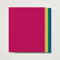
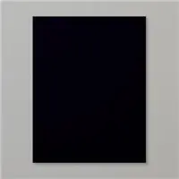
This week’s “Show Me the Sunshine” theme at the Global Design Project challenge had me reaching for yellow. What a perfect opportunity to break into my 2018-2020 In Colors cardstock pack! A panel of Pineapple Punch really brings the sunshine for this sweet card. Here’s my card for this week’s GDP challenge:
 And here’s the banner for the GDP challenge that inspired my card:
 Tips, Tricks and Reminders
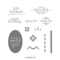
- Two Sneak Peeks. Not only does this card feature that bold, bright panel of Pineapple Punch (I’m SO going to love this color!), but it features a lovely sentiment from a great, new stamp set called Detailed with Love that demonstrators who attended OnStage were able to pre-order. Yay! Here’s a look at this sweet, new stamp set:
 How beautiful are these sentiments?! And here’s another look at Pineapple Punch:
  That color really packs a punch, don’t you think? [pun intentional] I introduced the new In Colors in a post last weekend – you can see it here.
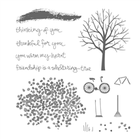
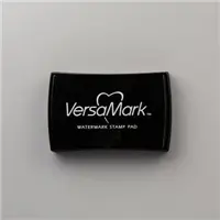
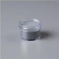
 - All that Shine. You might not be able to tell from the first picture of this card, but the “splattering” above the sentiment is stamped in VersaMark and heat embossed with Silver Embossing Powder. My original idea was to just stamp with Pineapple Punch, but the silver really adds something special here. I stamped the image of leaves from Sheltering Tree, masking the bottom of the card base below the band. I love the effect they give on this bright yellow panel. Here’s a look at the shine:
 And here’s a look at Sheltering Tree – I’ve used those leaves on more cards for texture than I have used them for leaves:
- Color Combination. There’s something really special about the combination of yellow and gray. I’ve often times paired Daffodil Delight with grays, so I thought it would certainly work with Pineapple Punch. I LOVE the outcome. If you are inspired by this combination of Pineapple Punch, Smoky Slate and Basic Gray, please save this:


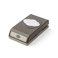
Stamp Sets: Detailed with Love, Sheltering Tree Papers: Pineapple Punch, Smoky Slate, Basic Gray, Basic Black, Thick Whisper White Inks: Archival Basic Black, VersaMark Accessories: Pretty Label Punch, Silver Stampin’ Emboss Powder, Heat Tool, Stampin’ Dimensionals

I hope you’ll pop over to the Global Design Project site to see the cards by the design team members and to play along with this week’s challenge.
Thanks for stopping by today!
Brian

Don’t miss out! You can also check out all the retiring items by clicking below to review the retiring items in my online store.
 The Clearance Rack is Restocked. Stampin’ Up! has replenished the items in the Clearance Rack at reduced prices up to 60% off! These items are offered on a while-supplies-last basis, so pop in and grab up your favorites today! Click below to see all of the items that are still in the Clearance Rack:
![]()


What a great way to use the Sheltering Tree Stamp Set. Love that bright pop of yellow!
Thanks, Dawn! I had fun with it. I have a feeling Pineapple Punch will work its way into our hearts just like Lemon Lime Twist did. It’s a standout, bright color but so fun to work with.
Brian…sunshine in deed, the pineapple punch is so bright, bold and beautiful! They greys shows it off, with the touch of black, great card!
Thanks so much, Katrina! Gray is such a great supporting player for yellow. It helps to tone it down a bit while also helping it to shine a bit. <3 Glad you like this card.
Love your clever use of the Sheltering Tree stamp, Brian. The Pineapple Punch yellow really brightens the card with the grays and black. Great card! Enjoy your day!
Thanks so much, HJ! I really enjoyed playing with this bright, bold yellow. Lots of fun to be had with this new shade! Glad you like it!
Gray is the perfect and modern complement to this beautiful yellow. Love the silver embossed background!
Thanks so much, Mary! I’m so happy you like it. The card went through several iterations before I landed on this combination. <3
Wow with the Pineapple Punch and grays! Sweet card!
🙂 Thanks so much, Windy! I’m so happy we have this new shade – I would have said, “we don’t need a brighter yellow,” but I would have been wrong. Glad you like it. <3
I love the combination of yellow and grays, Brian! Can’t wait to get my hands on these new papers – so excited!
They are truly wonderful, Karen! This yellow does not disappoint. 🙂 Glad you like the color combo!
The yellow is BIG in advertising . It is lively and happy ! Love this newbie !!
Great card !!
Thanks, Sonny! I agree with you on this color. It says, “Stop, and listen to what I want to say.” 🙂
I’m so anxious to get my hands on this Pineapple Yellow ink and paper! It looks like a “true” yellow with no tint like orange or red. I’m so happy to see you showing it off in all its glory Brian. Fabulous card.
I’ve always thought of Daffodil Delight as a bright yellow – until now. I can now see the difference. So glad you like it, Grace! <3
That Pineapple Punch is a knockout! I love the added silver embossing, the perfect finishing touch of brilliance!
Thanks so much, Nina! The silver seemed to coordinate with the Smoky Slate, so I gave it a shot. Happy with how it turned out. <3
Brian, I love this card! I’ve never considered myself a huge fan of the color yellow, but the moment that I saw Pineapple Punch, I was in love! Also, I ordered that Pretty Label Punch over a month ago, and apparently it’s still on backorder. Do you happen to know when they’ll be back in stock? Thanks!
Thanks, Rebecca! You should check with your demonstrator about your order – hopefully they’ll be able to help you out. <3
WOW! The Pineapple Punch and Silver Embossing is really a great combination. I’m thinking I’ll be seeing a lot of that in the year to come – from both of us!! Love it!
🙂 Thanks so much, Dianne! I had fun with it. <3
Love a yellow that packs a punch! Honestly, I read the headline and looked for a pineapple punch on your card. Ha! Always takes me a little while to get used to the new color names. 🙂
Ha! This yellow has “yellow” all over it – and I love it. Fun names, right?!