


I have been pondering this week’s CAS(E) This Sketch challenge layout for a while. How will I take this super-fun sketch and turn it into a super-fun card? I’ve tossed and turned. I’ve hemmed and hawed. I’ve gone back and forth. On Tuesday, it hit me and I knew exactly what I wanted to do. With inspiration from a fun Designer Series Paper, I created a fun, modern card. Here’s my card with this week’s sketch:
 And here’s the banner for the sketch challenge that inspired my card:
 Tips, Tricks and Reminders
- Thank U. The start of my card was this big “U” cropped with this page from the Best Route Designer Series Paper – this page features bold stripes of Pineapple Punch and Mango Melody – the the Large Letters Framelits Dies. I really wanted the bold stripes to stand out against the card front panel, so I popped it up against a Pool Party Panel.
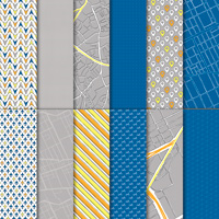
 How fun! Here’s a look at all of the colors and patterns in the Best Route Designer Series Paper – such a great collection of fun pages and colors:
  I masked one of the sentiments from One Big Meaning to get this modern “THANK” to go perfectly with the “U”. I guess I love One Big Meaning so much that I never moved it off my “current stamp sets” shelf. The fact that it’s retired doesn’t make it any less of a great set.
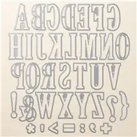
 - Large Letters Framelits Dies. The Large Letters Framelits Dies were amazing when they were first released a couple of years ago, but they gained new life when the Eclipse Technique made its rounds last year – everyone was making them, and everyone was loving them. You can see one of my Eclipse Technique projects here. The Large Letters Framelits Dies are a perfect size for card fronts or scrapbooks, so this is a must-have set of dies. I cropped the “U” to resolve the “thank” on this card – it’s a fun, modern way to show gratitude, don’t you think? If you don’t have them, you want them – you won’t regret it. Here’s a look at the Large Letters Framelits Dies:

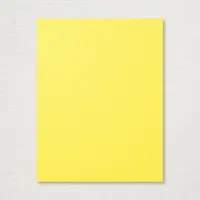
- Two Color Combinations. I’m sharing two color combinations today that were inspired by this card. The top panel showcases three colors that look great together. If you are a fan of the bright Pineapple Punch and Mango Melody with the soft Pool Party, please save this:
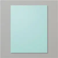
 I wanted to “tone down” all the brightness” a bit so I layered some Whisper White behind the focal panel and add all of that to a Crumb Cake panel. The warmness of Crumb Cake makes all the difference to me. If you love the bright Pineapple Punch with the soft Pool Party and the warm Crumb Cake, please save this:


Stamp Sets: One Big Meaning (retired) Papers: Best Route Designer Series Paper, Crumb Cake, Pool Party, Pineapple Punch, Basic Black, Whisper White Inks: Basic Black Accessories: Large Letters Framelits Dies, Stampin’ Dimensionals
I hope you’ll pop over to the CAS(E) This Sketch site to see the cards by the design team members and to play along with this week’s challenge.
Thanks for stopping by today!
Brian

 Between July 1 and July 31, Stampin’ Up! is hosting an amazing promotion where you can get one pack of select papers when you buy three packs of select papers.
 To help expand our family and create opportunities for even more meaningful relationships with fellow crafters, Stampin’ Up! is giving us a Stampin’ Pad Family Recruiting Promotion. During this promotion, new team members will receive a FREE assortment of Classic Stampin’ Pads (your choice!) with your Starter Kit!


This is fabulous! Wonderful colors and oh so creative! Love it!
Thanks so much, Linda! I played with several colors before finding Pool Party for that backdrop. Glad you like it! <3
I’m impressed by your display of vocabulary in the first paragraph but more impressed by the terrific, colorful, card. And yes, the Crumb Cake was the perfect contrast.
Ha! Thanks, Dianne! I had fun with this card. The colors are so happy. Glad you like it. <3
Love, love the pattern paper you used for your design, this fabulous letter really stands out beautifully.
Thank you for sharing.
XO
Maria.
Thanks so much, Maria! I had loads of fun with this one. <3 Thanks for your comments. <3
Modern in deed, I’ll take “Thank U” in any style. “Thank You”, is the most kindness sentiment there is!
Thanks so much, Katrina! <3
Love this card, Brian. I love using the large alphabet letters. It is an easy way to get a big impact. Love that DSP for the pop! Great job! Enjoy your day. (I hope this comment works.)
Thanks so much, HJ! I really wanted a bold pop for the “U” – this design gave me just that. 🙂
U never cease to amaze me with your creativity! I adore the splash of these colors!
Thanks, Mary! <3 I really enjoy this mix of colors.
U make everything look so easy, even a sketch like this! Fun card!
🙂 Thanks so much, Windy! It was a lot more fun than I thought it would be. <3
Don`t you just love it when you come up with FRESH AND CLEVER uses for another piece of your designer paper ? Wonderful things pop into your head when you PONDER !! (smile)
Cute card ! Love those big letters and look what you did with just one !!
Thanks so much, Sonny! I definitely had fun with this one – so happy to use this bold, graphic paper. This was a great way to use it. <3
All that tossing and turning and hemming and hawing paid off because you nailed that sketch Brian….SOoooo creative!!!!
Ha ha! Thanks so much, Dawn! So glad you like it. <3
Super neat and imaginative card today Brian! I love those big letters. HMMMMM – I’ll have to try an I heart U card for Valentine’s Day for the hubs. Thanks for bringing that idea into my brain with today’s card. I better write it down before I forget it. LOL Thanks Brian, you are always such an inspiration!
Such a great idea, Grace! I may have to use that idea, too – and will totally give you credit when I do. <3 Thanks for your fun comments. <3
The Large letters Framelits are some of my favorite dies, and I love the way you used them here. Love the bright pop of color with the pool party! Great card, Brian!
Thanks, Nina! I tried different colors as a backdrop to the “U” before finding that Pool Party was so great. I’m glad you appreciate that element, as well. <3
What a fun card! You are a clever one Brian King!
Thanks so much, Pam! <3 Glad you like it.
Fun card today and a great interpretation of the sketch! Awinner!!
Thank U, Sharon! I had fun with this card – I’m so glad you like it. <3
I love reading your blog as much as I love your cards. You hemmed and hawed. :o) Great take on the sketch. The “U” really, really pops on the Pool Party.
Thanks so much, Sue! I have just as much fun writing my posts as I do creating the cards. So glad you appreciate it. <3
Great masculine card and take on the sketch!
Thanks so much, Leigh! <3
Nice take on the sketch and a great man card.
Thanks, Cat! I had fun with this sketch – so glad you like the card. <3
I’m glad I’m not the only one who ponders, tosses and turns, and hems and haws when it comes to a design! Love how this turned out. The bold blend of colors plus the fun DSP make for one terrific card. That big “U” is a great design element. 🙂
Thanks so much, Jen! I really appreciate your compliments. This was a fun sketch that kept me guessing how I would create with it. Glad you like my project (and writeup). Thanks! <3
Wow…just wow! What a clever way to use the sketch! I love it!
Thanks so much for your comment, Melissa! I’m so glad you like the card – it’s a fun sketch. <3