


Sympathy cards are often the hardest cards to make for two reasons – (1) we are often filled with emotion and loss when making these cards in the moment and (2) it’s always difficult to find the right words to offer our condolences to those who’ve lost someone. Two suggestions for making this easier – make your cards early (have a stash of gorgeous sympathy cards on hand at all times) and rely on Stampin’ Up! for the words you want to say. Here’s a sympathy card I made for this week’s FabFriday sketch challenge:
 And here’s the banner for the FabFriday sketch challenge that goes live today:

Tips, Tricks and Reminders
- Petal Promenade Designer Series Paper. The foundation of this card is the gorgeous panel of Petal Promenade Designer Series Paper that gives a gorgeous texture and color to my card. There are so many gorgeous papers in this pack, but this is my favorite. It pulls in the right balance of pinks and greens – and that makes it easy to coordinate with Stampin’ Up! colors. These pages are perfect for sympathy, wedding or thank you cards. Here’s a look at the colors and patterns in the Petal Promenade Designer Series Paper:
 In the online store, you can see a closer look at each of the pages in the pack. Here’s a closer look at the front and back of the page I used in my card – I used the floral piece as the focal panel on my card and the bokeh piece on the opposite side for the outside frame and sentiment on my card:
 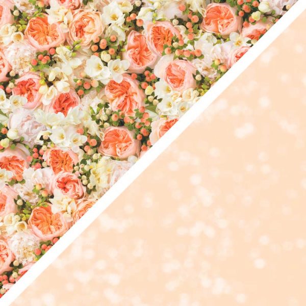 Do you ever wonder what goes on behind the scenes to create some of the gorgeous papers Stampin’ Up! offers? Here’s a fun video that gives you such a look:
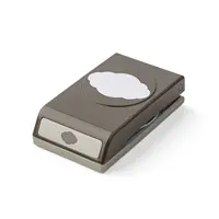
- Stamp Right on the Designer Series Paper. We don’t always think of it as an option, but I chose to stamp right on the Designer Series Paper for this card. Whisper White was too bright, so this Petal Pink bokeh design offered a lighter look. I layered a piece of cardstock behind the cropped sentiment (that was stamped with Mossy Meadow and punched with the Pretty Label punch) to add sturdiness to the popped up sentiment.

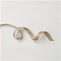
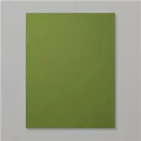
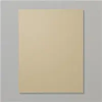
- Color Combination. I pulled the pink and green colors for this card right from the Petal Promenade Designer Series Paper. The softness of Petal Pink looks so great with the deepness and richness of Mossy Meadow. I love it! I added a Crumb Cake base and the touch of Crumb Cake ribbon for an additional, compliment to the others. If you like this combination of Petal Pink, Crumb Cake and Mossy Meadow, please save this:


Stamp Sets: Flourishing Phrases Papers: Petal Promenade Designer Series Paper, Crumb Cake, Mossy Meadow Inks: Mossy Meadow Accessories: Pretty Label punch, 3/8″ Classic Weave Ribbon (Crumb Cake), Stampin’ Dimensionals
I hope you’ll pop over to the Fab Friday site to see the cards by the design team members and to play along with this week’s challenge.
Thanks for stopping by today!
Brian

 Between July 1 and July 31, Stampin’ Up! is hosting an amazing promotion where you can get one pack of select papers when you buy three packs of select papers.
 To help expand our family and create opportunities for even more meaningful relationships with fellow crafters, Stampin’ Up! is giving us a Stampin’ Pad Family Recruiting Promotion. During this promotion, new team members will receive a FREE assortment of Classic Stampin’ Pads (your choice!) with your Starter Kit!


Beautiful card. And why don’t I remember to stamp on Designer Paper?
It wasn’t until the Whisper White was too bright that I thought to do it. 🙂 You aren’t alone in this. Thanks for your comment, Dianne! <3
This paper caught my eye right away. Going on my list of must haves! Beautiful card!
It’s a gorgeous pack of paper, Candy! The photos are so soft and sweet for a beautiful backdrop. Thanks, my friend!
So glad Mossy Meadow is back in the line up and love how you used it, the sentiment really pops. Gorgeous card Brian!
I can’t tell you how much I love Mossy Meadow – I picked this pattern because of the balance of green in it. The other pages are great, but I chose this one BECAUSE OF Mossy Meadow. 🙂 Thanks, Dawn.
This DSP is absolutely gorgeous and can be used for any occasion like you mentioned, weddings, birthdays, showers and even on sympathy and encouragement cards, it’s as beautiful as it is versatile.
Love the look of the sentiment stamped on the DSP, that is a great idea and your layers really enhance the beautiful design on this paper.
Thank you for sharing.
XO
Maria.
Thanks so much for your comments, Maria! It’s always lovely to hear from you. This paper is quite amazing! So glad you like it as much as I do. <3
Thanks for your words about sympathy cards. Sometimes they are really hard to make so it is a good idea to have several on hand at all times. The roses are beautiful and they are a good way to send “flowers” to a loved one.
Thanks for your comments, Evelyn! I’m happy to share my thoughts on card designs and card making (in general) – and I’m thrilled when I can help someone with theirs. We can easily make birthday cards or congrats cards in the moment, but sympathy cards are a must-have to stock up on. <3
Perfect idea to have sympathy cards ready to go! Love this beautiful paper and simple sentiment.
Thanks, Mary! I’m so happy you like the card. <3
Love this beautiful card using the gorgeous DSP. You’re right, we should have some sympathy cards in our stash, which would lighten the day when we need one. Love the sentiment. Your tip about stamping on DSP is great. Enjoy your day!
Yay! You’ve hit all the highlights of my post, HJ! I’m so glad you like what I shared – that’s important to me. I always appreciate your kind comments. <3
That video of making the designer paper made it look so easy but I hardly think it is. I’m glad we have the SU people to go through all the steps for us and then all we have to do is order it! LOL Your card is magnificent and so very comforting. I’m sure it would be uplifting for anyone who has suffered a loss. Great job Brian.
Thanks, my friend! I loved the video, too, and was excited to share it with y’all. Might not have learned anything from it that I can replicate, but it sure is interesting to see the behind-the-scenes about how the stuff we love is created.
Wonderful card esp with this DSP and great advice!
<3 Thanks so much, Windy! I really appreciate it and am glad you like it.
What a beautiful card, Brian! Sympathy cards are the hardest thing to make, so having them on hand is a great idea. This lovely DSP is perfect:)
Thanks so much, Nina! I’m so glad you like the card. This paper is pure perfection. <3
Love the card, do you share your measurements?
The card is beautiful! Can you provide dimensions for the DSP used?
Thank you so much, Megan. I’m so glad you like the card. Here are the measurements for the focal panels: the base is a standard 4-1/4″ x 11″ (scored at 5-1/2″), the pink DSP is 3-3/4″ x 5″, and the floral panel is 3″ x 4-1/4″. I hope that helps!