Last year, while we anticipated the reveal of the 2022-2024 In Colors, I pulled together a comprehensive list of Stampin’ Up!’s In Colors over the years, including a few fun facts about the In Colors (so many of our core colors were once an In Color). I’ve updated the list and the fun facts to include last year’s In Colors, this year’s In Colors and the color refresh that happened this year. Even if you enjoyed that post at the time, it’s worth another look after the refresh. What fun! I hope you enjoy it! ♥
I’m hosting a history lesson today.
So many of our favorite Stampin’ Up! colors started as In Colors. In yesterday’s post, I confessed I wasn’t sure if Pacific Point was, at any time, an In Color. That prompted me to do a little research about In Colors – and I’m sharing that with you today. I should have done my research before throwing that out there because (as you are about to see) Pacific Point started as an In Color.
What are In Colors?
Back in 2006, Stampin’ Up! added six colors to its color collection in the Annual Catalog. The In Colors offer colors that are trending in home décor, fashion, design, and crafting. For several years, Stampin’ Up! offered a collection of six In Colors each year. In 2010, the company offered five In Colors and announced that In Colors would be active for two years, alternating between years.
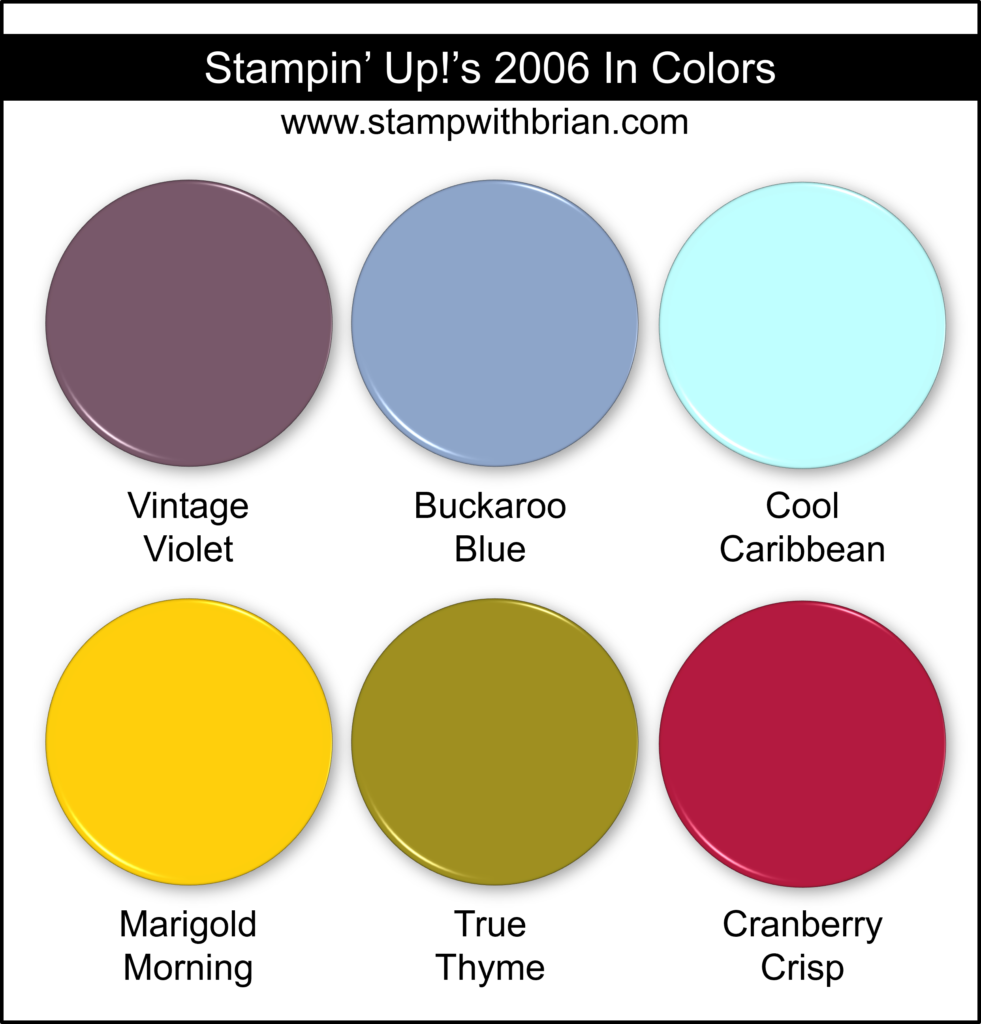
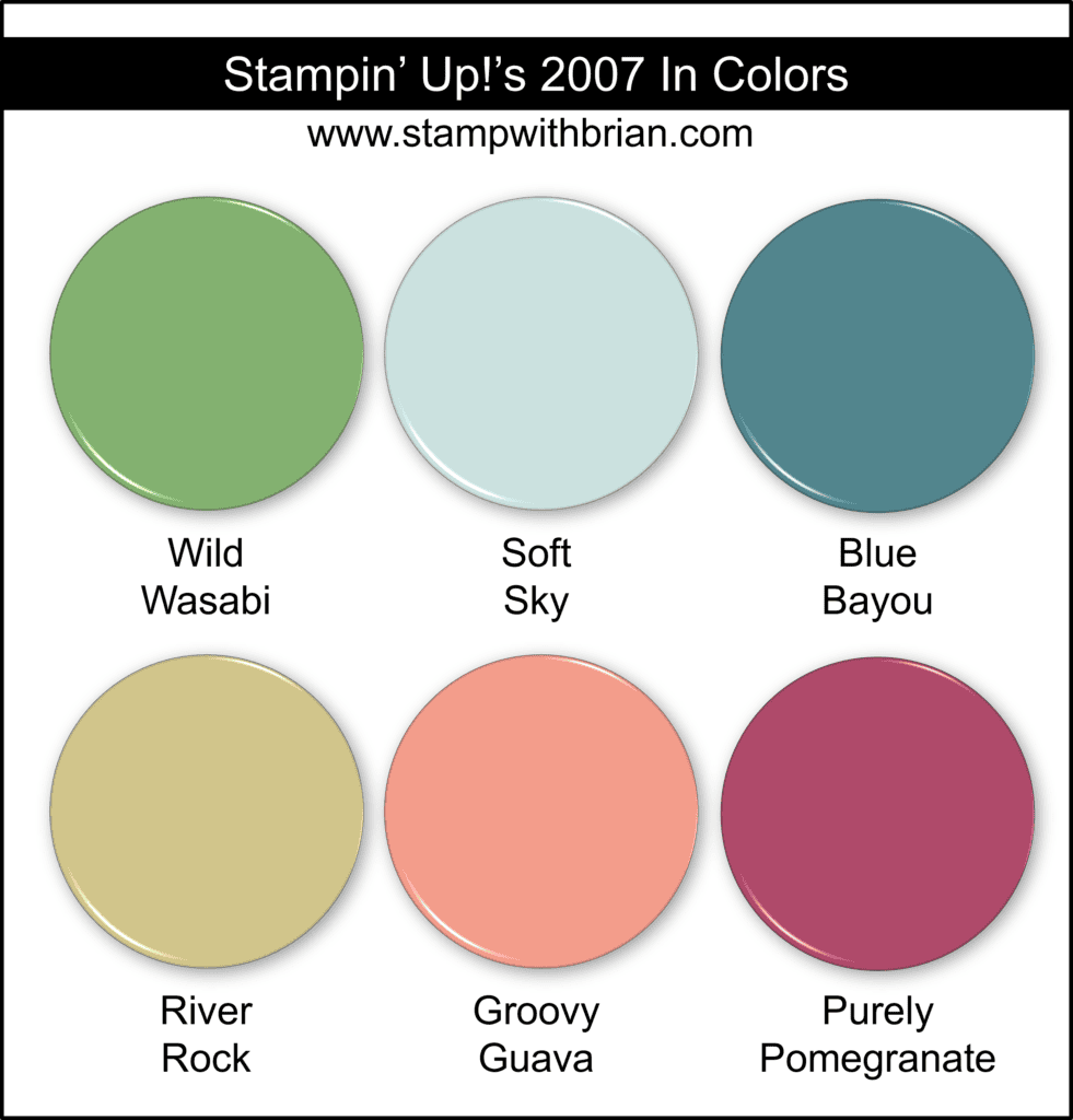
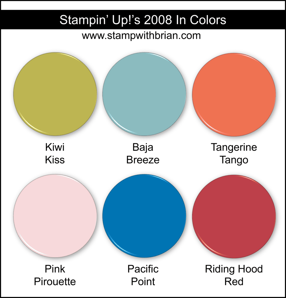
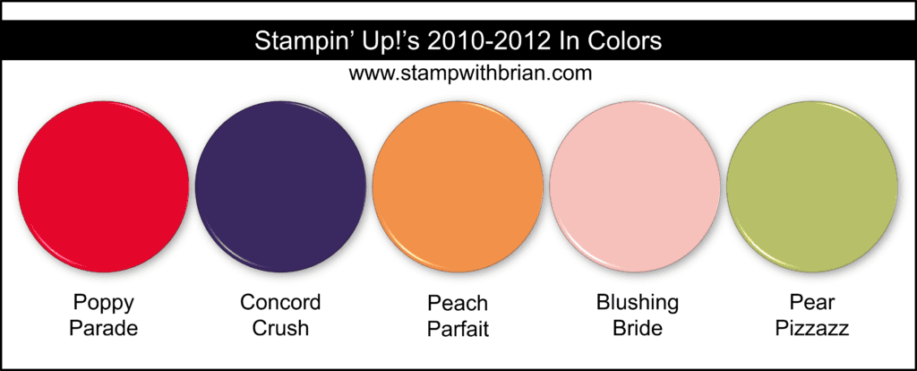
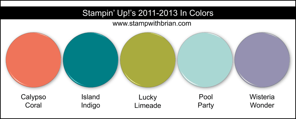
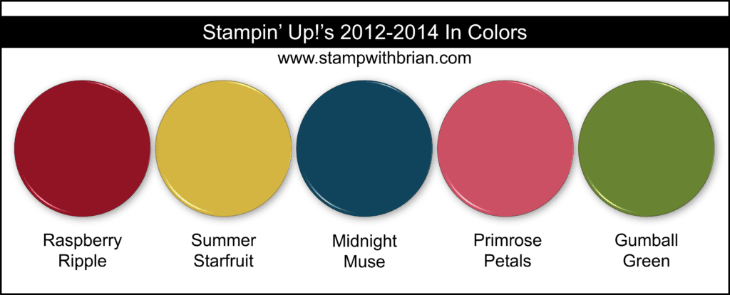
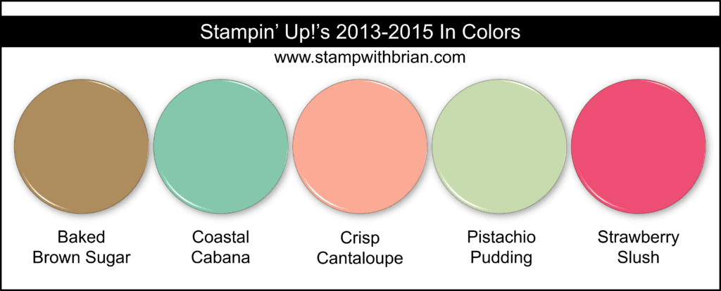
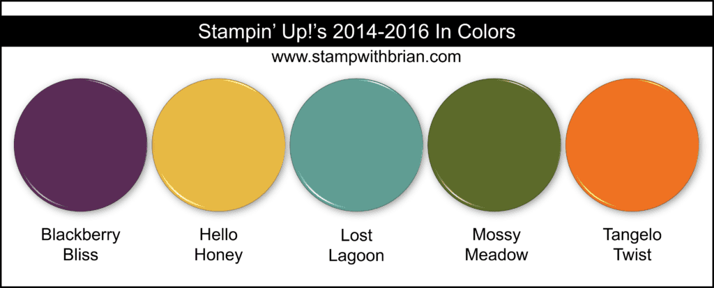
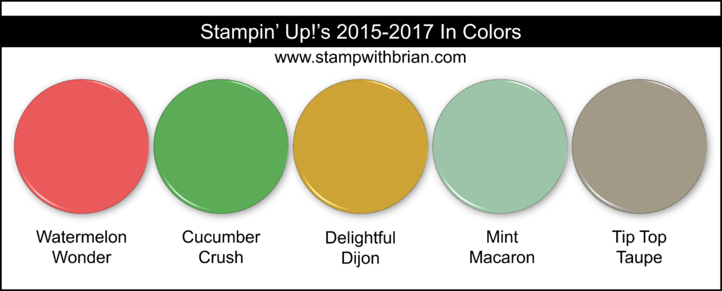
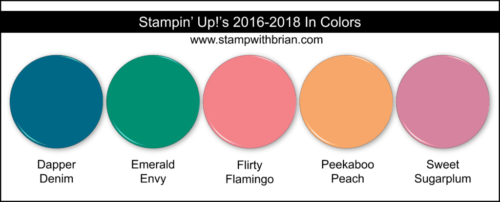
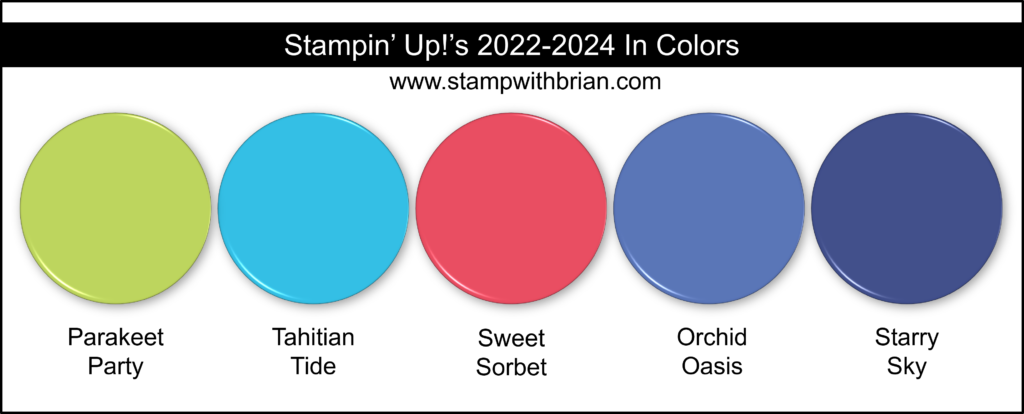
I’ve pulled together graphics of the In Colors from 2006 through the In Colors announced in 2023. What fun! While this will be a walk down memory lane for some, others will be enjoying new colors never seen before.
Here’s a look at each year’s collection of In Colors:
What do you think? Do you have some favorites in this amazing collection of colors?
Fun fact #1 – Sixteen colors in our current color families started as In Colors. Here are the collection colors that were introduced to us as In Colors:
- Crushed Curry (2009 In Color -> Regals)
- Melon Mambo (2009 In Color -> Brights)
- Poppy Parade (2010-2012 In Color -> Brights)
- Calypso Coral (2011-2013 In Color -> Subtles)
- Pool Party (2011-2013 In Color -> Subtles)
- Coastal Cabana (2013-2015 In Color -> Brights)
- Blackberry Bliss (2014-2016 In Color -> Neutrals)
- Mossy Meadow (2014-2016 In Color -> Neutrals)
- Lost Lagoon (2014-2016 In Color -> Subtles)
- Flirty Flamingo (2016-2018 In Color -> Brights)
- Lemon Lime Twist (2017-2019 In Color -> Brights)
- Berry Burst (2017-2019 In Color -> Brights)
- Blueberry Bushel (2018-2020 In Color -> Regals)
- Pretty Peacock (2019-2021 In Color -> Regals)
- Misty Moonlight (2020-2022 In Color -> Neutrals)
- Fresh Freesia (2021-2023 In Color -> Subtles)
Fun Fact #2 – Baja Breeze is the greatest In Color ever made.
I love to share great color inspiration – I hope you’ll come back for daily inspiration and color combinations you won’t want to miss.
Thanks for stopping by today!
Brian
The New Catalog Is Here!
Be sure to check out Stampin’ Up!’s 2023 Annual Catalog – you’ll get lost in the amazingness! Click on the image below to download it now:
CLICK HERE to learn more. about the colors or projects featured on the front cover of this amazing catalog.
 Placing an order today? Of course you are! If you are placing an order for $150 or more, I want you to enjoy all of the Host Rewards you have earned. If your order is less than $150, I’d love for you please add this Host Code – H277ZNTV – when prompted. Thank you!








Hi Brian from Brisbane, Australia. We are lucky to have a FB group here to be able to purchase retired product and I copied all the photos from your post last year and it has been so helpful as I tried to get a little taste of all the colours I could and as I am also purchasing retired DSP, it has been great to find the recommended cardstock , because everything has to match…lol…thank you for sharing this great resource.
Brian, love your trip down memory lane! So many colors have come and gone and returned! Baja Breeze and Gumball Green were my top faves, and lemon lime twist, which I’m happy to have back! Thanks for your work n putting this together!
Dear Brian,
Wow! THANK YOU so much for this great “history of the In Colors”.
The first Stampin’ UP! party I attended was in the later half of the 1990’s. You’ve got me looking back to the beginning of the 2000’s
when i truly got “hooked”. 😉
Thanks for your in-color round-up! What a great trip down memory lane.
Vintage Violet! I bought a whole package and the ink pad. There have been some fabulous colors over the years and this was a great history lesson. Thank you!
I love lists and this one is a keeper! Thanks for the lesson.
It’s fun to see all of these colors from over the years. The Color Team does a great job of choosing the In-Colors each year and getting everything to match. Enjoy your day!
I still have some Baja Breeze Glass Glitter- I’d offer it to you but I think you might unfriend me!!!!
This is fantastic!! I just loved reading it. I’m gonna now have to pull out Baja Breeze and start using it. My favorite is Seaside Spray — although last years incolors as a group were by far my favorite of all time!
Thank you for the In Color history lesson. That was a great walk through many much-loved colors. I so appreciated it.
Always love seeing your color combinations there so helpful. Thank you for color history it so interesting to see all the different color pallets from year to year.
I respectfully disagree, Brian. Surely Purely Pomegranate has to take the top prize for most beautiful color ever!
I didn’t realize for a number of years that at the time I first began using SU products, the In Colors were a new offering. I still have some of those colors in ink, cs, and ribbon. You never know…I might pull out some dsp and need them some day! 😀
Wow ! What a trip into the world of Stampin Up`s colors ! This is a great review !
I am going to miss Pacific Point though !
Thank you for this awesome
Post which is such an informative post. I can’t believe my all time favourite is Cool Caribbean. It seems like just 3 years ago I bought 6 packages because it was retiring. I started buying SU since 2006.
I love your blogs on color. I am seeking to have a small piece of every cs color Stampin’ Up! has.ever made.
I have most of them, except Rocket Red and Luscious Lime, which were in SU’s first catalog in the early 90’s. If you have any info/sources on the very early colors, please share with me. Thanks
What a fun trip down memory lane! I started as a demo in 2009 so it’s nice to see all the colors since then. Cranberry Crisp is amazing! I’d love to see that one back since I missed it the first time. I also think your fun fact #2 is spot on. I miss it too. Thanks for sharing
So fun to read and see all the In Colors! Thank you!
Gosh, I would love if SU would rerun a bunch of those colors!
Wow! What a wonderful post. I started collecting everything SU back in 2016, and have all the In Colors 2016-2018 and 2017-2019. I’ve picked up some older ones over the years, but only have one old DSP and no card stock. I’ve a few that apparently were never In Colors, much to their dismay!
The one I miss the most is Cinnamon Cider.
Love your history lesson! Thanks for the roundup of our colors!
Thanks for doing this in-color list etc. I started card making in 2005, so I have and use a lot of these. I have and use Baja Breeze and practically all the blues made. They are my favorite colors.
Brian, thank you so much for doing this. What a fun look down memory lane and what a wonderful resource (I am a bit of a paper hoarder)! Thanks for all the wonderful ideas you share with us.
This is an amazing post. I’m curious if you’ve ever done the same type of timeline for the core colors?
Brian,
I cannot believe I found this FANTASTIC resource of yours as I was working backwards on my very extensive collection of inks and papers and got to 2006 In-Colors. Yours was the only response to googling 2006 In Colors. I had probably repeated the same research you did. I can now print off this BEAUTIFUL page to keep. I too have a HUGE collection of everything STAMPÍN’ Up. 2006 is the only year I don’t have inks from. I cannot wait to get a color print out of this page.
THANK YOU!!! I just showed my daughter what you had done as she has watched me doing this all day on post-it notes and lining up the inks next to them.
I don’t see Certainly Celery on your list above. Might I ask where you looked? I also would like to do some research on old colors. Thanks for taking the time to do this. Giving you a huge thumbs up!
Hi Brian…I must tell you that I love you for keeping track of the “In Color” collections !!!
I am a former demonstrator and have every Ink Pad, Ink Refill, 1 of each individual pack of Cardstock, and Markers from the year they started making them. My 3 “Bestie’s” ( from the age of 5 ) and I are avid stampers and scrapbookers. We call ourselves “Inksomniacsrus” because when we get together, we stamp into the wee hours of the morning requiring little to no sleep.
At any rate, thanks for maintaining this In Color list !!!
Can you please update the in colors list?!
Yes! This is on my list for this week. Thanks.
Thank you, Brian! I am currently updating and this was exactly what I needed!