



Every year, Stampin’ Up! introduces us to a set of five on-trend colors that stick around for two years – and I look forward to it every single time. It’s like Christmas for me! I love opening up the new catalog, spotting these fresh shades and imagining all the ways they will come to life in my projects. So exciting!
Stampin’ Up!’s 2026-2028 In Colors
Today, I’m sharing a look at each of the new 2026–2028 In Colors along with some of my thoughts about them. I can’t wait to start creating with these inks, papers, ribbons and embellishments – and I have a feeling you are going to love them just as much as I do! Here are Stampin’ Up!’s 2026-2028 In Colors:
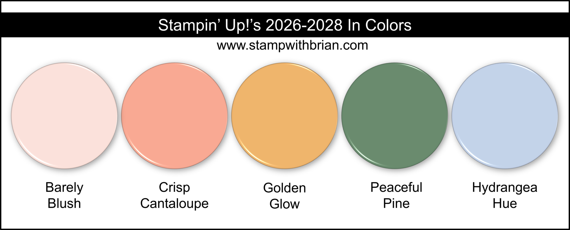
* We don’t yet have the official HEX codes for these colors, but these are close enough to give you a really good idea of each one.
Ooo-eee! There’s so much to love about this mix of soft and rich tones. While I sometimes need a little time to warm up to new In Colors, I was instantly smitten with this group. One of the best ways to understand new colors is to see how they compare to familiar favorites and how they work in color combinations – so let’s take a closer look at each one!
BARELY BLUSH
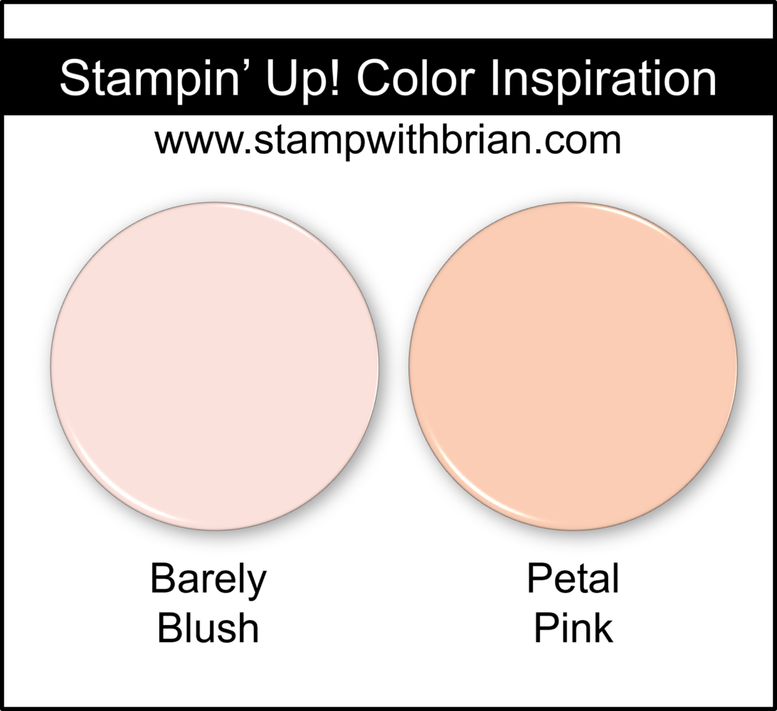
Barely Blush is the palest of pinks – soft and sweet, It’s perfect for baby cards, spring florals and gentle sunset skylines. Here’s a look at Barely Blush: 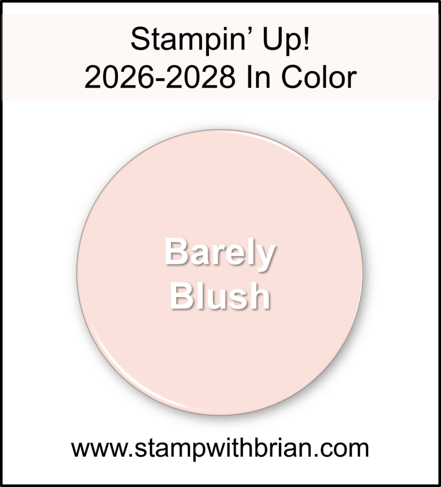 At first glance, you might think Barely Blush is the same as Petal Pink. I thought so, too! But once you see them side-by-side, you’ll notice Petal Pink leans much more orange. Here’s a side-by-side of these two colors:
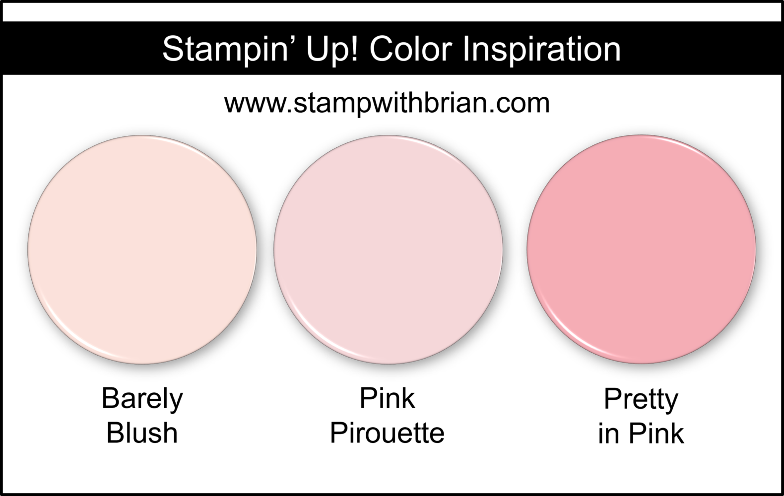
  Compared to other soft pinks we’ve loved over the years, Barely Blush really holds its own with a delicate, airy feel.
  It’s only natural to pair the soft Barely Blush with other sweet tones. I think Barely Blush will pair well with Lemon Lolly and Pool Party. Here’s a look: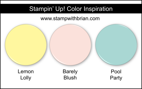
CRISP CANTALOUPE
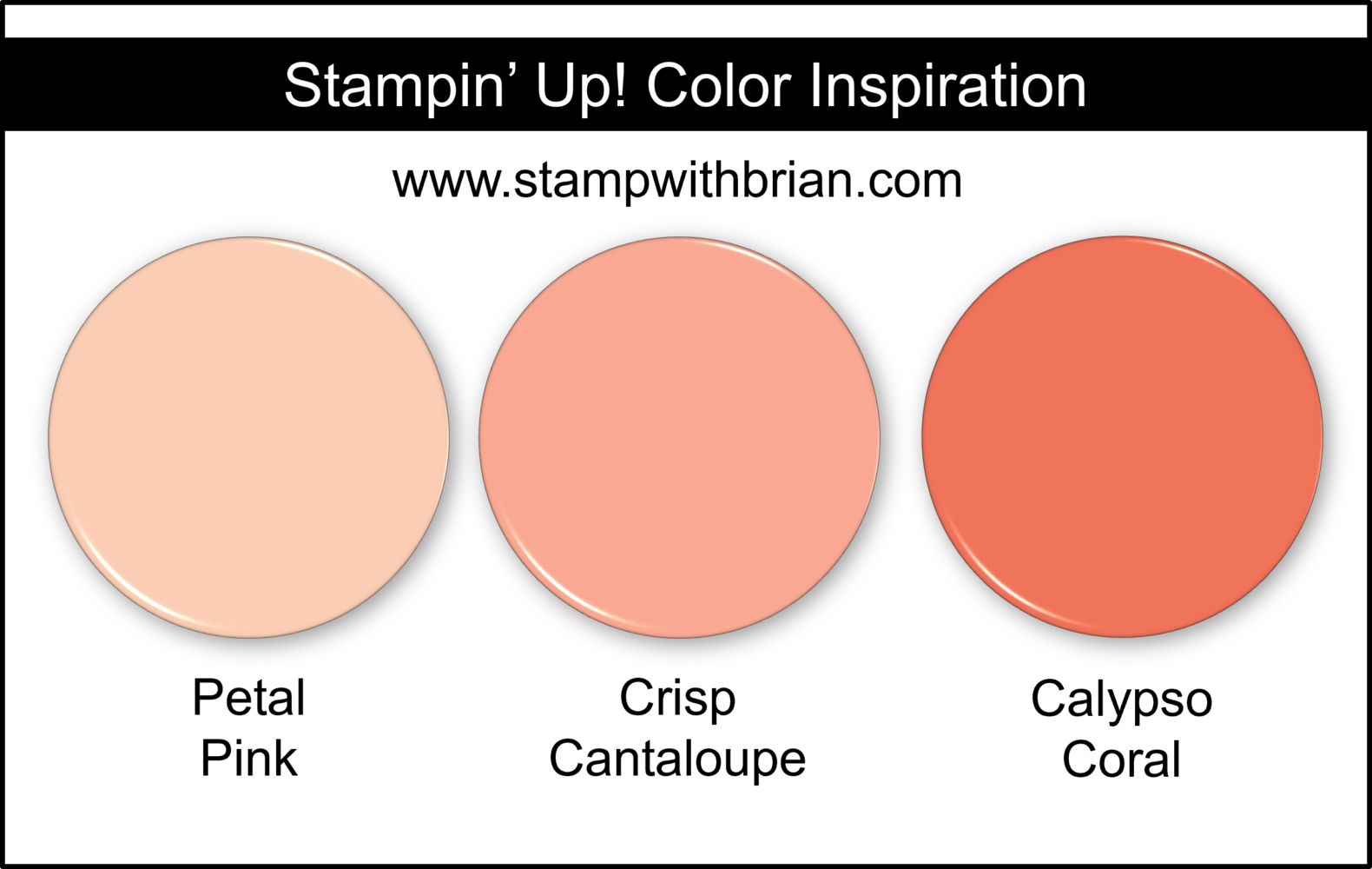
IIf Crisp Cantaloupe feels familiar, you’re right! This returning favorite was originally a 2013–2015 In Color – and it’s just as lovely now as it was then. Here’s a look at Crisp Cantaloupe: 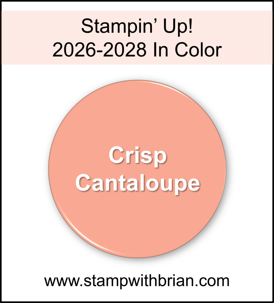 Sitting right between pink and orange, Crisp Cantaloupe has a soft, juicy warmth. When placed next to Petal Pink and Calypso Coral, you can really see its unique balance.
  I think this color really shines when paired with Misty Moonlight and Darling Duckling – such a warm and inviting combination!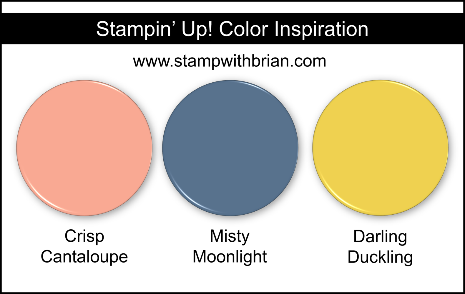
GOLDEN GLOW
Golden Glow might be the one I’m most excited about. It’s a rich brown-gold that feels both warm and grounding. Here’s a look at Golden Glow: 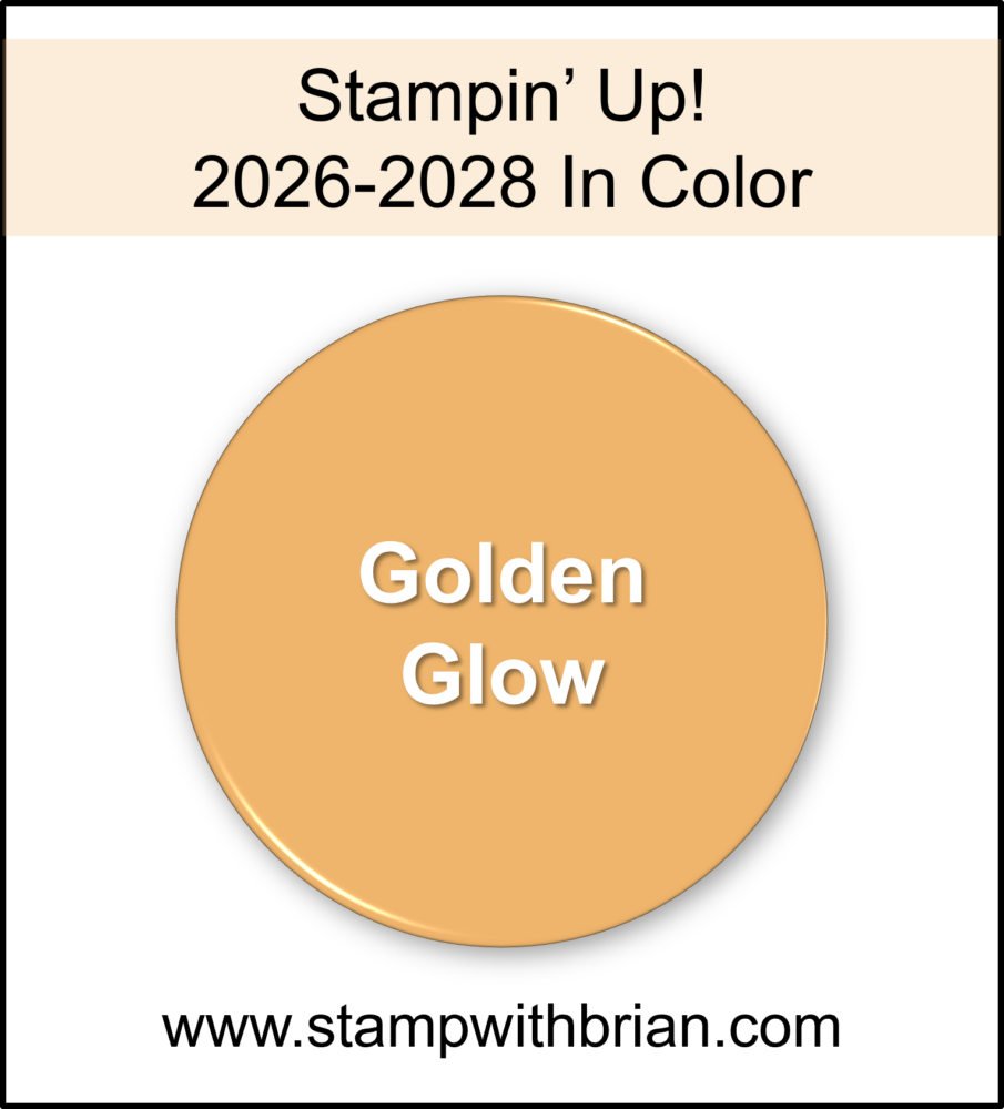 We’ve had some really great gold and brown colors over the years. Here’s a look at how Golden Glow compares with Peach Pie (a retiring 2024-2026 color that’s rich with orange tones) and Wild Wheat (a retired 2023-2025 In Color that gave us A LOT of gold):
 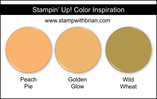 At first, I thought it would be very close to Wild Wheat, but I love how distinct it actually is. Golden Glow pairs beautifully with neutrals like Crumb Cake and Mossy Meadow for a sophisticated, earthy palette. Here’s a look: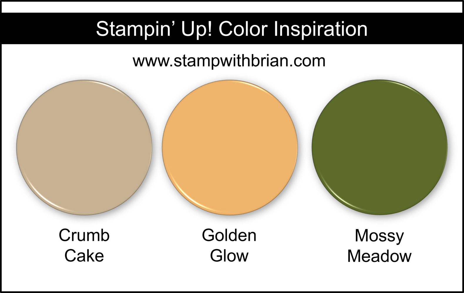
PEACEFUL PINE
Peaceful Pine leans closest to the Regals family, but it still carries a softness that makes it feel fresh and versatile. Here’s a look at Peaceful Pine: 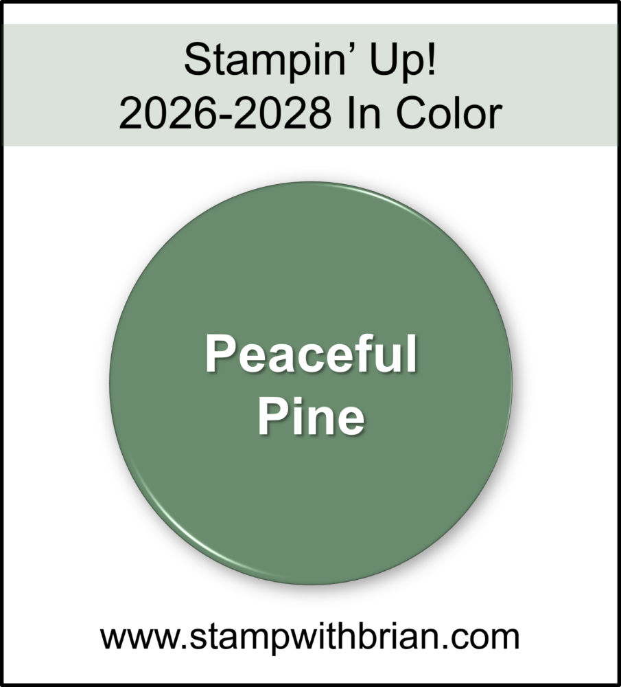 We’ve had some amazing greens over the years, and when you compare Peaceful Pine to Soft Succulent and Evening Evergreen (which were both 2021-2023 In Colors), you can really see how it fits right into that lineage while still offering something new:
 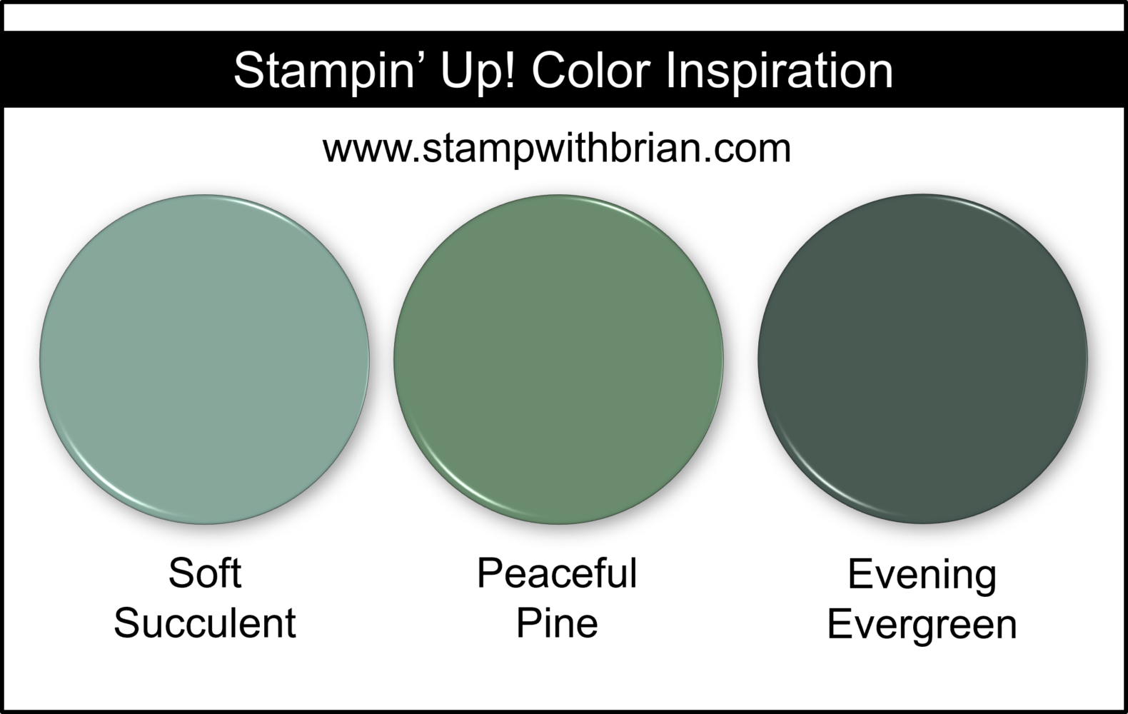 With its slightly dusty tone, I think Peaceful Pine looks fantastic paired with Cloud Cover and Cajun Craze.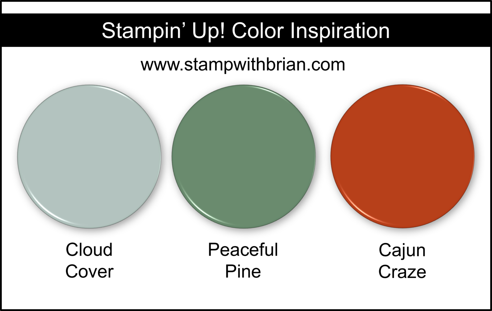
HYDRANGEA HUE
Is it blue? Is it purple? Either way, Hydrangea Hue is absolutely gorgeous and sure to be a standout favorite. Here’s a look at Hydrangea Hue: 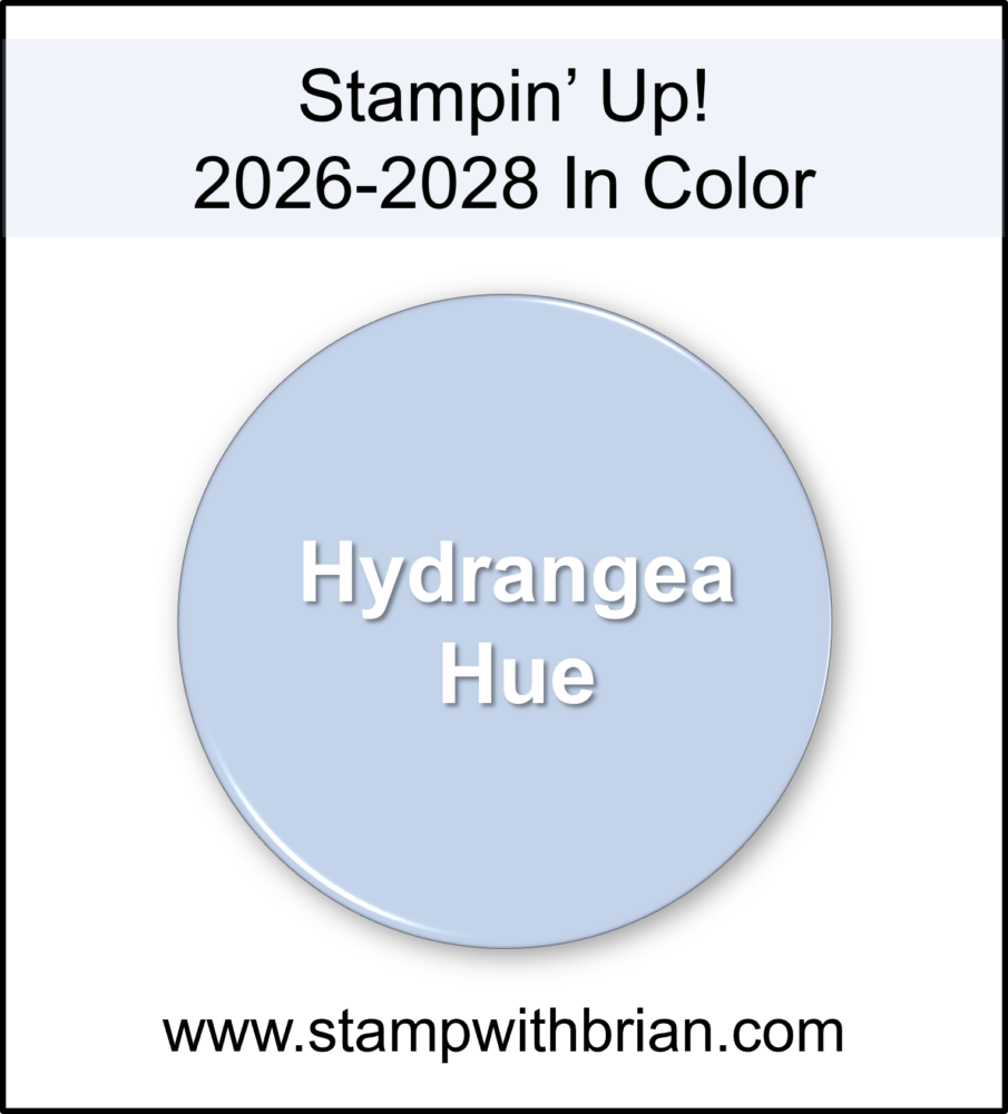 Is it blue? Is it purple? Either way, Hydrangea Hue is absolutely gorgeous and sure to be a standout favorite. When I first saw this color during a visit to Stampin’ Up!’s home office last fall, it immediately reminded me of Seaside Spray – one of my all-time favorites. Side-by-side with Seaside Spray (a 2019-2021 In Color) and Almost Amethyst (a core color from 1997-2010), you can see just how beautifully Hydrangea Hue bridges blue and purple tones:
 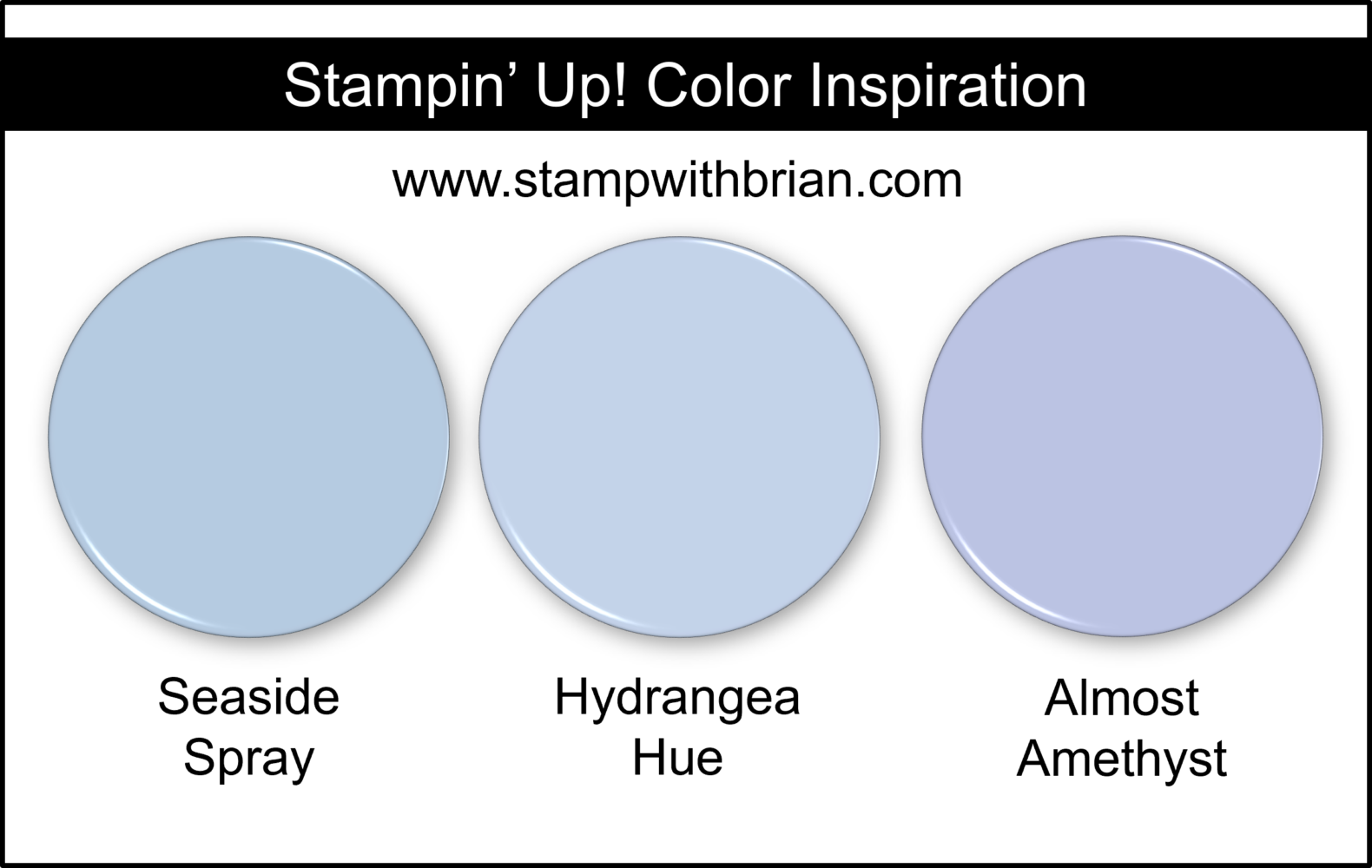 For a fun and unexpected combination, I love pairing it with Petal Pink and Lemon Lime Twist.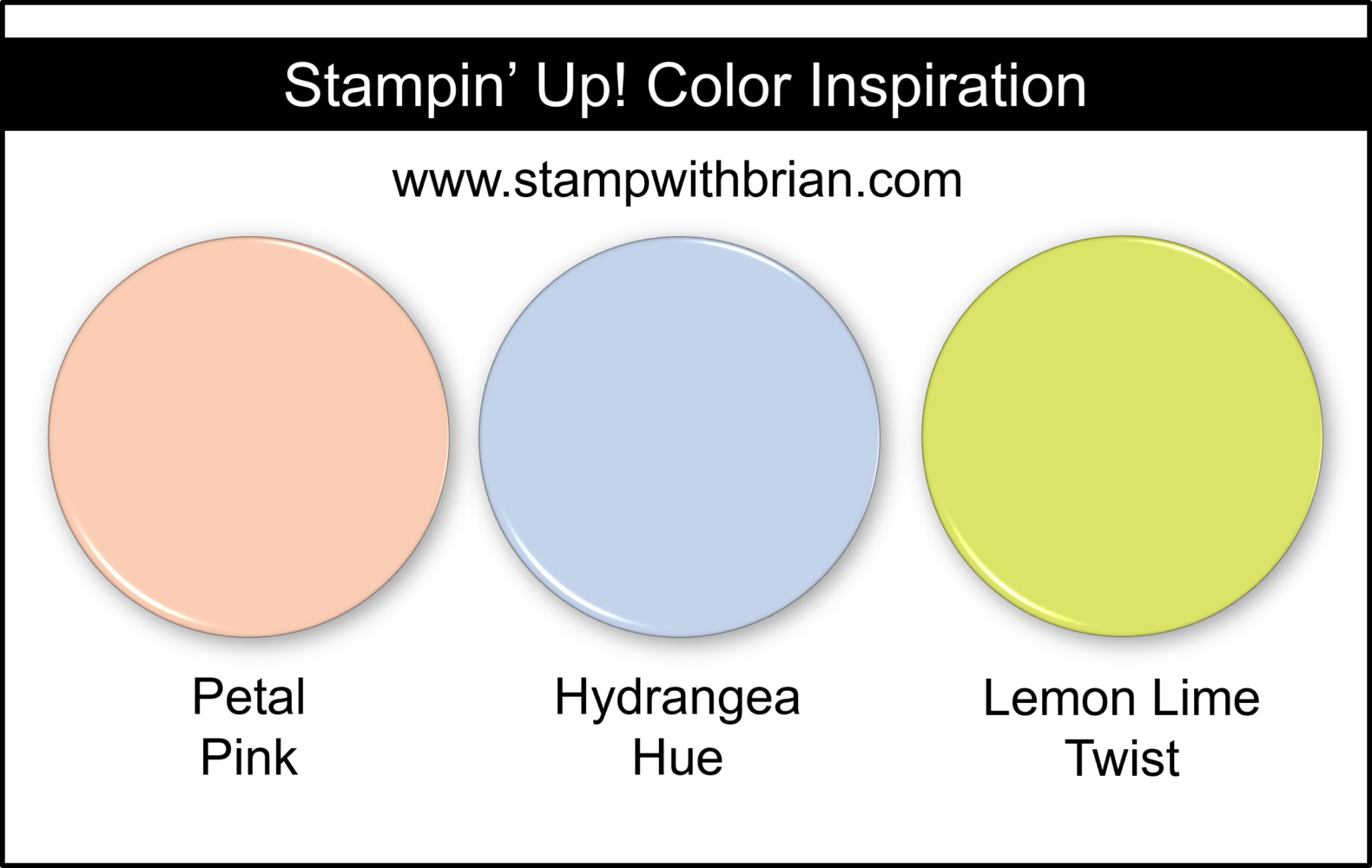
Last Thoughts
How exciting are these new colors? Do you already have a favorite? This new collection of In Colors offers a beautiful balance of soft, airy tones and richer, grounded hues. Whether you are drawn to the delicate charm of Barely Blush or the bold versatility of Peaceful Pine, there is something in this lineup for every style and season. Exploring how these colors compare and combine is just the beginning – I can’t wait to see how they come to life in upcoming projects. The new In Colors will be available with the release of Stampin’ Up!’s May–August 2026 Catalog on May 5.
Thanks for stopping by today!
Brian

New Product of the Month
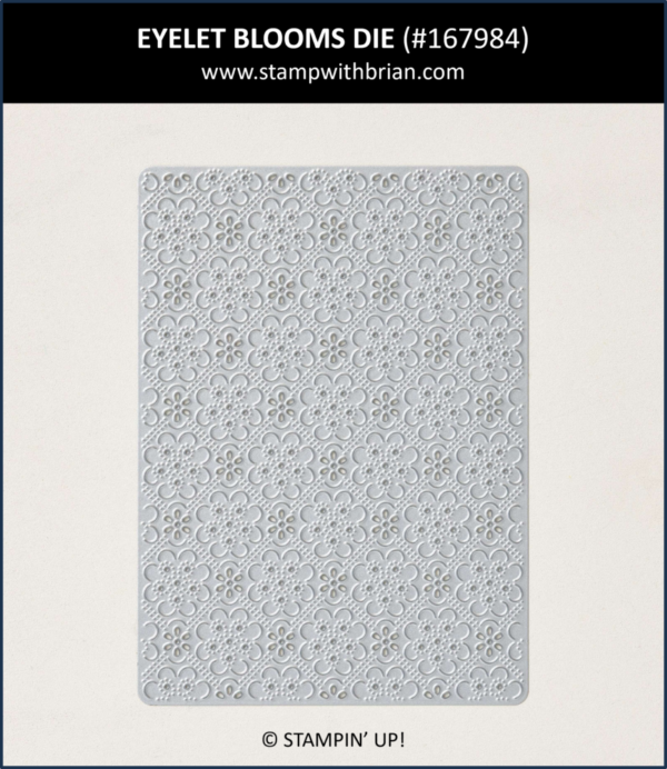
When you place a $75 order (before shipping and taxes) in April, you can select the new Product of the Month for just $5. Here’s a look at this incredible die:
Last Chance Sale
The Last Chance listing includes MANY products at great discounts. Take a moment to check out the products included in this sale – it’s been very popular with my customers. To shop the Last Chance Sale, click on the image below:



Wow Brian
Thanks for all your research into how these InColors fit in with our current and retired colors!
Every year I look forward to your color combinations for ready reference!
My favorite color is purple so of course Hydrangea Hue is my overall favorite of this group of colors! I’m sure I’ll warm up to all of them.
So happy to share, Dawn! These are all lovely colors – and I agree that Hydrangea Hue is going to be huge. It’s so different from anything we have. Can’t wait to play with these new colors! ♥
Brian, I know how much you love blue so I figured Hydrangea Hue would be your favorite. Mine are Golden Glow and Peaceful Pine. I have my original Crisp Cantaloupe pad, cardstock, and DSP. The pad is still juicy!
I love the blues that can also play purple – I am so happy for Hydrangea Hue! 🙂 I also have the Crisp Cantaloupe pad from years ago, but I’m excited by the new format of the ink pads (with magnets), so I pre-ordered a new pad. Love it!
I look forward to your annual post on the new colors. I will admit that, at first, I was not crazy about this year’s palette, because I tend to gravitate towards bolder and brighter colors. Now I can’t wait to start using them! It’ll be fun to play with color combinations for a fresh look.
They tend to alternate. Last year’s have so many brights. I think these colors will work well with brights and may take on a little brightness, depending on what they are paired with. ♥
I like all of these new colors. Usually, there is one new color that doesn’t appeal to me, but all of these are very nice. I can’t wait to get them into my stash. Thanks for the great color combos…always so inspiring! Enjoy your day!
I couldn’t agree more, Hilda! Each of these new colors is wonderful in its own way. ♥
Wow, your secret keeping abilities for Hydrangea Hue are extraordinary! I love all the new colors and am excited to use them. Since I have all those ancient colors you showed, too, it’s going to be a color explosion in my stamp room!
We weren’t even allowed to take pictures in the room where we saw all the new goodies… We saw the OnStage bag that’s Hydrangea Hue. Of course I asked what the name of the color was… 🙂
Oh, Brian: you really know how to make my opinion of the new In Colors go from lukewarm to excited! Thank you very much for your summary and inspiration!
I love that so much, Yvonne! I hope you have fun with these new colors! ♥
These new In Colors are fabulous! I am also MOST happy about Hydrangea Hue. It sort of reminds me of my favorite crayon….Periwinkle. I really enjoy your comparison to both old and current colors. Thanks for sharing.
Thanks so much, Bobbi! I always love to share these new colors – and pretend my thoughts on them are important. 🙂
I love your combinations Brian. I especially like the Crumb Cake, Golden Glow, and Mossy Meadow. Being a hydrangea lover in my garden, I am excited to add the Hydrangea Hue to my collection.
We also have hydrangeas, but they are a brighter tone. I’m so happy you like my combinations – the one you mention is one of my favorites, too! I think I’m really going to love Golden Glow.
Thanks for bringing the color combos together? They r beautiful!!
So happy to do it – it’s how I warm up to them. 🙂 Thanks, Kathy!
I hate typing errors!!! Supposed to b !!!! at the end! My fav is the blues combo!!
🙂
As a 25+ year stamper, I always look forward to your color comparisons. It helps me put them in perspective and see how it could benefit my collection. Thank you so much for doing this and offering up so many inspirational cards and designs.
I really appreciate your sharing the colors that go together, this is very helpful. The Hydrangea Hue is my favorite so far.
Thanks, Lora! I really love these colors and look forward to exploring them more. ❤️