


Yesterday was Saturday. Tomorrow is Monday. That means today is Sunday. It also means it’s time for a Sketch Challenge from The Paper Players. I used this challenge as an opportunity to use some products I’ve not used before – it’s always fun to use new stuff, right? Grab your coffee, sit bakc, and let’s make a card!
Here’s my project:

And here’s Jaydee’s sketch: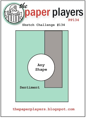 Tips Tricks and Reminders:
- Use those scraps! I am not going to lie to you. This entire card is designed around the Midnight Muse Perfect Pennants crop that I pulled out my Bucket of Lost Dreams. That’s the name I’ve given the container where I store all my remnants from projects gone by. I punched several pennants for a previous project before settling on another color, so I tossed this one in the bucket. I was so happy to find it in my bucket.
- Layering. This sweet scallop fits nicely inside the pennant. The bottlecap fits nicely inside the scallop. And the Curious Curios set was designed to fit perfectly inside the bottlecap. These shapes work so nicely together because they don’t overlap or conflict with the patterns of the coordinated shapes. If the scallop were larger such that it touched or covered the cutouts from the pennant, the layering here would not work. The piece inside the bottlecap is punched with a 1″ circle punch, and the balloon is punched with a 3/4″ circle punch. It add yet another layer that is difficult to make out from this picture. Rather than add this shape on top of the detailed DSP, I cut out a 3″ circle from the DSP to leave a negative space and nestled my layered creation inside.

- Word Window punch. I quite like the way the Word Window punch originates on the side of the page and extends in. When I punched the sentiment, I lined it up on the right side of the punch and then snipped the end in-line with the side of the card.
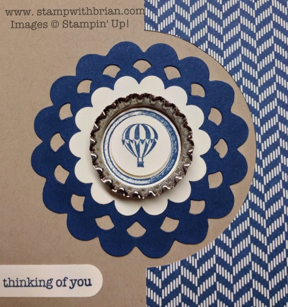
Stamp Sets: Curious Curios, Teeny Tiny Wishes Inks: Midnight Muse Papers: Midnight Muse, Crumb Cake, Very Vanilla, Comfort Cafe Designer Series Paper Accessories: Perfect Pennants Bigz L die, Scallop Circle punch, 1″ Circle punch, 3/4″ Circle punch, Word Window punch, Soda Pop Tops
Tomorrow I’m sharing my adventures at yesterday’s vendor fair. Until then, check out the other inspiration cards at The Paper Players – and please play along!
Thanks for stopping by my blog today!
Brian


Nice! Like this alot, great job! Thanks for sharing.
I like this card …I am very impressed with the layering …. i love the tiny hot air baloon …but , why does SU call that circle doozie a pennant? I scanned this card looking for a pennant of which you speak and then after reading your description through again I realized it`s the Bigz die title . I personally think that Midnight Muse object is a doily or even a circle . Even so …you did another winner !! You do the Paper Players proud !! Oh, I also liked the detail of not putting “the pennant ” on the dsp so as not to obstruct the openings and muddle up the whole flow of design .. You are so “artsy” .
I love your card! I wish I had found your blog before…you do beautiful work! Keep it coming!
I love the layering too, and the circles look great with the bottle cap and the little balloon. Did you know that you can run this bottle caps through the Big Shot to give them an entirely different look?
This circle dies look like doilies, real pretty indeed and the way you placed this on the “negative” cut out from the DSP, is brilliant. You did the same layout on a Valentines card using the “negative” and it look beautiful.
Wow, I really like what you did with this sketch! And I have some leftover parts that are begging to be used…this is great, thank you for the Sunday inspiration, O Keeper of The Bucket !
Omg Brian that is beauitful !! Nice work of art
But you don’t SUPRISE me !!
Love it , that’s a case , if you don’t mine .
Tfs
Hugs Frenchie
Have a nice week !
This is just L-O-V-E-L-Y!! You have such a nak for making us re-look at SU products that could easily be “passed by” (this time referring to the Pennants Die). Wasn’t much of a bottle caps fan either …until NOW!
Good morning Brian! I never would have thought to make a negative area around that gorgeous scalloped circle – and your layering is magnificient! Can’t wait to hear about your vendor fair experiences. I’m crossing my fingers that you had as much fun as I used to have doing these fairs.
Of course, being a math teacher, this card really appeals to me. I love all the symmetry. The cutout is very clever.
Another winner, Brian! You da bomb, daddy-o! Love, love this gorgeous card. As always, I love the negative spaces…perfect. Beautiful job with the DSP and Word Window punch. Your center creation really pops! Can’t wait to hear about the fair!
Really like this card. I don’t get the whole bottle cap thing but I do like how you used it in this card. Who knows? Maybe the bottle caps will grow on me.
Great card, Brian! I love your colors and layered focal point but I ADORE the way you’ve nestled them in the negative space–genius!! Happy Sunday, my friend!
This makes me want to forget about getting ready for next week and spend the rest of the day playing with paper!
I keep looking at Curious Curios and the bottle caps and each time I pass them by. Not really sure if I am sold on them. Upon having ‘googlie eyes’ admiring your creation, you may have swayed me to give them another look yet again. Once again, hats of to you…….you’ve got another winner!
I do hope you are resting today and recharging your batteries from your long day yesterday. Until tomorrow my friend.
Beautiful! Love how you cut out the designer paper for your focal piece!
Awesome, Brian! I love the bottlecap…and the way you punched out the DSP in order to nestle the layered focal point.
Oh so handsome. I really like your style of cards. Clean and crisp. I hope you don’t mind if I CASE your card. I enjoy viewing your daily blog. Thanks for the inspiration.
Thanks, Sharon! I really appreciate it.
Very nice card, and great colors! Thank you for sharing.
I’m also doubtful of the bottle caps, but I think you’ve showed this element very nicely!
Wow…flying high in that beautiful balloon….!!!!!!!!! You should be glad that you cannot hear me sign that song…LOL!!! Fab card design – I have a few of the soda pop tops and need to play with them as I’ve seen great ideas – not as good as yours, of course!
I like how you cut in the half circle, something I like to do and always forget. Great card.
Love the CAS design and colour combo, Brian. The cut out is so effective in highlighting the centre piece. Love the idea of the ‘Bucket of Lost Dreams’ as well!
Simple and clever as always!