


Lately I’ve been eyeballing two of pages from the Modern Medley Designer Series Paper. The pages with newsprint on them really appeal to me for two principal reasons:
- The print on the pages (you know I read this stuff) is from The State, a newspaper in South Carolina. The print mentions Clinton, Fountain Inn and Greenville – all cities in South Carolina. It even mentioned Clemson College. I was raised in South Carolina, so it’s pretty cool to see these mentioned. More specifically, my brother and his family live in Fountain Inn, so that’s really cool.
- The print on the pages are negative images of one another – it’s the same print on both pages where one is Very Vanilla with Basic Black print and the other is Basic Black with Very Vanilla print. More on this later.
As soon as I saw the sketch challenge for Freshly Made Sketches, I knew I’d make this card: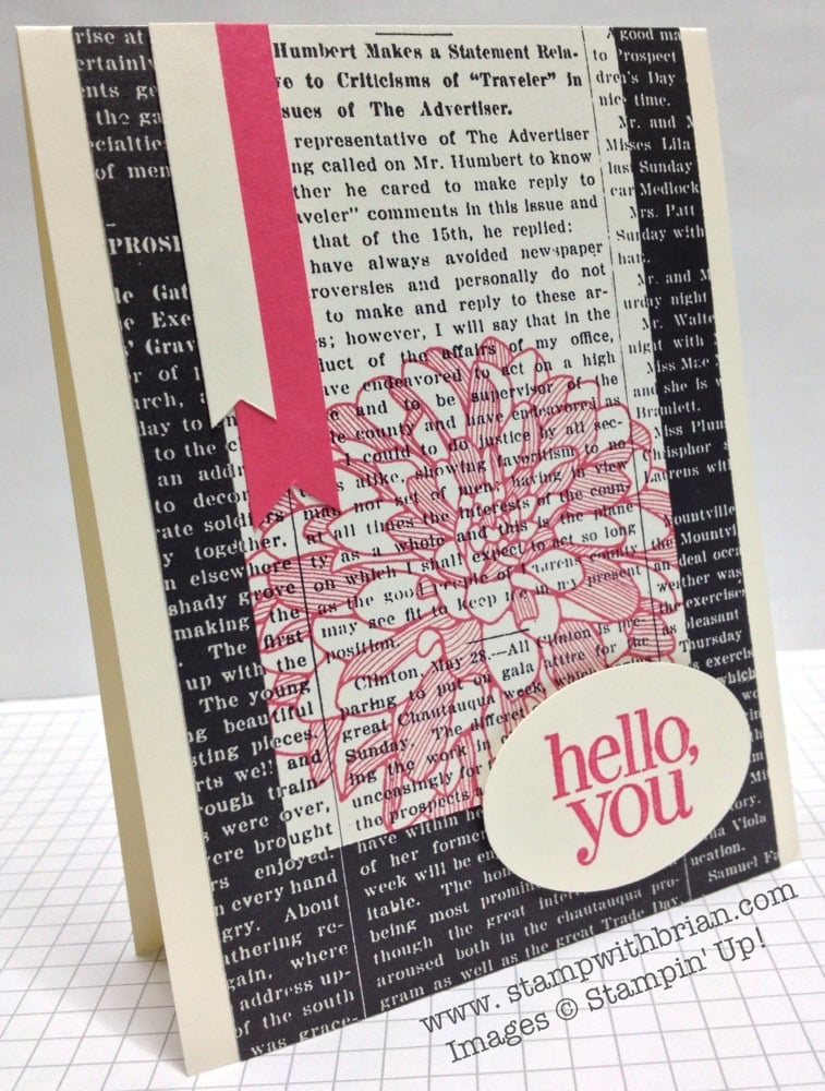
Here’s the challenge badge for Jen Timko’s sketch for Freshly Made Sketches: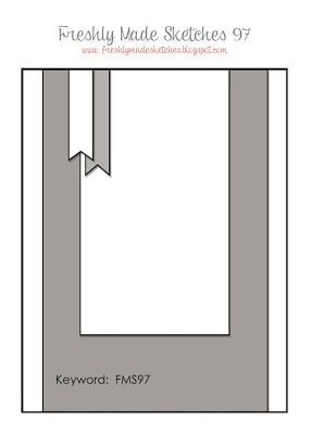
Tips, Tricks and Reminders:
- Why, So Negative! As I mentioned above (I assume you read all of my blog entry), the newsprint papers from Modern Medley are negative images of one another. I carefully trimmed the pieces so the Vanilla-based one would be positioned perfectly over the Black-based one. As you can see, the pieces are aligned such that the words flow continuously.
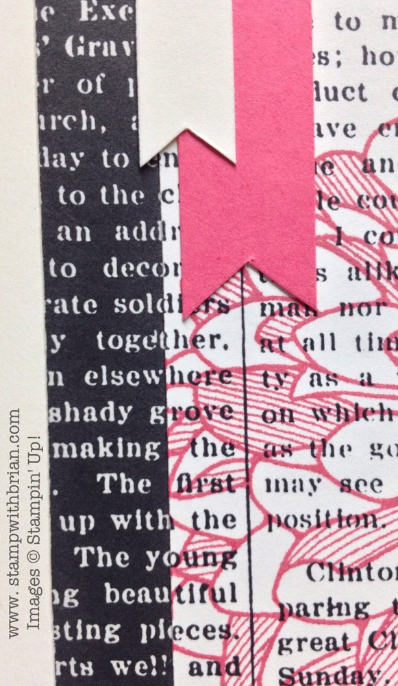
- Color Scheme. This card is a spin on the old “black and white and red all over” joke. Who doesn’t love black and white with a little punch of red. Instead of red, though, I chose to let Strawberry Slush shine here. True to my “rule of threes,” Strawberry Slush appears in the banner, on the flower and in the sentiment. That’s all you get!
- Card Base. I generally create cards with a solid cardstock base. Every once in a while, though, I’ll allow Very Vanilla or Whisper White to carry the card. Because this card is covered with Designer Series Paper (the only 80 pound cardstock is in the single Strawberry Slush banner that drops from the top fold), there’s not a lot of weight on the card front. Bonus to using Very Vanilla as the card base here? The inside is ready to write on – no additional cropping and gluing to get a piece I can write on. Yippee!
Stamp Sets: Regarding Dahlias Inks: Strawberry Slush Papers: Modern Medley Designer Series Paper, Very Vanilla, Strawberry Slush Accessories: Extra-Large Oval punch, Stampin’ Dimensionals
Thanks for stopping by my blog today!
Brian


Well, how about that ! I lived in Columbia, S.C. for 10 years . I will have to look at that dsp closer . I like this Modern Medley Series a lot . And how funny you are with your “Black and White and Red ,etc….. This triggers a memory of a tradition I use to have of reading the Sunday paper on Sunday afternoon . Wow, that`s a blast from the past ! Oh, and by the way …. I like your idea of stamping that Dahlia on the newsprint . I often use newsprint paper to stamp objects on but, I hadn`t thought about this big beauty . Great card !
Thanks, Sonny! The dahlia stamp wasn’t my first choice from the Annual Catalog, but I have grown to really like it. Like the Swallowtail, I think it is beautiful as a partial image. Newspapers? What are those?
Jennifer! Love this sketch girlfriend! And Brian! Yummy color selection, something about Very Vanilla paired with a little Strawberry Slush makes me want to ask for seconds!
Patti – you’re right! It’s a great sketch. I always get so hungry when I work on my projects – the color names are so delicious.
Great card indeed Brian, I like the way you cut your CS and aligned so perfectly, it does look like one solid piece. The beautiful Dahlia in that luscious Strawberry Slush ink really pops as a focal point. Thank you for sharing, happy Sunday!!
Thanks, Maria! When cut right, it all lines up on its own. I also liked the Strawberry Slush here too.
Very clever, Brian!
brilliant
Very cool card, Brian! Love how you stamped on the DSP. And to align it so perfectly, what patience you have!
I am a fan of the newsprint pages too, but never thought of using both sides on one card. Brilliant! I’ll be in my stamping room later today trying that! Thanks for another great idea!
Love it!!!!
I’m loving the black lately in cards. Seems I only used black at Halloween time. Nice thought to make the words continue across the card. I’m just having so much fun with your blog and enjoying the inspiration you are giving me.(us). Thanks a bunch!
Wow you have a great eye and infinite patience. I love this card.
Love how you used the DSP here, Brian. This is such a great sketch and I’ve seen so many nice cards using it.
You have the patience of a Saint Brian! The results are gorgeous.
Your alignment on these prints is genius, Brian!! And the pop of color from the Dahlia…love it! Such a fabulous card! So glad to see you this week at FMS!
For the first time, I like the Dahlia stamp! I’ve seen some nice cards done with it, but none
I wanted to try – until now! I’m new to your site, but look forward to it every morning. Thanks
For being so generous with your ideas!
Barbara Stitt – Bristol TN
Oh Brian, this is a fabulous card!!! Love the color combo, but most of all, the way you blended the newsprint if fabulous! The dahlia is wonderful as a main decoration and your flags pull everything together beautifully!
Gorgeous card Brian! Love the Strawberry Slush – my fingers are stained with it as I type! I hear wallpaper is making a comeback – you will have people lined up wanting to hire you – hope you have a ladder! LOL! Great design!
I appreciate the attention to detail you put into your cards, such as making the continuous word flow. Your readers do pay attention to these things, and they are what make you so fun to read and follow. Wonderful card!
Oh the stamping of the dahlia on the newsprint is wonderful…..I love it!
I love this card, the colours, the layout and especially the overstamping of the flower and how you matched up the text, I love lining up the same prints in different colours, fabulous! 🙂