


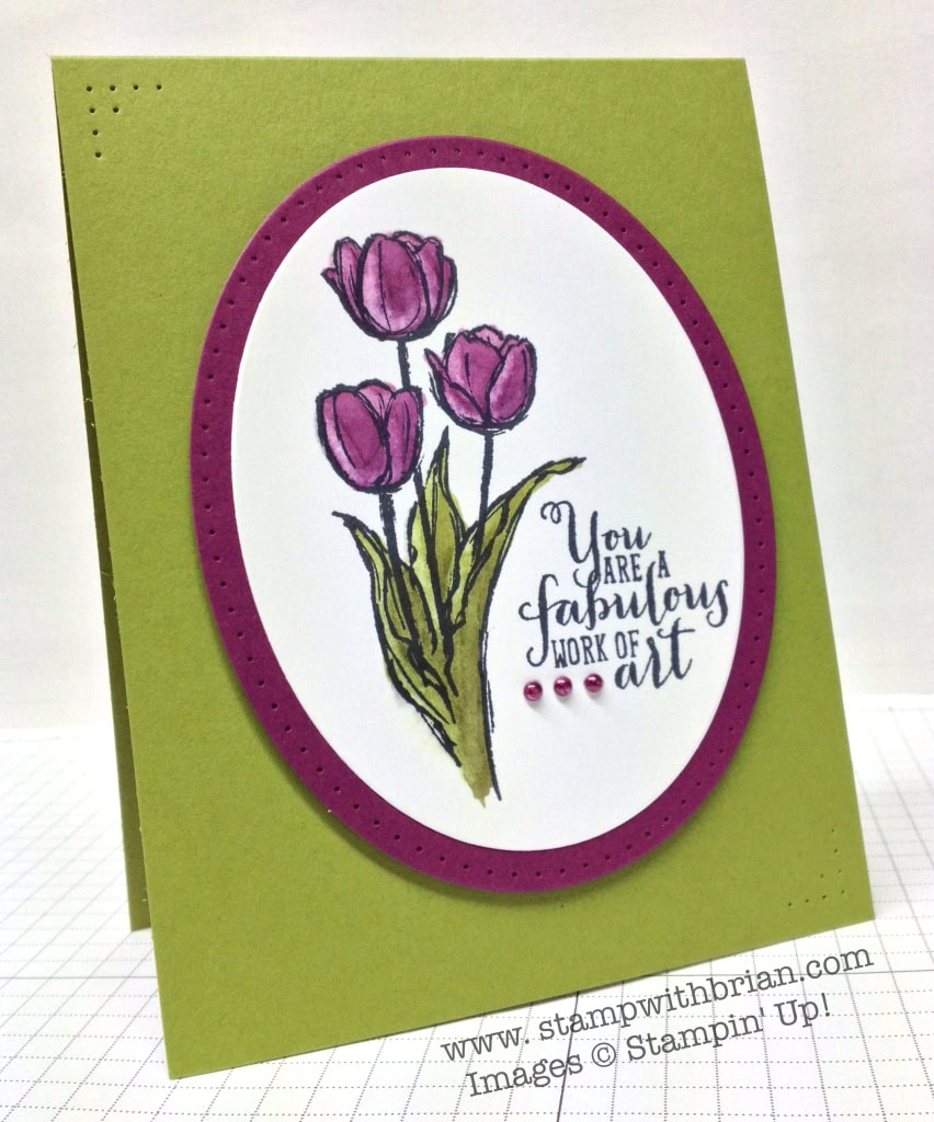
Ann Schach is hosting a Clean and Simple “Floral” Challenge over at The Paper Players. I saw this challenge as a great way to “break-in” my new Blendabilities – Stampin’ Up!’s new alcohol-based markers that can be used to achieve the look of watercoloring. While they won’t be ready for order when the catalog is released June 2, I’m sure they’ll be available soon thereafter. That gives me time to really figure them out and perfect my technique. 🙂 Here’s my card:
 And here’s the challenge banner for this week’s challenge from The Paper Players:

Tips, Tricks and Reminders
- Painting with Blendabilities. Blendabilities are alcohol-based markers that will be sold in a variety of Stampin’ Up! colors. Each set comes with three markers – one of the markers is the “true” shade of the color, while the other two are either darker or lighter. I painted the base of the flowers with the darkest of the pens in the Rich Razzleberry pack. About a third of the way up, I started with the next lightest. You can paint over and over, blending the two together. Leaves less streaks than Stampin’ Write Makers. I then swiped the Color Lifter along the edges to remove some of the darker purple.
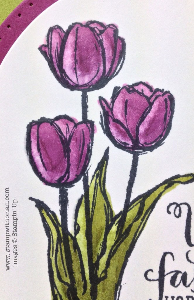
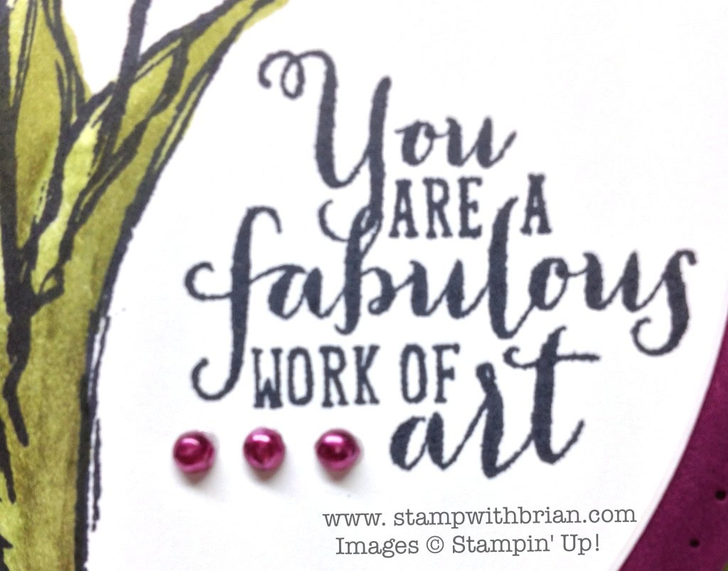
- Another “Woo Hoo” with Blendabilities. Because they are alcohol-based, Blendabilities can be used to paint rhinestones, pearls or buttons. Woo hoo! I accented this purple-and-green card with some purple pearls.
- Don’t forget the Paper-Piercing Packs. The paper-piercing packs and tools are so easy to forget because they don’t sit out on my desk, but they always add such a nice touch to a card. Since this card was so clean and simple, I paper-pierced the oval around the flower and two of the corners of the Old Olive card stock. Viola!


Work of Art (sentiment on this card) is a stamp set that will be available in the 2014-2015 Annual Catalog. Blessed Easter (flowers on this card) is currently available in the Occasions Catalog but goes away June 1. If you want it (and you do), then get it now. 🙂
Stamp Sets: Blessed Easter, Work of Art Papers: Old Olive, Rich Razzleberry, Whisper White Inks: Memento Tuxedo Black, Blendabilities (Old Olive, Rich Razzleberry, Color Lifter) Accessories: Ovals Collection Framelits, Pearl Basic Jewels, Occasions Paper-Piercing Pack, Essentials Paper-Piercing Pack, Stampin’ Dimensionals
Thanks for stopping by today!
Brian

 Don’t You Want a New Catalog? I offer free catalogs to all of my customers. If you are my customer or want to be my customer, please email me your name and mailing address. I’ll be more than happy to send you the gorgeous book. You can email me at [email protected].
Become a Stampin’ Up! Demonstrator. When you join Stampin’ Up! and become a member of my community, you will have the opportunity to order select items from the upcoming catalog today. It’s a great time to sign up, so please reach out to me if you have ever given it a thought – or simply click here to join now.


Your card is a work of art. You used the blendabilities perfectly! Ann will be so happy to see that you used pearls on your card. Coloring them with the blendabilities was the perfect touch.
Woo Hoo! Pretty!! Love the oval paper piercing too!
A beautiful card, Brian, to showcase the new Blendabilities Markers. And I can hardly wait to get my hands on the Work of Art stamp set. 🙂
Gorgeous!
Your card is beautiful! Your blended coloring looks nice. I don’t remember having seen you do paper piercing before. Nicely done!
The whole Copic-type marker coloring is very intimidating to me. I had decided that I wasn’t even going to bother worrying about it. While that is still true, now I want the markers just to color the pearls and rhinestones! I have Sharpies with which I’ve colored both pearls and rhinestones upon occasion, but to have the “right” color for a project would be cool!
Thank you for sharing!
Wow! Great card…one of your (many) best!
This is beautiful, Brian. Love the paper pierced corners, especially. To my eye, it directs me to the main image.
That Rich Razzleberry is showing up in true beauty ! I love the oval shape to accentuate the Tulips ….so pretty ! The corner piercing adds a great subtle touch of detail ….Pretty card !
Brian, I think Blendabilites are alcohol markers, not water color.
Thanks, Barbara. I’ve update the description.
Love it love it love it ! Thank you for telling us what Blendabilities do …I was going to ask you otherwise 😉 . Greetings from Anita
I have stayed away from the Copic markers because I found them intimidating also. I know the adult education program in an adjoining community actually had classes to learn to use them. In addition they were pretty pricey. Hopefully SU’s version will be a bit more reasonably priced because you really cannot get any markers that compare to the look that the alcohol based ones give. Additionally there are some books out there to teach you to use alcohol based markers that are excellent. Since I’m a visual learner I prefer to watch someone use them and learn that way. You did a super job with this card Brian. Paper piercing is one of my favorite ways of adding that special something to a card. I hope SU has some new stencils for paper piercing in this catty. Crossing my fingers.
Brian this card is absolutely stunning. I would love for you to do a video on these markers. Perhaps you can think of another way to educate us on them.
Another beautiful card! LOVE it!! Great layout and colors!! Yep, Ann will love your colored pearls!! I love this stamp set as well! It’s part of my collection and I was so hoping it would be carried over to the new catty! Oh well, can’t have everything!
Breathtaking! Love this card. Can’t wait to start playing with ny Blendabilities. Love your tips about using them. Thanks.
Beautiful card, Brian. I’m really liking this rich new razzleberry color. Thanks for the reminder about using the paper piercing cards. I forget to use them too and they are such a simple but elegant touch.
Lovely coloring! Piercing really adds that special touch. 🙂
Oh so royally rich! Beautiful card. The blendabilities are so cool. I was able to doodle around with them finally.
Love this…. I am a Cpoic addict, but I did try the Razzleberry marker and love it. this is my favorite color of all time. Plus alot more affordable then Copics. Take care…
Gorgeous card Brian! Love the extra detail of paper piercing. Blessed Easter is one of my most favorite stamps in the Occasions catalog 🙂
Brian, I was crazy busy yesterday, with the weather being really fabulous, we’ve been working on the yard, fixing flower beds, etc. I didn’t have much time to come here but now, even if it’s a day later, I must tell you that your card is gorgeous!! Purple is my most favorite color and the paper piercing around this lovely image and on the corners, really add a touch of elegance.
Thank you for sharing.
Fabulous card, Brian! Love the paper pierced detail in the corners, too. Thank you so much for joining us at the Paper Players this week! 🙂
Beautiful card! I CASE’d it for a sympathy card. Thank you for the inspiration.