


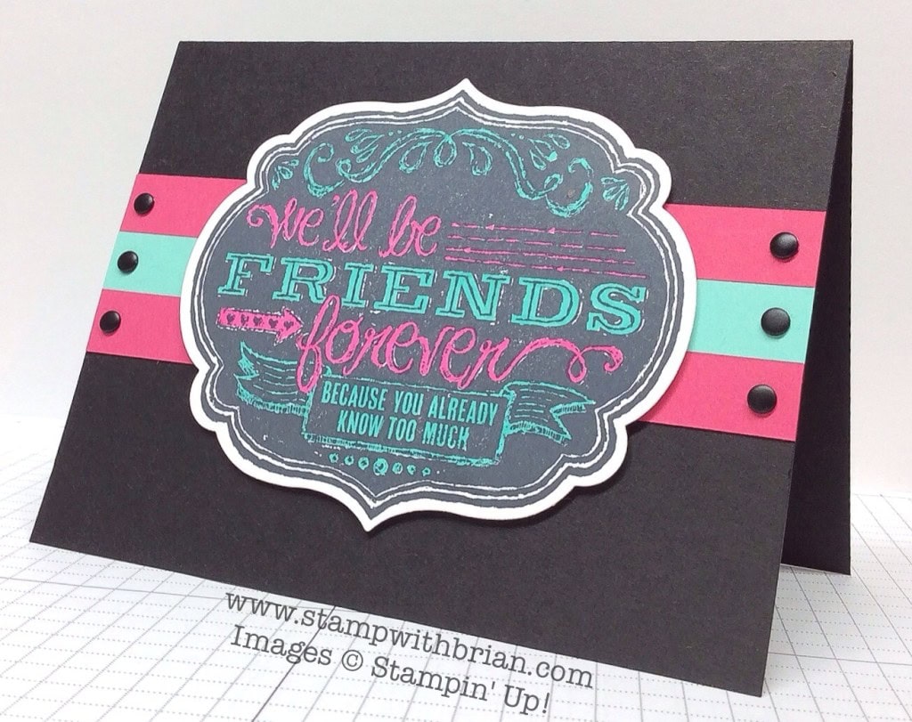
I love to play with color. Black cardstock and black ink offers the perfect backdrop for bright colors to pop and shine. Well, they don’t really shine (that would require glitter, and we’re not going there…). Where was I? Oh, yes! Bright colors really pop on a black background. With the Friends Who Know single stamp (love the look of it, love the sentiment), I created this card:
Tips, Tricks and Reminders
- Blendabilities. Blendabilities is the hardest word to spell-check. The string of vertical lines (iliti) is so hard to see. BUT…the upside is the Blendabilities are super-easy and super-fun to use. Yay! I divided this sentiment between Coastal Cabana and Melon Mambo, allowing for a perfect balance of the colors. No real blending here – just coloring. I used the brush tip of the marker for the larger letters and the fine tip of the marker for the smaller details. Is it just me, or is coloring so relaxing? Makes me feel like a real artist.
- Color Inspiration. It’s really a quite simple color combination, but I’m fond of it. I’m accustomed to pairing Coastal Cabana with Strawberry Slush (they both arrived at the same time), but I thing Cabana pairs well with the spicier Mambo when Black is added to the picture. A very ’80’s feel. Feel free to save this graphic if you are also inspired by this color combination:

- Color Repetition. Not only do I love this combination of colors, but I chose to repeat them on the card. I cropped thee strips of the coordinating papers to layer behind the cropped sentiment. This extends the color of the words from the stamped image to the base of the card. I anchored these strips with Basic Black Candy Dots on either side.
Stamp Sets: Friends Who Know Papers: Basic Black, Coastal Cabana, Melon Mambo, Whisper White Inks: Blendabilities (Coastal Cabana, Melon Mambo) Accessories: Labels Collection Framelits, Neutrals Candy Dots (Basic Black), Stampin’ Dimensionals
Thanks for stopping by today!
Brian

RETIRED STAMPS SALE IN ATLANTA

Do you want lots of stampin’ supplies but want to pay very little? Deb Cozzone, Pam Morris and I are hosting a Retired Stamp Sale at Deb’s home in Roswell, Georgia. We’ll have food, make-and-takes, and lots of entertainment. BUT…the real reason for the event is to get together with you (and to load our retired stamp sets and supplies into your car at bargain basement prices). I hope you will join us!
The event will be Tuesday night, August 12 from 7:00 – 9:00 in Roswell, Georgia (just north of Atlanta). If you are in the Atlanta area, please email me at [email protected] if you’d like to join us, and I’ll send over Deb’s address. Between the three of us, we have hundreds of stamp sets that date back to the 1990’s, so there’s a little bit here for everyone. My goal is to sell everything Tuesday night. Won’t you join us?
Awesome Promotions. Stampin’ Up! is offering some really great promotions in August – from Big Shots to great bundles, check them all out here.

Weekly Deals. They’re here! They’re here! Click on the image below to check out the weekly deals – current products discounted for just one week.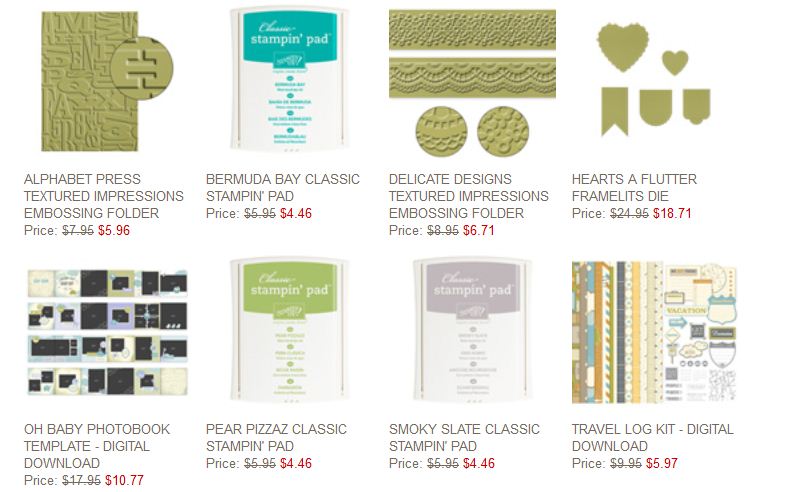


Yes, glitter! 🙂
Great color inspiration and card Brian. And no, it’s not just you. I find coloring to be very relaxing.
Hi Brian:
Today you are using one of my favorite sayings! LOL Those colors really do Pop for sure and I want to add that spell check doesn’t like the word framelits either. The color combo today reminds me of the 50’s when turquoise and pink were all the rage. Fun stuff. Have a fabulous day………….can’t wait to see the new Holiday Catalog!
What a really pretty color combination, the words just jump out of the card.
I also find coloring very relaxing, time slows down in my craft room when I’m in there working on my cards.
You are DEFINITELY a real artist! Thanks for the post – I hadn’t thought of how to use this stamp. Very nice.
Lovely card Brian . That color combination of Coastal Cabana and Melon Mambo really does pop when paired up against a background of black. Another fantastic job
Very nice! Just wondering …. Would the SU markers have worked equally well?
Thanks, LuRae. I think the markers would have worked (since I didn’t incorporate the shading), BUT I love these Blendabilities because they don’t streak at all. I always get a really dark image with the markers (but maybe that’s just me).
Oooo, I love it Brian , but I bet some glitter really stand out …. Lol
Hugs frenchie ,
oohhhh I might need to make plans to come to this!!! I hate being broke 🙁 I’ll have to give myself a very strict small limit. But it’d be awesome to paruse the wares and see your amazing face Mr. Brian!
Brian, that is a great card! Love the colors. Haven’t gotten that stamp yet, but it’s on my list. Will have to try what you’ve done. Have a great day
This IS so ’80s, Brian!! Took me awhile to figure out that the stamp background is black. I’m wondering if you oh might consider linking the stamps to your website so that if I don’t want to get up and go find the stamp picture in my catalog, I can look at it online? Just an idea…