


If you’ve followed me for a while, you already know how much I love printed papers – the patterns and colors in Stampin’ Up!’s Designer Series Papers are the foundation for many of my cards. I adore the papers in Stampin’ Up!’s 2016 Holiday Catalog, and I am so glad you have the chance to order them for yourself (as a Stampin’ Up! demonstrator, I’ve been able to purchase these beauties since the beginning of August).
To further share these papers with you, I’m dedicating today’s post to the colors in these papers. Each one of the photos below shares the name of the paper, the product ID, a beautiful picture of the papers and the colors in each. Save these pictures or print them as a handy reference in your craft room.
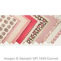
Candy Cane Lane Designer Series Paper. Candy Cane Lane is sticky sweet with bright red and white and warm browns. I love the images that pair perfectly with these colors in this fun pack of 12″ x 12″ papers. There’s such warmth in this paper.

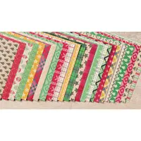
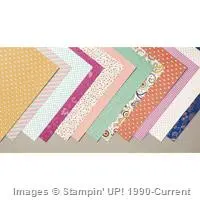
Warmth & Cheer Designer Series Paper Stack. Warmth & Cheer includes 48 sheets of 6″ x 6″ papers and is filled with warm, cuddly patterns the are both retro and modern in feel. Perhaps they are sooo retro that they are actually cool again? I love that Stampin’ Up! added Delightful Dijon to this mix of red, green and brown. This set of papers is flexible for Christmas, Autumn, Thanksgiving and other times of the year.

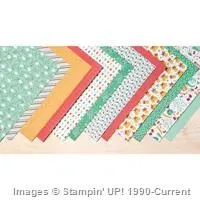
Presents & Pinecones Designer Series Paper. Presents & Pinecones is a perfect mix of pine boughs and Christmas merriment – a balance of sophistication and fun. The mix of greens and reds give this set of papers a Christmas-y feel, but many of the pages can be used for Fall and Autumn projects.

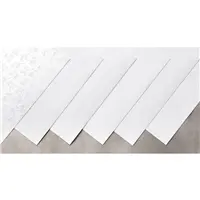
Fancy Frost Specialty Designer Series Paper. Over the past several years, Stampin’ Up! has released several specialty papers that come with clear, heat-embossed pattern. This paper is different – this paper is dry-embossed (the paper is pressed from one side to create a design you can easily run you finger over). The patterns are quite stunning. Add ink or leave it as-is, this paper is going to be a favorite for your holiday projects.

Petals & Paisleys Specialty Designer Series Paper. This is the set of papers that’s designed for your warm, Fall projects. Cajun Craze and Delightful Dijon are the prominent colors in these papers which include floral images and intricate patterns. The colors in these pages are so warm and work well with the two pages (the last two shown below) that include copper foil patterns.

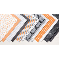
Halloween Night Specialty Designer Series Paper. Boo! Every Holiday Catalog needs a spooky, scary set of papers. Halloween Nights delivers fun patterns with pumpkins, bats, spider webs and haunted houses. Also included are beautiful patterns, including a brick wall, bold stripes and silver foil dots.
 I adore Stampin’ Up!’s printed papers. Not only do the papers include colors from the current color families for perfect pairings in projects, but the colors work so well together. As with most of Stampin’ Up!’s papers, these papers can be used outside of the holiday for which they are designed – there are seasonally decorated pages and pages with basic patterns.
Feel free to save off these photos for your own reference. 🙂
What do you think? Which of these papers speaks to you the most?
Thanks for stopping by today!
Brian


Yowza! Great idea for displaying our pretty paper along with the color palette for each!
love….love…..love ! DSP….love it ! Adding the colors is so helpful .
Such a handy reference print out !
Your Warmth and Cheer colors are the same as the ones from Presents and Pinecones. I think it is supposed to have Garden Green, Crumb Cake, and Basic Black instead of Early Espresso, Emerald Envy, and Mint Macaron.
Yipes! I know exactly how that happened, and it’s been fixed. Thanks for the heads up, Natalie (although you are welcome to email in private when you find big, honkin’ errors in my blog posts going forward). 🙂
Oh… sorry!
I love all these tips to make creating easy. We never have enough time to spend crafting. This shaves off a few minutes and every bit counts. Thanks, Brian, for your tips.
Brian
Thank you so much for this quick look guide. For Designer series paper.This is the type of information that is so helpful.
thank you for showcasing the D S papers with the inks that work with them. this is very helpful
Oh, THANK YOU so much, Brian for this. It is the best reference, right there on my desk!!!
🙂
Boy Brian – it must have been a lot of work and a ton of time to put this post together. You are just amazing and treat all your customers so extra special well. I am in awe of you and your talents. Thank you for all you do and for all you share. Here’s a big thank you hug from a little old lady! LOL
Brilliant, Brian. Thanks so much for sharing.
Since I participated in both Brian’s annual and holiday catalog paper shares, I am the lucky recipient of his custom swatch booklets for each DSP series. They feature the color palettes and make it easy to choose coordinating card stock. – Ellie in Illinois
THANKS
Thanks so much, Brian. I have printed it and it’s headed for my reference notebook. Have a great day!