


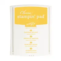
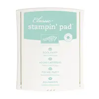
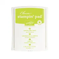
I couldn’t get enough of this week’s Paper Players color combination when I played around in the Fungeon Monday night – the combination of Daffodil Delight and Pool Party has always been a favorite of mine. The addition of Lemon Lime Twist sends it right over the top! I shared one card with this color combination yesterday (you can see it here) and let these soft, sweet colors build a backdrop for this bold, graphic sentiment from the Lovely Inside & Out stamp set on today’s card. Here’s my sweet 4-1/4″ x 4-1/4″ card:

And here’s the banner for the challenge that inspired my card:
 Tips, Tricks and Reminders
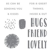
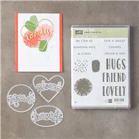
Since I’ve already shared this stamp set and coordinating dies (I showcased them here and here), I’m going to share the three techniques I showcased on this simple card.
- Stamping Off. If you want to achieve a lighter concentration of a color when you stamp, you can stamp off once – or twice – or three times – on scrap paper before stamping onto your project. Each of these flower/starburst images in the background was inked up with a full concentration of ink and stamped onto scrap paper before hitting this background. Daffodil Delight and Pool Party were stamped off once, while Lemon Lime Twist was stamped off twice. Together, they make a beautiful backdrop, don’t you think?
- Isolating Images on a Stamp. I like to make my stamps work for me. I want them to say exactly what I want them to say, so I often times hide parts of a sentiment. I wanted to remove “great” from “for a great” so that it would make sense with “lovely” before “friend.” There are several ways to achieve this (I chose the fourth):
- Place tape over the part of the sentiment you don’t want, ink up the stamp, remove the tape, stamp it down.
- Ink up the stamp, place tape over the part of the sentiment you don’t want, stamp it down.
- Ink up the stamp, put a thin piece of scrap paper (or sticky note) on the project and line up to stamp on the scrap and not on the project.
- Flip the stamp over and carefully ink the parts of the stamp you want to stamp.
- Random Stamping. I love patterns, so it’s difficult for me to achieve a random look when stamping – a collage style is really hard for me. This background, though, was easy! I started with the lightest color (Daffodil Delight) and filled the background with some white space between. I then added a couple of Pool Party images, followed by Lemon Lime Twist. It’s important to remember the edges AND to sit back and evaluate the balance of colors every once in a while. Squinting works!
Stamp Sets: Lovely Inside & Out Papers: Daffodil Delight, Basic Black, Whisper White Inks: Daffodil Delight, Pool Party, Lemon Lime Twist, Archival Basic Black Accessories: Stamp-a-Ma-Jig, Stampin’ Dimensionals

I hope you’ll pop over to The Paper Players site to see the cards by the design team members and to play along with this week’s challenge.
Thanks for stopping by today!
Brian

Order Big & Earn an ADDITIONAL Rewards. All orders over $150 earn Stampin’ Rewards – what a great opportunity to earn free products (your choice) when you treat yourself to a fun shopping spree! During June, Stampin’ Up! is giving us one more incentive to place a big order. 🙂 Not only can you earn the standard Stampin’ Rewards for purchases from the new catalog, but you’ll earn an additional $35 in Stampin’ Rewards (to spend however you want) for orders greater than $350. That’s HUGE!


Beautiful card, Brian. I love the color combo and the tips you gave us about how to get the sentiment we want using the different methods of getting it on the finished card. Have a great day!
Amazing how you constructed the sentiment. Bravo for bold and bright!
Just plain gorgeous! A card with real impact. The background you created for your sentiment really makes it “pop”. Anyone would be thrilled to receive this card Brian. You are just fabulous – oh, and by the way, pretty lovely yourself!
Thanks Brian for showing us a different size card, I too often am a creature of habit. The large sentiment is FUN!
It’s bright, it’s cheerful, it makes me smile without trying to hard. I love a happy card and this is a happy card.
Lots of awesomeness!
Brian, isn’t this the best color combo! So bright and cheerful! I love square cards and the black background makes your bold sentiment pop! So happy you joined us at The Paper Players this week! XX
Two for two Brian! I love how today’s card shows that these bright colours can be used to create a subtle yet still zingy background behind your bold black sentiment. Thanks for joining us over at The Paper Players this week!