


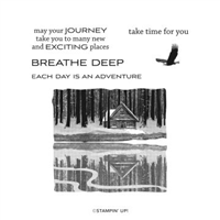
Simple can really be beautiful when you have the right products. The card I’m sharing with you today features a beautiful image, an inspiring sentiment and a few shades of gray. Here’s the simple (but effective) card I made:

The mountain cabins in the Peaceful Place Suite of products in Stampin’ Up!’s July-December 2021 Mini Catalog features a beautiful variety of grays. This set is featured later in the catalog (on page 60), but I thought it would be perfect in gray to look like a charcoal sketch. I was right, right?!
Here’s a look at the GORGEOUS Reflected in Nature stamp set:
 The image in this stamp set is a Distinkive image that gives way more depth and detail than you could ever imagine with a stamped image. Let me give you a closer look at this image on my card:

Do you love the mix of Smoky Slate, Basic Gray and Basic Black? I sure do and have used it a lot. If you like this mix of colors, I hope you’ll save this for future reference:
 I’ve used this combination a lot, so I thought I would take us down a little memory lane trip to look at some of them (you can click on any of these photos to see the original post for each):


 Here are the products I used on today’s project:
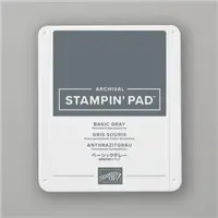
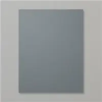
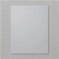
Stamp Sets: Reflected in Nature Papers: Smoky Slate, Basic Gray, Basic White Inks: Basic Gray, Memento Tuxedo Black Accessories: Stampin’ Dimensionals


Thanks for stopping by today!
Brian

Shelli’s Hope Box Paper Pumpkin Kit
It’s not often we get the change to buy a Paper Pumpkin kit that’s already been released – and it’s not usually offered to those who don’t subscribe to Paper Pumpkin. The August Kit has been added to the online store for ANYONE to purchase now through September 30 (or when supplies run out). If you’d like to learn more, click on the image below:

 Placing an order today? Of course you are! If you are placing an order for $150 or more, I want you to enjoy all of the Host Rewards you have earned. If your order is less than $150, I’d love for you please add this Host Code – Y7NK3DAD – when prompted. Thank you!


Love the simplicity as well as all the inspiration for these neutrals!
Love your card. This is one of my favorite stamp sets. Your choice of colors
are perfect for this card.
Yes, it is beautiful and perfect in the grays!
The gray you used on this card are FANTASTIC. You might have showed me I DO NEED this set.
PS…..Spotted you at Back-Stage (and had a “Hi Brian King” made up to show on my Zoom camera…….but thought I had better not. But I did show it to Peggy Noe in one of the break-out sessions).
LOVE the first card, Brian. It is soooo contemplative!!!!
Thanks for the ideas on different options for this paper . I was truly stumped after I would use the cabin layout . Plus I bet adding some Bermuda Bay or Granny Apple Green or Cherry Cobbler would help.
When I first saw this stamp set, I was amazed at the quality of the reflection. It’s amazing, and you’ve done a fantastic job making it even more beautiful.