Before I share today’s project, I have to just say “wow!” to your kind remarks on the card I shared yesterday. On the one hand, I was happy that Kate received so many supportive compliments – she deserves them. On the other hand, I rarely get THAT many comments – no fair! 🙂
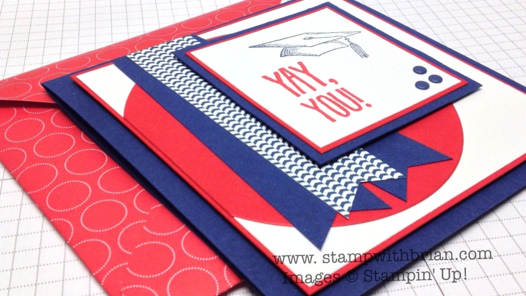
Leigh Ann asked me to make a card for her daughter who is graduating from high school this year. This week’s Freshly Made Sketches layout was the perfect start to this graduation card. Here’s my card:

And here’s Cindy Lovell’s sketch that inspired my card:
 Tips, Tricks and Reminders
- Repetitive Border. I’m a type-A personality. Things don’t ALWAYS have to follow a certain rule, but I like when they do. If I create a panel inside a panel on a card or in a project, I want to make sure that the inner border parallels the outer border. In this case, thick blue, thin red, white on both layers.
- Glue-Snip-Glue. When assembling a card, I never glue anything down until everything “works.” When an item needs trimming (the banners along the top of the white background), make sure to glue those down and trim before gluing that layer to the next. Glue-Snip-Glue.
- Balancing Act. Balancing all of the elements on a card can be tricky. Before gluing it all down, make sure all pieces contribute to an aesthetically pleasing composition. With all the blue and red, the centerpiece of this card moved around a bit before settling closer to the top, right corner than the sketch. I also added three Night of Navy candy dots to in the corner of the centerpiece to further balance it all.
Stamp sets: Pomp and Circumstance Papers: Night of Navy, Real Red, Whisper White, Regals Designer Series Paper Stack (Night of Navy) Inks: Real Red, Night of Navy Accessories: Circles Collection Framelits, Regals Candy Dots (Night of Navy), Stampin’ Dimensionals
Thanks for stopping by today!
Brian
Want to know more about the current promotions? Click here.


Awesome, awesome, awesome! Love the glue snip glue tip, I try and explain that to everyone, but not as well as you did though… Will copy… 😉
Very fun for the Graduate! And a matching envelope makes it so Special! Congratulations to the Graduate!
The three banners really stand out to me. I love your take on this card Brian. And the glue snip glue tip is such great advice.
Love the layers, thin, thick, etc! It is a great sketch that you brought to (a wonderful) life! Thanks, as ever, for sharing!
Brian, you are a true artist when combining colors, sizes and placement of main design.
Your cards always look so professional. Maybe some day I will be able to do that also.
I’m thinking of CASE’ing this card for my niece who is graduating from high school this year. Hope you don’t mind. Her favorite colors are mauve and pink. Do you think these colors will look good together?
By the way, the links in your email are not working.
Good morning Brian:
Love the bright red, white and blue. The color combo is always to very “clean” looking. Of course, your take on the design sketch is exceptional. I think what strikes me the most are the three “ribbons” angled the way a ribbon presentation would be for the winner of a competitive event. Just that little angle reminds us of “big winner” and, of course, high school graduation is the epitome of winning after 12 years of study. Fabulous card and I’m sure the recipient will be thrilled with it!
Oops – it’s supposed to be SO very clean, not to – sorry.
There are some advantages to being only 6 years old. lol
It`s all about details… reading the fine print so to speak . You give away such good “how To” tips …. Now three things I like about this card …stealing your “Act”
The sentiment (good choice ) the addition of subtle dsp to keep it from being all solid (or Japan`s flag) and last ,but not least how you placed those cute Candy Dots (not all in a row ) Great card ! And yes, I know Japan doesn`t have blue in it`s flag ,but that red circle just kinda made me think of it . Happy Sunday !!
What a great card Brian. We have several grad parties this summer and this layout would be so easy to apply with the school colors. Thanks for the great idea.
L
Love the ever-so-slightly askew banners for the perfect touch of tassel movement!
Such a cute graduation card!
Brian, I love the colors and everything about this card!
Love everything about this card!
Great card, Brian, as always! One can never go wrong with a red, white, and blue theme!
The colors and bright and cheery. Any graduate would be pleased to receive this card.
Oh… you are so funny! Poor Kate, LOL This card is gorgeous, I love the banners. I need to get moving on grad cards.
Beautiful card! Love the placement of the banners and of
Course the candy dots. I am going to google the
School colors of the college my friend’s son is
Graduating from and case this. Thank you Brian.
this is FABULOUS and could be customized for the graduate’s school colors! way to go, man.
I just love the way your cards have that simple wow in the details. One of the best lessons I’ve gotten from your creations on your website is to take a step back, look for places that might need a pop, but be simple at the same time. I bet that is as clear as mud.:) Thanks for all the great tips as well as terrific examples.
Thank you, as always, for another great tip in gluing down the pieces of a project whether it is a new tip to some or a good reminder to a more experienced card maker!
I LOVE how you placed the banner pieces – an outstanding idea – I would NOT have thought of that one … and the “movement” it makes is the best!
Fantastic card, as always! Love the colors and the fantastic layering (I’m a repetitive border person too, lol). Glad to see you this week at FMS!
Perfect card for a graduating teen! Love the colors against the white space, and that’s a fun sentiment. Thanks for joining us at Freshly Made Sketches this week!