


Pals Paper Arts is celebrating its 300th challenge this week. That’s a lot of great projects and super-fun challenges, and I’m thrilled to have been here for so many of them. Sandie Conner is hosting this week’s sketch challenge and has created a sweet sketch that allowed me to play with some new products. What fun! Here’s my card:

And here’s Sandie’s sketch that inspired my card: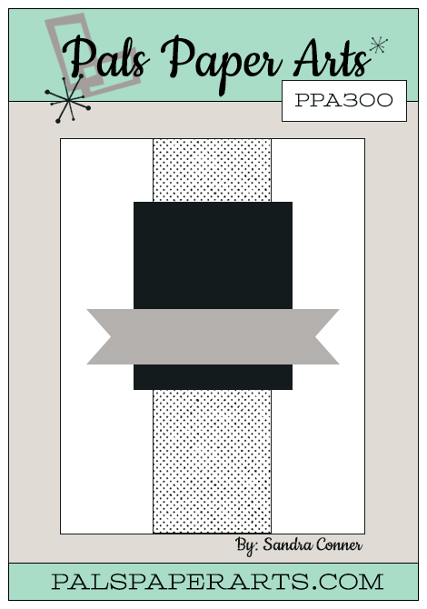
Tips, Tricks and Reminders
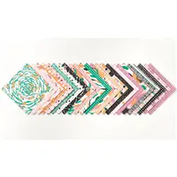
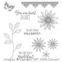
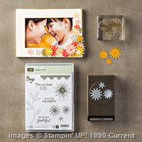
- Yippee! for Sneak Peeks. What’s better than the amazing Perfectly Wrapped Project Kit in the upcoming catalog that creates 8 gift bags and 8 gift boxes? The Perfectly Wrapped photopolymer stamp set that coordinates with the kit — but I don’t see any reason why you shouldn’t have both. 🙂 The stamp set is filled with fun flowers and great sentiments that can be combined to create almost any gift-giving greeting. Not only do I love the supportive and kind words in the set, but I also love the playful and happy font that’s used to create them. While I’m sharing this photopolymer stamp set, take a peek at the Playful Palette Designer Series Paper Stack that I used to create the band down the middle of the card.

Perfectly Wrapped, Stampin’ Up!

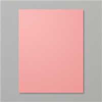
Playful Palette Designer Series Paper Stack, Stampin’ Up!
- A Third Color. My card is built around two colors (Basic Black and Flirty Flamingo) on a Very Vanilla Base. While those colors worked wonderfully together, a small amount of a third color helped to make the principle colors pop. I added a small yellow flower from the Grateful Bunch stamp set – a Basic Black outline with Daffodil Delight petals and a Pink Flamingo center – that adds a perfect accent for this fun sentiment.
- Color Combination. Basic Black is a friend to any color – since black is the absence of any color, it complements any color and amplifies the beauty of the original color. Flirty Flamingo appears brighter next to Basic Black but is softened a bit by Very Vanilla. If you also love this combination, feel free to save this:


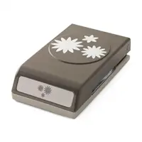
Stamp Sets: Perfectly Wrapped, Grateful Bunch Papers: Playful Palette Designer Series Paper Stack, Basic Black, Flirty Flamingo, Very Vanilla Inks: Archival Basic Black, Stampin’ Write Markers (Daffodil Delight, Flirty Flamingo) Accessories: Blossom Bunch punch, Hexagon punch (for banner tips), Stampin’ Dimensionals


I hope you’ll pop over to the PPA site to see the cards by the design team members and to play along with this week’s challenge.
Thanks for stopping by today!
Brian


Brian – I like how you used the banner here, stamping the sentiment on different colors. Nice card.
Love this. Can’t wait to get this set and kit. One of my faves ❤️
Hooray! I love this adorable card and highlight of new products! I hadn’t noticed that adorable paper pattern (yet)!
This card is a such a stunner! I love how you titled the banner! As usual, your cards are show stoppers and today is no different! Love it!
Loving the Flamingo…….sweet card!
Great card today, Brian. Love the colors and think I’m really going to love the Flirty Flamingo. Looking for my catalog to arrive any day now!
Love this color combo, Brian!! The banner on the diagonal is such a fun touch along with the flower! Thanks for playing along with the 300th challenge this week!
Stunning in deed, looking forward to this one.
Fun card…it pops!
Cute card Brian
I really like how all of your cards have something kind to say 🙂 A beautiful clean and crisp card. Love it
Darling! Love the color combination.