


After the posts for my blog haven’t been released over the past couple of days, today’s post fits right in. I had already planned to share this “re-do” at the time that I was asking for a “re-do.” If you missed my posts over the past couple of days, you can see them here:
Brian’s Spring 2017 Product Shares
Tasty Trucks & Tasty Treats for the Be Inspired Design Team Blog Hop
I often times talk about “my original intentions with a card design” and how I changed course during construction. I don’t often end up with a card I don’t like because I fix the problem before I glue everything down. Occassionally, though, I get all the way through a project and love everything about it – until I take the picture and get it ready to share on my blog.
The “happy retirement” card I shared last week for the FabFriday sketch challenge was my second attempt at the card. I liked the first card, but I loved the second one. Here’s the final card that I shared on my blog (you can click on the photo to read my full write-up about this card):
 And here’s the card in it’s primitive version:
 I liked the first version, but there was something really special about the updated, new version of the card. I saved the sentiment – I cropped the sentiment panel off the first card (snip the Stampin’ Dimensionals with Paper Snips and roll the adhesive off the back of the panels) and recreated the other panels. Can you spot the five things that are different between the two?
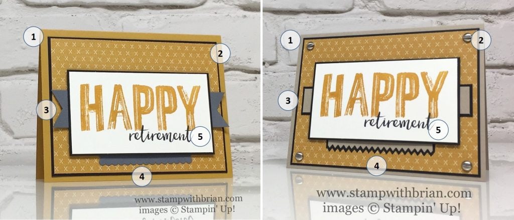 Here’s a rundown:
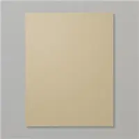
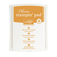
- I changed the card base from Delightful Dijon to Crumb Cake. I knew I wanted to lighten the card a bit and needed something to soften all that Delightful Dijon.
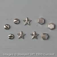
- I added four “screws” from the Urban Underground Embellishments to the corners of this main panel. The embellishments have a strong adhesive dot on the back and are super-easy to adhere.
- The Basic Gray banner bothered me because the banner because of how it hung over the base panel. They are perfectly centered on this card (believe me), but they look off-center at the angle of the photo. I like the squared-off, smaller and bordered band that’s featured on the second, final card.
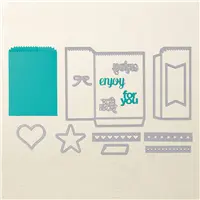
- My below-the-sentiment feature was cropped with the largest Layering Squares Framelits Die. It was a nice, elegant scallop, but it didn’t really pop against the Urban Underground Specialty Designer Series Paper. I used the Mini Treat Bag Thinlits Dies to create a fun, jagged edge for the feature in my updated card.
- The placement of the sentiment panel on the first card bugged me. It was too far down on the card base for my liking. I made sure to scooch everything up a little to achieve the perfect balance I wanted on the card.
It doesn’t take a lot to change a card from “That’s nice” to “I love it.” We don’t always have to shoot for “I love it” – but it’s fun when we can see the difference. 🙂
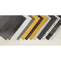
Stamp Sets: Happy Celebrations, Milestone Memories Papers: Urban Underground Designer Series Paper, Crumb Cake, Basic Black, Very Vanilla Inks: Delightful Dijon, Archival Basic Black Accessories: Mini Treat Bag Thinlits Dies, Urban Underground Embellishments, Stampin’ Dimensionals


What do you think? Can you see what a difference very small changes can make to a card?
Thanks for stopping by today!
Brian

Do you like FREE stamps? Between January 4 and March 31, you can earn exclusive Sale-a-Bration products with every $50 you spend on the products you already want. AND when you buy Stampin’ Up!’s Starter Kit ($99 for $125 of your choice of product), you get TWO free stamp sets (also your choice). To learn more about Sale-a-Bration and other ways you can win big during Sale-a-Bration, click here.
New Sale-a-Bration Options. Did you see the new Sale-a-Bration items? Three new options were released yesterday. What fun! Please CLICK HERE to see those new items.


Such small changes make such a big difference. Amazing!
Love this masculine duo. How fun to do “spot the 5 things.” Clever!
Thank you so much for sharing how you changed your original card and why. To me it was very helpful to see the changes you made. I have not been a demonstrator very long and have some difficulty in the creating process (probably because I was raised in the era where you “follow directions” and “stay in the lines”).
I love both cards but there is something about the revised version that just pops, in a friendly way!
Both cards are really nice but I have to say, I LOVE the “Re-Do” card more! I’m with Mary, the “spot the 5 things” is clever! I’ll add “engaging” as well.
It’s funny but my final cards never end up with what I had in mind when I started making them either. Evidently what I see in my head when I start is not that pleasing to my eye when it’s actually done. Mostly you have taught me one (well you have taught me many but right now we’ll go with one) thing that has so improved my card making and that is the slim outline backing in black for many elements. I’m so thankful that you are willing to share your talents.
I LOVE your second card!!! (I love the entire Urban Underground Suite!) The second card is a perfect example of why you are where you are!! It is just a fabulous card!
I concur. The first one was nice but the second one is awesome!
I like the Crumb Cake card base on your second card . I agree that it softens the Delightful Dijon . I was working with Crushed Curry yesterday and ended up toning it down with Very Vanilla . BTW ….have you noticed the YELLOW family in commercials lately ? Wonder if that will pop up in our new IN Colors ???
I do like the revised card more…..love those cute screws !!
Sometimes it is only a small change. Sometimes it is better to just scrap it and think of plan B. Your changes did add the WOW factor to this card.
Liking the side-by-side comparison & pointing out the differences, Brian. It really does show what a big difference just a few changes make. Great job!
Hi Brian, I got your post perfectly today. You are so funny about your card. It is like Susan Itell’s Saturday version #1 and stepped-up Sunday version #2. I think the saw-shape vs the scallop-shape is the best change. Some of the other changes were more subtle. I totally missed you changed the card base to crumb-cake. I also think the squared off cut vs the flagged cut works better too. (Just my thoughts.) Both are very nice.
Happy Saturday!
🙂
Only Brian King can improve a Brian King card!
Good to see the “pros” need a redo every now & again! Sometimes card making is a lot like life……
Love your blog Brian. Was worried when you were MIA earlier in the week.
Love it!