


It’s time for another CASE the Designer Challenge with the Global Design Project. There are so many places to find inspiration for the project we make – I love the opportunity to create a project that’s inspired by the art of my fellow team members on GDP. Always a joy! This week we are CASEing a beautifully-layered project by Charlet Mallett, my talented friend and design team member. Here’s my card for this CASE the Designer challenge:
 And here’s the banner for the challenge that inspired my card – this challenge goes live at 9am EST:
 If you’d like to read more about Charlet’s project, click here to see her original post. When we CASE (Copy and Share Everything or Copy and Selectively Edit), we find inspiration in a project – theme, color combinations, layout, products used – and create our own project by making changes to make it our own. When CASEing, it’s important to give credit to the original designer – it doesn’t take away from your project at all.
Tips, Tricks and Reminders
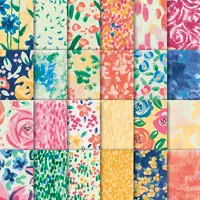
- Garden Impressions. I was inspired by the way Charlet beautifully layered strips of floral paper in her sweet card. I love the big band of flowers that spans the front of her card and how she smartly layered smaller panels over top of it. While I didn’t completely mimic her design, she inspired me to play with these beautiful layers. While Charlet used the gorgeous Share What You Love Specialty Designer Series Paper to create the fun layers on her card, I reached for the beautiful Garden Impressions 6″ x 6″ Designer Series Paper. I love these watercolored patterns – the panel of Calypso Coral texture works perfectly with the floral patterns on the larger strip behind it. Here’s a look at the must-have Garden Impressions 6″ x 6″ Designer Series Paper:
 I’ve created similar graphics for all of the new Designer Series Papers – you can see them here.
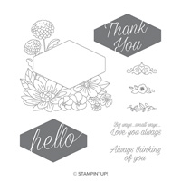
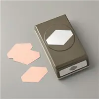
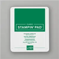
 - “Intentionally” Artistic. I chose one of the sentiments from Accented Blooms for the “thank you” on my card. The stamp is a solid stamp with a negative image – the ink hits the background and not the sentiment. The sentiment coordinates with the Tailored Tag punch and a beautiful floral image that I didn’t use here. Anyhoo…I opened a brand new ink pad of Shaded Spruce to stamp this sentiment. After I stamped it, I realized the pad was a big inky. Instead of wiping some ink off and re-stamping, I kept the “watercolored” look that I got the first time. I think it looks better with the watercolor paper fro the sentiment to not be 100% solid. Here’s a closer look at my “intentionally artistic” sentiment:

- Color Combination. The featured colors I used on this card are pulled from the floral pattern on this Garden Impressions 6″ x 6″ Designer Series Paper. To the Shaded Spruce and Calypso Coral, I added large panels (the base and beneath the sentiment) of Crumb Cake. You can never go wrong with Crumb Cake. If you love this combination as much as I do, please save this:


Stamp Sets: Accented Blooms Papers: Garden Impressions 6″ x 6″ Designer Series Paper, Crumb Cake, Shaded Spruce, Thick Very Vanilla, Very Vanilla Inks: Shaded Spruce Accessories: Tailored Tag punch, Stampin’ Dimensionals
I hope you’ll pop over to the GDP challenge to see the cards by the design team members and to play along with this week’s challenge. The challenge goes live at 9am EST.
Thanks for stopping by today!
Brian

 My Favorite Things. Want to see what I love most in this amazing book? Maybe you’ve missed something or maybe I can help you to pare down your wish list? Be sure to check out both days and let me know what you think! Click on the links below to review my list of Favorite Things:
- My Favorite Things from Stampin’ Up!’s 2018 Annual Catalog – Day One
- My Favorite Things from Stampin ‘Up!’s 2018 Annual Catalog – Day Two


Ooooh, love this color combination Brian! Beautifiul!
I love the off set panel of calypso coral. It makes you stop and take a second look. Wait, what’s different, ahhh the asymmetric balance. Kind of like a secret garden, with flowers hidden, that you have to spend an extra moment to find. Love your cards.
Thanks so much, Susan! I had fun with these patterns and am glad you like how I’ve layered them. I appreciate your comments. <3
Thanks so much, Dawn! I pulled 2/3 of them right from the paper. 🙂 I always love to hear from you. <3
Very artistic! Nice layering and colors!
Thanks, Windy! I tried lots of different things before landing on this look. I’m glad you like it. <3
As the king of layering, you have a beautiful card today, Brian. Love the DSP you used. Enjoy your day!
Thanks so much, HJ! I do love gorgeous layers and was so inspired by the way Charlet layered DSP on her card. <3
I had the same thought as HJ…you are the King of layering. You selected one of my favorite Designer Series papers and one of my very favorite stamp sets, so of course, I think the card is a winner.
Yay! I’m so glad you like it, Dianne! The combination of these two is such fun – I’m so happy I’ve picked your favorites to play with. <3
Lovin’ the layers and the pretty Shaded Spruce tag!
Thanks, Mary! I enjoyed playing with the layers until I came up with something I liked. <3
I love this card Brian! At first I was like, he turned over that beautiful piece of blue paper….then I was all, ohhhhhh so pretty!!!! LOVE the color combo!
🙂 Thanks, Laura! Nope, it’s just two strips of the Designer Series Paper. I’m so happy you like the card. <3
Brian, the layers are so beautiful, this color combination is another winner, love it!!!
Now, are my eyes fulling me or did you tilt the sentiment? 🙂 😉
Hello Brian: My first comment didn’t stick so I’m here again to tell you how much I like your card, the layers are beautiful as always and the color combination is a winner, winner!!!
Now, are my eyes fulling me or did you tilt the sentiment? 🙂 😉
Thank you for sharing,
XO
Maria.