



If you’ve followed me for any length of time, then you know I love collecting and creating with Stampin’ Up!’s Designer Series Papers. The gorgeous patterns, the thoughtful color combinations, the coordination with other products – it all just works. And every collection brings something new to fall in love with!
I was instantly smitten when the Celebratory Sips Designer Series Paper was introduced in the Online Exclusives. From the vibrant patterns to the bold, refreshing color schemes, this paper is as fun and lively as the drinks it features. But there’s more to it than cocktails and lemonade — the set includes so many versatile pages that work beautifully across all sorts of themes. Here’s a peek at the patterns and coordinating colors you’ll find in Celebratory Sips DSP (click the image below to flip through all of the pages in my online store):
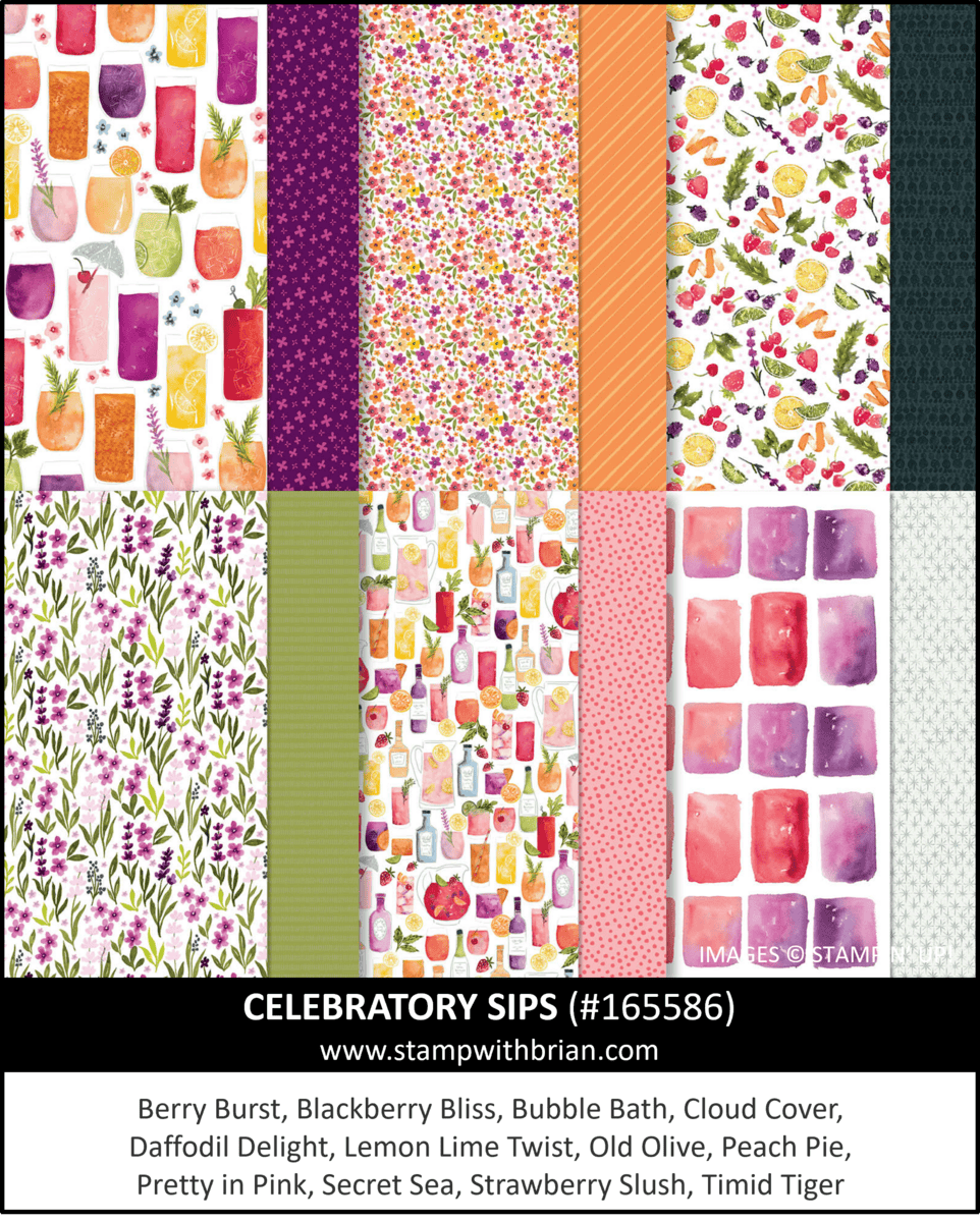
If you’re looking for color inspiration, unique patterns, and a paper pack that works well beyond just “cheers” cards — this is it. This amazing collection of designs includes Berry Burst, Blackberry Bliss, Bubble Bath, Cloud Cover, Daffodil Delight, Lemon Lime Twist, Old Olive, Peach Pie, Pretty in Pink, Secret Sea, Strawberry Slush and Timid Tiger.
Inspiration
I have really enjoyed working with the pages in the Celebratory Sips Designer Series Paper – how could I not?! Here are some of my projects with the pages from the papers I’ve shared on my blog (you can click on each photo to read the original post about each project:

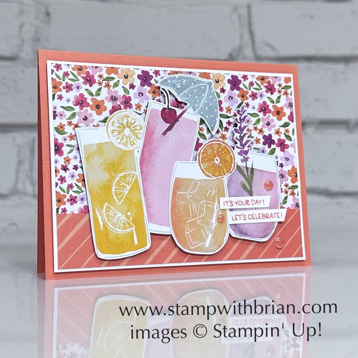
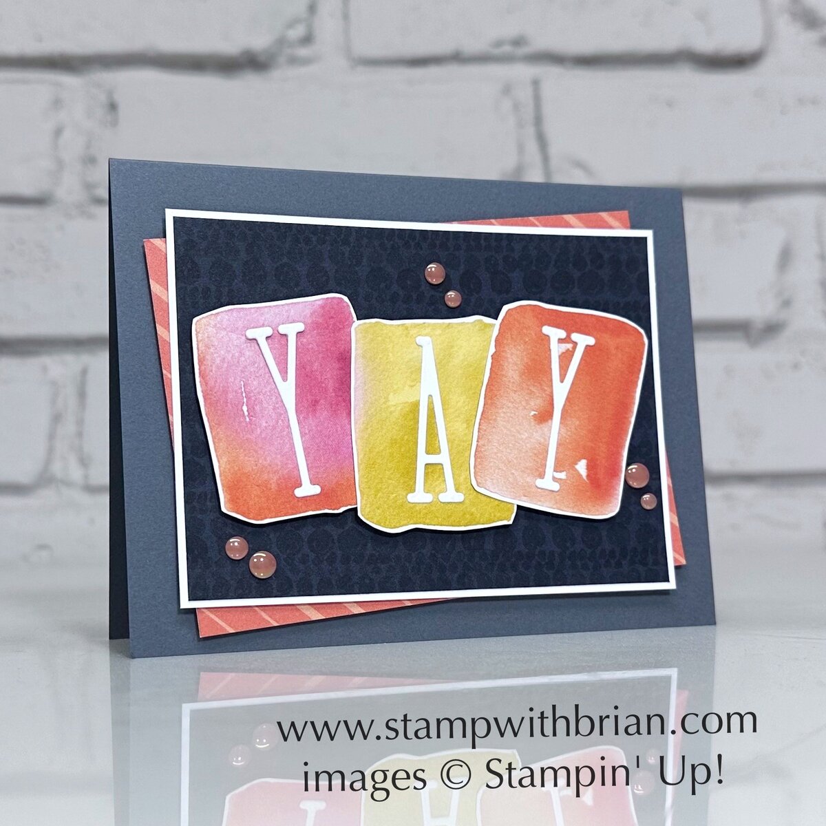
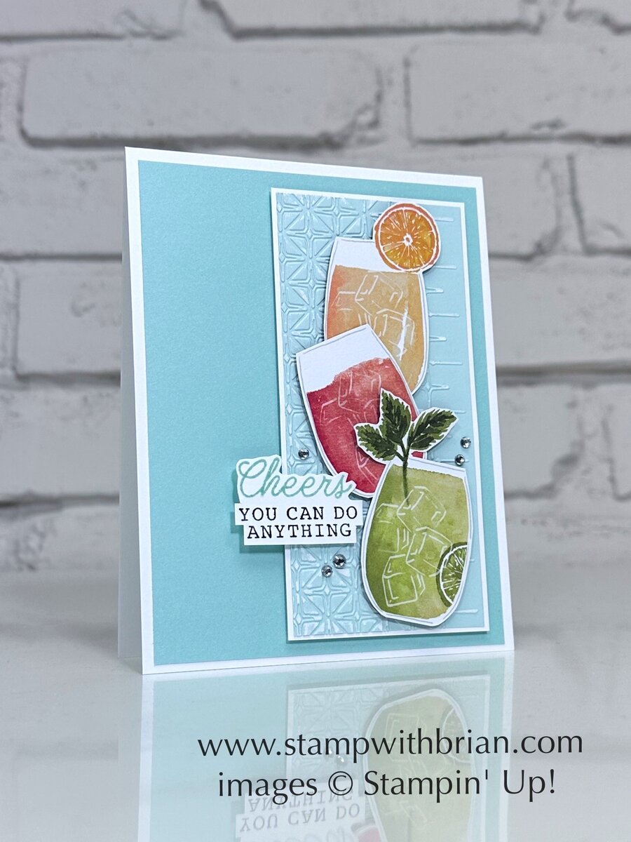
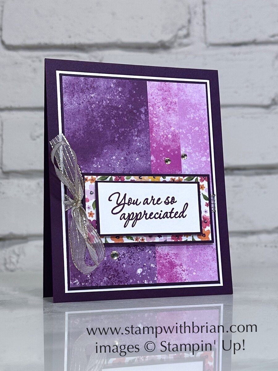
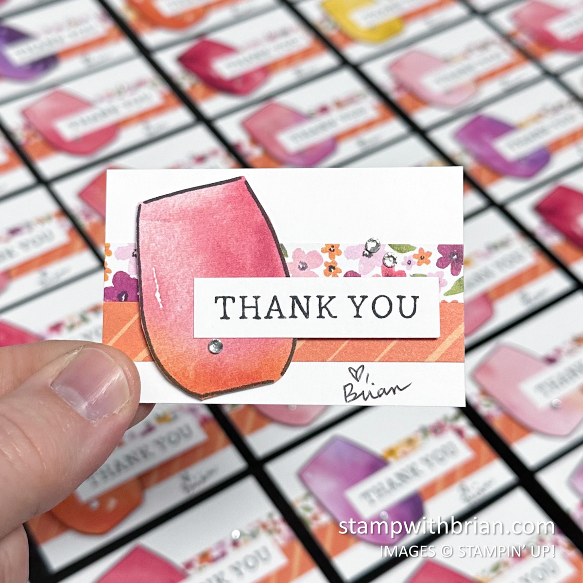
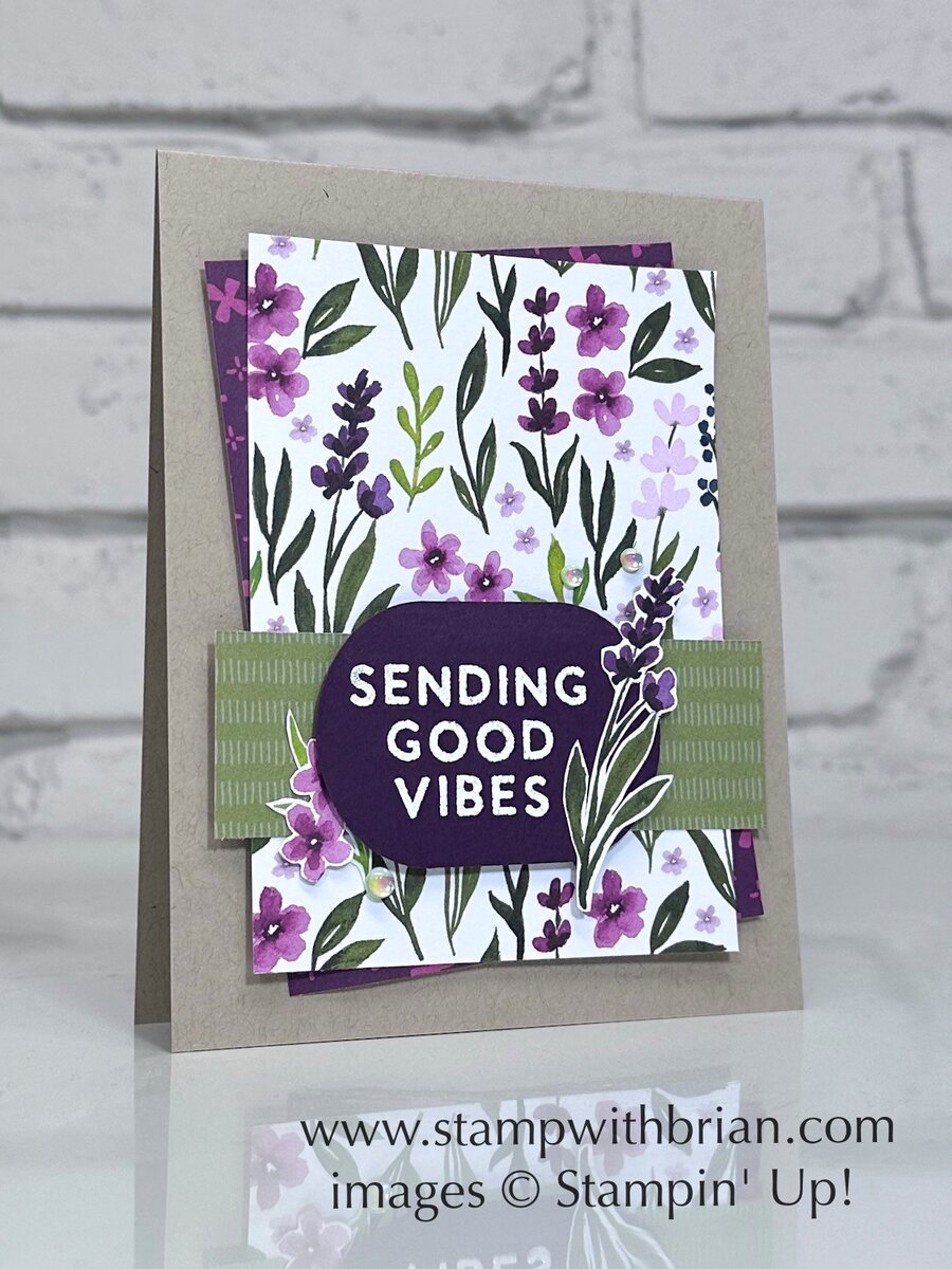
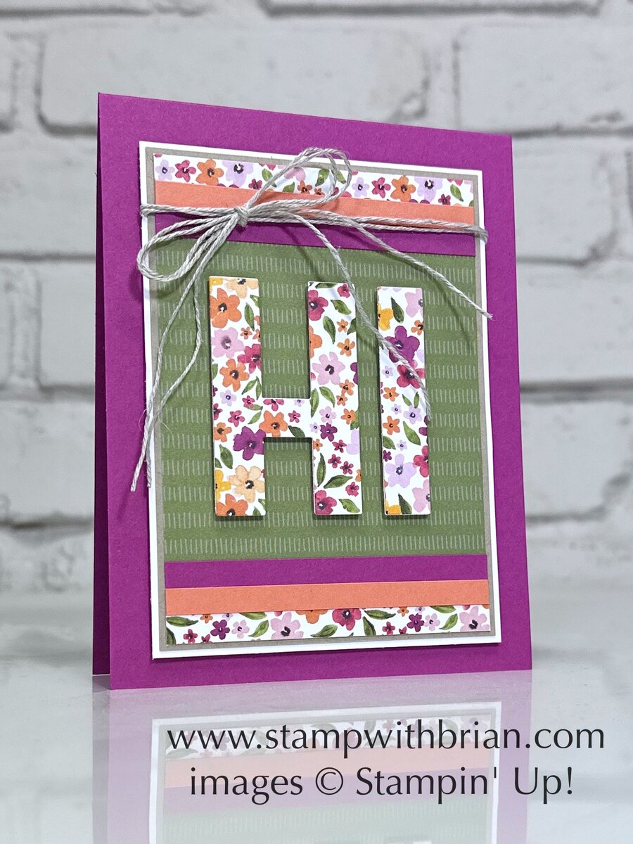
Today I’m going to share some suggestions for pulling together great color combinations with the pages of the Celebratory Sips Designer Series Paper.
Straight from the Papers
One of my go-to strategies when starting a new card or project is pulling my colors directly from the Designer Series Papers – and Stampin’ Up! makes it so easy!
These colors are combined from the colors exclusively in the Celebratory Sips Designer Series Paper – such a great variety of colors in this pack of papers:
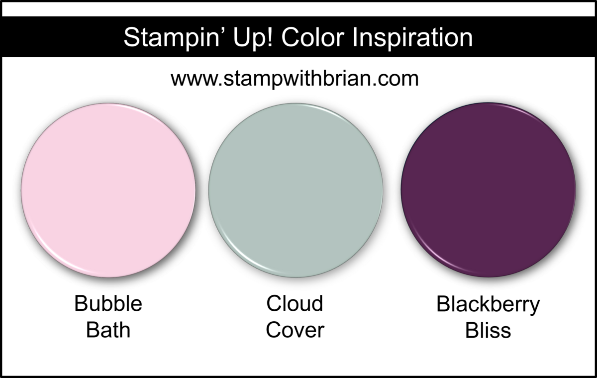
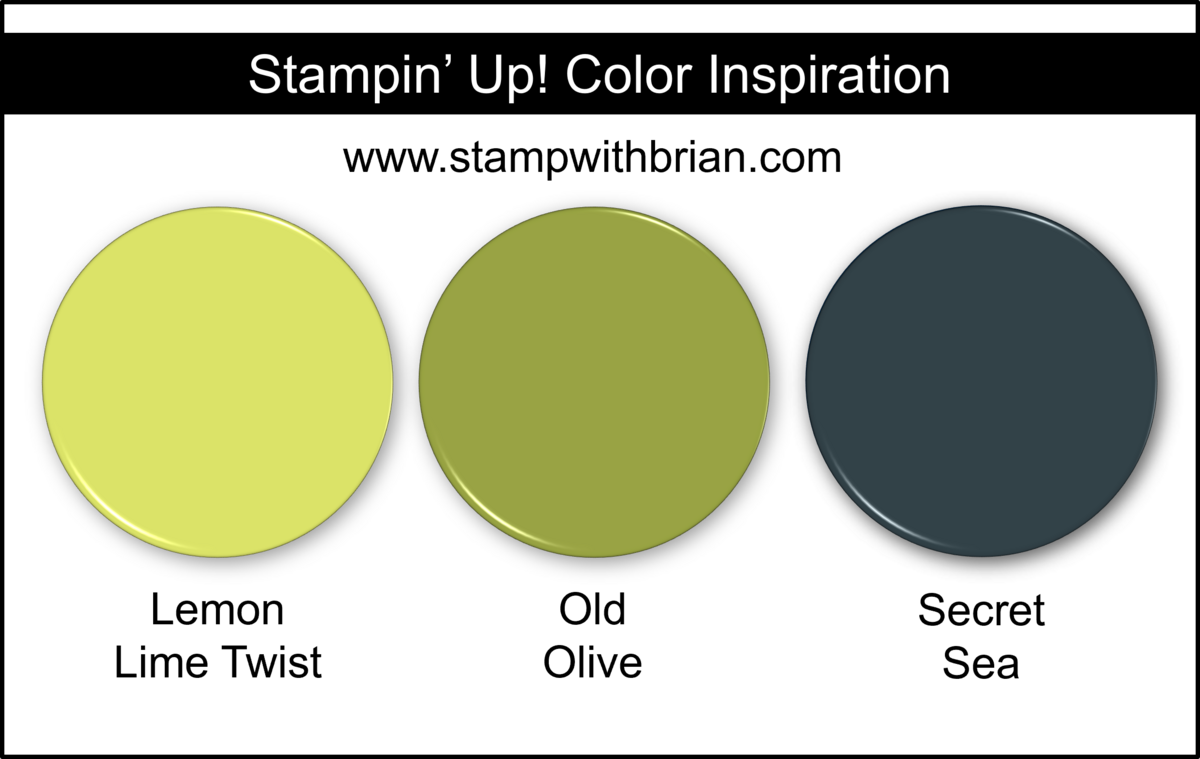
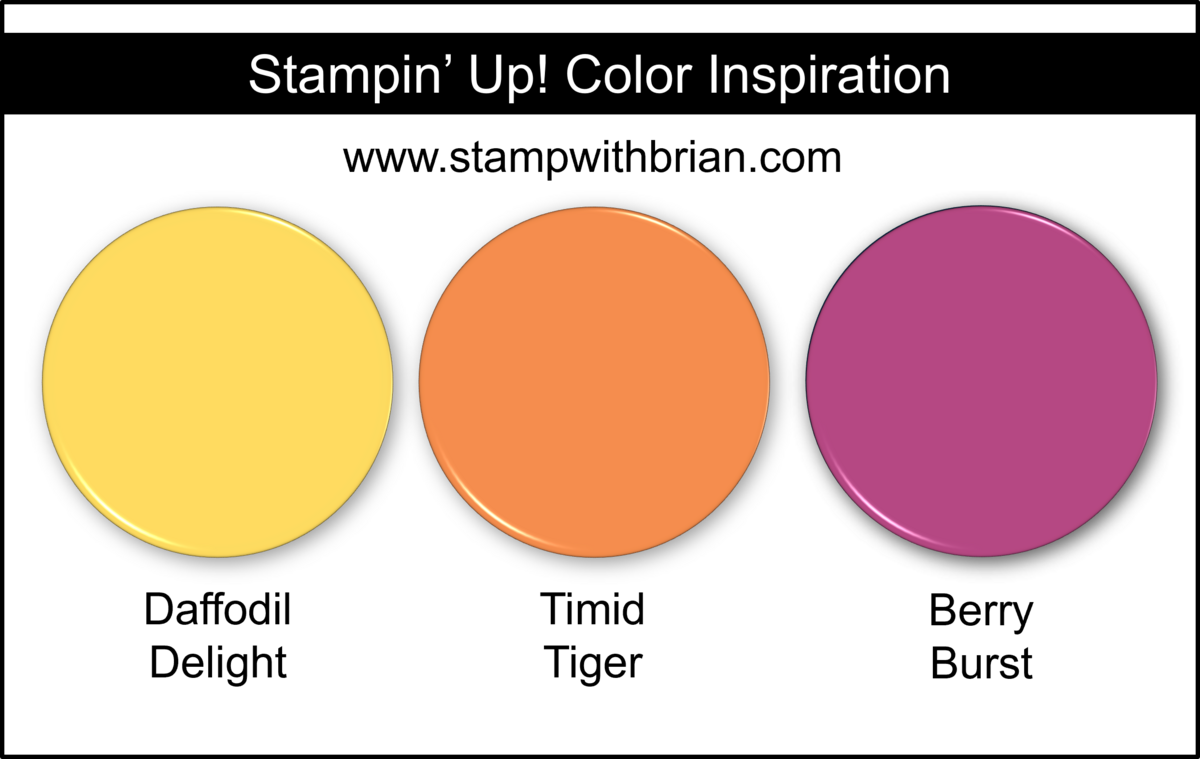
Combined with Other Colors
By adding one other color to the shades in these papers, you can really transform the feel of the pages or create all new combinations with inspiration from the paper. Here are some color combinations that feature two colors from this pack of papers and one color from outside the pack:
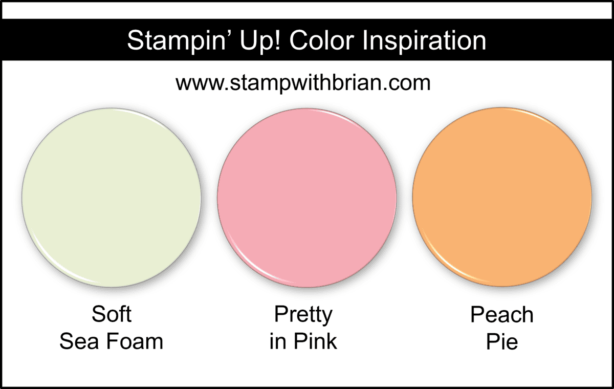
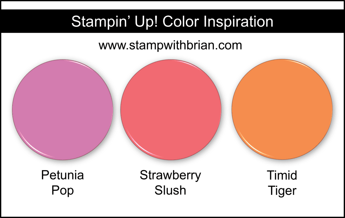

By limiting the colors you’ll use in a project (or expanding the colors to those outside a pack of papers), you can really find some beautiful color combinations for our projects.
I hope you find this helpful, and I hope some of these combinations inspire you. Please save any (or all of these) to Pinterest for future reference.
Thanks for stopping by today!
Brian



Hi Brian
I especially love your DSP color combinations blogs!
Reviewing the cards you have made so they are in one place to reference is great 👍🏻
Thanks for sharing 😊
Thanks so much, Dawn! I am often surprised by how much I use the DSP when I pull one of these posts together. Glad you like them! ♥
Cool and colorful! Thanks for showing these splashy combos in a creative way!
🙂 So happy to share, Mary! Thank you so much!
Hard to pick a favorite card in this line up……but if I HAD to it might be the YAY card! This is such a wonderful suite!
Thanks, Linda! I had fun with that one – I love those watercolor splotches in the papers. SO MANY great patterns in these pages.
Your creativity shows when pulling these fun color combinations together. Love this suite. Enjoy your day!
Thank you so much, my friend! ♥
I’m thinking I need to try out a Lemon Lime Twist, Old Olive, Secret Sea combination this afternoon! I love all the cards you’ve made with the DSP.